


Janet Abrams: Michael, You’ve been drawing for decades now.
Michael Webb: Seven and a half decades, if you count those done when I was six or seven years old.
JA: Do you ‘do’ or ‘make’ a drawing?
MW: That’s a very important question. To ‘make’ a drawing implies a certain inventing, whereas a Working Drawing, where everything has already been designed (or so you delude yourself), would be a drawing you ‘did’. But a drawing you ‘make’ has the implication of creativity. In French, there is presumably no difference: the verb faire translates as ‘to do or to make’.
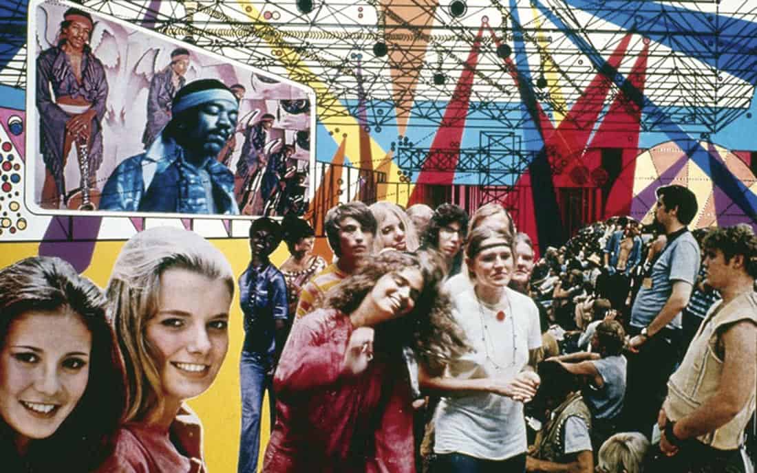
Figure 1. Ron Herron © Archigram Architects, Batiment Public, Monte Carlo: Hendrix Interior. 1969. Black ink line drawing, color film and newsprint collage. 36 cm x 28 cm
JA: How do you decide what to draw?
MW: Long ago, I developed a list of subjects I considered worthy of exploring through the act of drawing: a Drive-in House; a temporary environment of dwellings that would come and go; an elegiac study of a landscape that is dear to me. More often than not, my first stab at a drawing – derived from contemplation of the subject – would be disappointing, but a new drawing would grow, phoenix-like, out of its ashes. A drawing often starts out prosaic, even dull, but by keeping going, ideas as to its furtherance begin to present themselves. It can be years before I realize how a particular drawing should have been done. The process is self-perpetuating: the wretched shortcomings of a given drawing are expiated by its successor which, in turn, yields yet another new drawing.
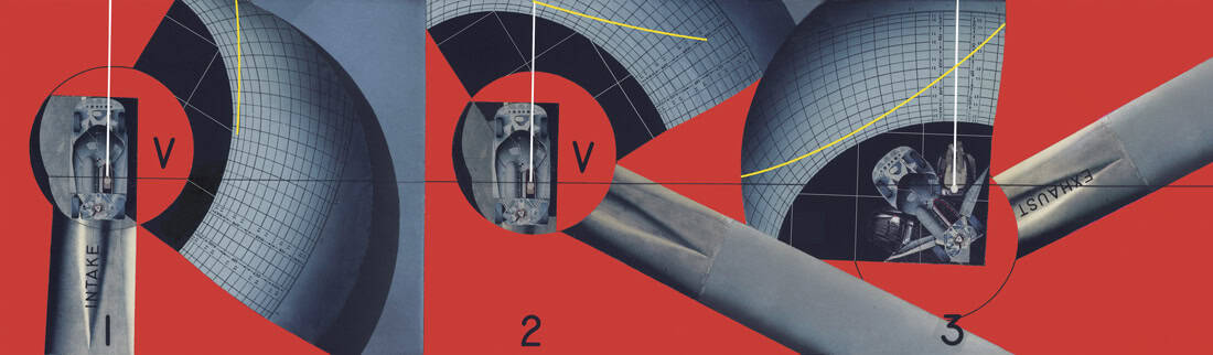
Figure 2. Michael Webb © Archigram, Three-Phase Horizontal Section through the Drive-in House, 1995. Color-aid paper and airbrush (digitally corrected). 55 cm x 16.3 cm
Phase 1:
The car enters through an intake tube positioned vertically on the page. The white vertical line denotes the driver’s center of vision. A convention of architectural projection drawing is that the plan of the building should be placed on the sheet (or screen) so the main entrance lies along its bottom edge; thus you can imagine yourself walking through the building’s interior spaces by tilting your eyes upward towards the top of the drawing.
Phase 2:
The drum bearing the car has rotated clockwise so that its interior is now sealed off from cold air in the intake tube. Nevertheless, in order to follow the convention, the driver’s center of vision remains vertical hence the rotating drum is graphically inert, while the inert house rotates graphically around the drum. (Slavish adherence to the rules of projection drawing thereby results in chaos in terms of readability.) The car doors begin to open.
Phase 3:
The drum has rotated further so the car now shares the same space as the schematic living area. Graphically, however, its position is such that the driver’s steadfast center of vision is yet vertical. The car’s doors are now fully open. As the car rotates about the house so does the sun (denoted by the yellow line in each phase).
JA: You trained as an architect in London at the (then) Regent Street Poly. How did that compare with your experiences as a member of Archigram?
MW: Polar extremes. The education I received at the Poly was very serious, well thought-out, but rather puritanical: all hard-edged rectangles, no frivolity – in keeping with the tenor of architecture at the time. So it was a bit of a culture shock to join these ne’er-do-wells producing this wonderful, exotic, erotic architecture. In early Archigram, especially from the hands of Ron [Herron] and Peter [Cook], one was supposed to enjoy making a drawing: beautiful colors were appropriate and desirable, as were photos of people having a good time inside the building. At the Poly, if you wanted to put a figure in a drawing, you should only show one and it should be there purely to indicate scale. In certain Archigram drawings, the figures occupied almost three-quarters of the drawing and you really had to look for the architecture behind them. (Fig 1) Which, if you could find it, was quite standard for the period: the space-frame roof truss, which Konrad Wachsmann had developed, and geodesic spheres, which of course Bucky Fuller started. None of us in Archigram were ‘form givers’. The drawings weren’t so much about the architecture, but rather the effect on social engagement that the architecture produced.
Fun fact: when the drawings were made, the beautiful young people were cut out from color magazines, then coated with rubber cement to apply them to the surface of the drawing; they had perfectly clear skin, but over the years, it no doubt became blotchy. Same with the drawings: the rubber cement has started to come through the photographs, and they now look somewhat jaundiced, curling up at the edges!
JA: Sounds like Dorian Gray in reverse. Much of Archigram’s exuberance came from looking across the Atlantic at the USA, right?
MW: During that time in London in the Sixties when we producing those drawings, the initial push was from the USA, but then England started to get cheerier and happier. The Mini car was an icon of cool young people with drive, as it were, and ambition.
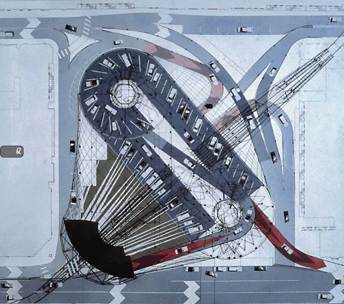
Figure 3. Michael Webb © Archigram, Plan projection of the Sin Palace with added drive-in movie screen, 1970.
Photographs of cars, colored overlays, and ink line on Mylar. 100 cm x 85 cm
JA: Since the Archigram period, you’ve moved on to making more ‘romantic’ images like the Temple Island Project, which you’ve been working on for many years. (Figs. 4-8)
MW: You use the word ‘Romantic’ because some of the later work reminds you of paintings by Turner, Claude Lorrain, John Martin. I wonder if the Archigram period isn’t romantic also. It has very much to do with life and enjoyment, and maybe recollection and sadness…just a different way of showing it.
JA: True, in Archigram there’s the romantic fantasy of a futuristic technological lifestyle projected via collage.
MW: You can’t go on producing Archigram drawings forever. Each period of drawing you feel you’ve worked it to death. You need to move on, into a different realm.
Figure 4. Michael Webb © Archigram, A cone of vision enclosing the landscape of the Regatta, 1981. Watercolor on Schoellershammer Parole board, each board 75 cm x 50 cm
The image, composed of two adjacent drawings, shows only what an observer located at the apex of the cone of vision can see; he, she or they cannot see what is behind the objects of which the landscape is composed. These invisible components, therefore, are not shown.
Figure 5. Michael Webb © Archigram, The temple dome projected onto a hemispherical picture plane, 1978.
Chinese ink wash on d’Arches paper. 50 cm x 37.5 cm
The beholder here is a floodlight casting a pool of light on a spherical surface – the dome of an aedicule, a temple whose dedicatee is supposedly Mother Thames. The floodlighting apparatus is attached by means of telescoping arms to a track set into the entablature of the drum that supports the dome.
As the floodlight circumnavigates the dome, it creates pools of lightwith continuously changing outlines.
These shapes are then used as sectional profiles to create the form of the boat in which the Rev.
Charles L. Dodgson, accompanied by the Rev. Robinson Duckworth and the sisters Liddell, will glide down the Thames all in the golden afternoon* – to quote the opening poem from Alice in Wonderland:
All in the golden afternoon
Full leisurely we glide
JA: Your more recent work is incredibly painstaking – you lavish time and handskills on representation, in oils, watercolor and other media. I remember you steadily working on one painting from the Temple Island Project during your term as a 2011 Mellon Senior Fellow at the Canadian Centre for Architecture.
MW: In Montreal, I wanted to get involved in childhood recollection of the Henley Regatta, seeing where a study of the landscape would lead me. With the fear that it might only be of interest to me and my Mum. The Regatta course seemed potentially generative of numerous paintings and drawings: it’s a textbook in basic perspective projection. All the rowing lanes are set out in the river, converging to a point on the horizon, virtually but not entirely covered by the temple on the island. The Temple Island drawing could be seen as a proposal for a giant structure, but one you have to imagine. There’s an intimation that a building might be there, but in fact is not there. That’s another way of being ‘green’.
Cedric Price seems to me the ultimate ‘green’ architect: if he had the opportunity of not designing a building, he took it. Architects who fancy themselves as ‘green’ are still bent on making buildings; they just make them with sunscreens, active roofs and so on. But it’s a much greater step not to make a building at all. If you cherish a landscape, you have to reject the invitation to impose a building on it.
JA: Common to all your drawings is an interest in perspective and games with geometry and optics. Can you summarize the core of your investigation?
MW: I’m making some effort to understand the impact of a journey to infinity – what that would involve. Every perspective projection is a representation of infinity. When you draw infinity, you get a great mass of lines around the vanishing point, which connects to the idea of a black hole. My work is a geometric investigation that involves motion too: there’s one drawing that shows a single point traveling towards the vanishing point at a constant rate.
The interesting thing about perspective projection – which supposedly presents objects as they appear in life – is that it doesn’t. Drawing class professors warn students about the dangers of getting too close to the object they’re drawing, because distortion may result! But it is just this distortion that interests me.
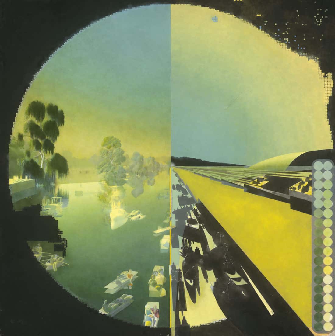
Figure 6. Michael Webb © Archigram, The landscape of the Henley Regatta represented via a dot matrix, 1987-2020. Oil on prepared board. 72 cm x 71 cm
The colors comprising the matrix are merely identical repeats of those found in the Munsell Color Sphere but in differing juxtapositions; so the painting can be defined as the colors found in the Sphere, multiplied and rearranged to create the illusion of an 18th century landscape painting.
JA: Tell me about the tools and materials you work with, and why.
MW: For my oil paintings, I apply extremely thin, transparent layers of paint to the surface of a whiter-than-white commercially prepared board, with a ‘tooth’ just sufficient to hold the thin films of paint; any evidence of brush strokes is anatema to me! Rather than applying the paint with a conventional brush, I use a small piece of sponge attached to the handle of an X-Acto knife, dipped in the glaze and applied to the board. The colors of the paint appear richer when applied one on top of the other (and diluted with a blending medium) rather than mixed prior to application – for example, by applying a blue and an alizarin crimson to achieve a purple. Incoming light passes through the layers and is reflected off the white ground into the eye of the beholder. When combined with properly rendered shades and shadows, the painting seems to possess an ‘inner light’. In this process – usually referred to as the glazing method – it’s as if each layer of paint were on separate but superimposed sheets of glass. In that respect, it has a connection with color separation in photography.
I am moved by perfect gradients, and the astonishing light effects at sunset, especially when the air is heavily polluted. These I want to capture; no reason to ask why. Lebbeus Woods once said to me that the two of us represented the wet and the dry. I wet, he dry. His medium was exclusively charcoal; he had learned how to apply unbelievably smooth gradients. Nevertheless, a close-up of his dark areas to my eye looks somehow rough. I preferred the smoothness in both close-ups and distance shots in drawings done with graphite pencil, where one starts with an 8H and works down to 2H, F and B. The problem is that you can’t get a real deep black like with a charcoal drawing. So a graphite drawing tends to remain the shy, retiring type. If you use, say, a 2B pencil, the application tends to give off a rather unpleasant shine.
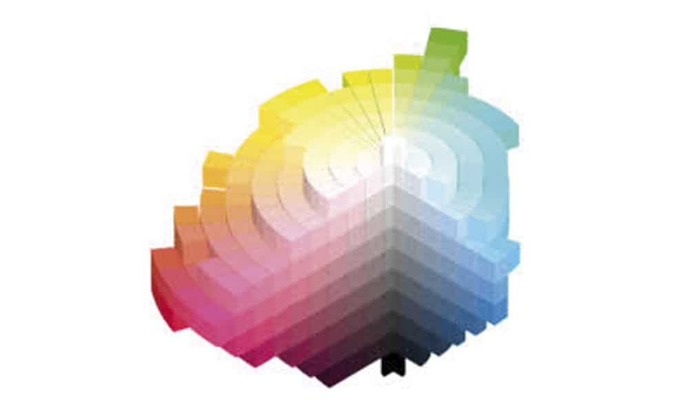
Figure 7. The Munsell color system. developed by Albert H. Munsell in the early 20th Century, specifies three properties of color: hue, value and chroma.
JA: Why do you stick to hand drawing at a time when most architects have switched over to using computers for drawing?
MW: There’s a certain sensual pleasure, I must confess, in hand drawing. But that’s not what’s kept me at it. Rather, it’s my total inability to understand digital technology. Hand drawing and painting require a skill level perhaps not fully appreciable by those who have wisely left the tools associated with our calling untouched. Sometimes, by sheer luck or intuition, the addition of a color or tone makes a drawing sing out: a joyous, albeit rare moment. In Proust’s À la Recherche du Temps Perdu, the writer Monsieur Bergotte is amazed by a patch of bright yellow on a roof in Vermeer’s View of Delft – a spontaneous gesture in paint, but so perfect that it must surely come only from God.
In The Exquisite Corpse [1], Michael Sorkin refers to the ballad of John Henry – the eponymous rail-spike driver who tries to beat the steam hammer at its own game – in describing the persistence of those architects who still draw by hand. What do they think they’re up to? It seems to me that when one technology supplants another, the new doesn’t eliminate the old, but makes it into something rarefied – something to be practiced with almost religious intensity. Like cooking.
The availability of computer drawing doesn’t mean the end of hand drawing, but puts it into a unique category: not dead but special in a way it never was before.
With digital technology, so much of the image you produce isn’t yours, but those who developed the program. When you open up Photoshop there’s a long list of people who invented it. God bless them! How brilliant of them! So a drawing by Michael Webb is also by the people whose names appear on Photoshop’s front page.
With computer drawings, so much is given to you. Several semesters back I attended a review at an Ivy League school and the drawings were most disappointing: they all looked alike. In the days of hand drawing, those students who were intent on becoming architects really learned how to draw and usually did the good projects.
The bad projects were badly drawn, though not always.
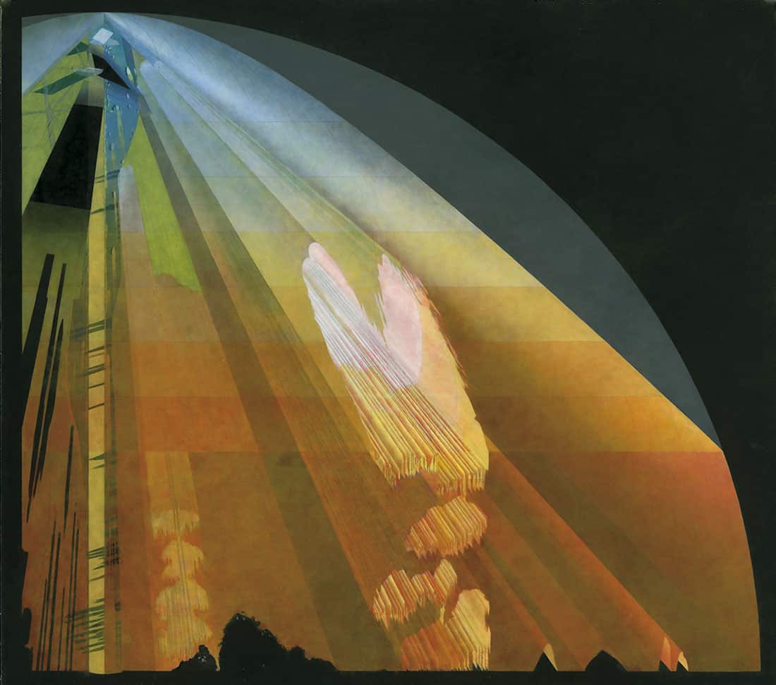
Figure 8. Michael Webb © Archigram, The landscape of the regatta viewed by a second observer whose viewpoint is located elsewhere 2010-present. Oil on prepared board. 100 cm x 95 cm
I have moved my easel, as it were, from the apex of the cone of vision to another location; it matters not where. In so doing, voids have opened up behind objects in the landscape that are visible to all except the beholder standing at the apex of the cone.
The planar truncation of the cone, whose surface is described by a hyperbola, means that these voids will erupt through it. For example, the void caused by the large weeping willow near the apex of the cone where it erupts through the surface, will reproduce at larger scale the outline of the tree’s hanging tendrils.
A second willow, bottom left, further from the beholder, will record an outline where the increase in scale is less. It is assumed that the particulate matter in the air is at such a high level that the cone can be removed from the surrounding landscape as if it were a solid and examined independently, like an ice core. As soon as the beholder moves, the voids will start gyrating like movie gala searchlights and creating new gashes in the surface of the cone.
JA: You’ve taught drawing for decades. What do architecture students need to know about the history of drawing?
MW: Oh, everything. To understand computer graphics you need to know about the History of Drawing. Most drawing courses involve something being placed in front of you and you drawing it. I’m more interested in drawing where you have to invent the subject matter. That seems much closer to what architects do: conceive of something in the mind, reify it on a sheet of paper. Go into a Starbucks and there’s an architect at another table – you can tell because he’s wearing all black – talking to an associate. He pulls out a felt pen and starts drawing his latest creation on a napkin. The ability to represent what you have in your mind for your next building is really miraculous .
In a Drawing Class, you learn to do that such that the napkin drawing tells you where the design can go. If it’s good, it can lead to the next stage of the design. If it’s shitty, it won’t do anything. Some students are quite inventive, intelligent, and dedicated, but nonetheless pretty poor at drawing. No matter what I say regarding hand drawing – that it’s invaluable – some refuse to believe it.
JA: Give me some examples of your course assignments, and what you were trying to get the students to understand.
MW: I gave an assignment recently about putting the dining room from Buster Keaton’s movie The Scarecrow on a two-dimensional sheet of paper. Everything on the table – marmalade, butter, plates, cups, salt, pepper – is hanging from strings, so if your partner asks for the salt, you just reach up, grab it and send it over with a pendulum-like movement. A drawing can represent very complex ideas but you have to limit its scope. How do you interpret? What do you leave out? What do you include? If you take some element of that meal, the drawing can handle it, but the elements still need to look like parts of a meal. Otherwise it’s just a boring exercise in rearranging components.
In another assignment, I asked my students to think of Grand Central Station as a metaphor for the human circulatory system: the blood becomes people moving through the station. I showed them an amazing cross section drawing by L. Ashwell Wood (Fig. 9), who drew for 1950s English children’s comics, in which cutaway techniques are used to reveal what’s hidden beneath the floor level and subway lines. Revealing what can’t be seen is really important to consider.
I had them draw a very complex series of ramps beneath a pedestrian bridge. Then I showed them images of a semicircular rail tunnel no-one would know about unless they’d investigated the drawings, and asked them to place it on the drawing in its proper location vis à vis the ramps. Difficult because you’re seeing not just what’s in front of you, but also what can only be conceived of. The students came back with amazingly good drawings, pastels on dark colored paper.
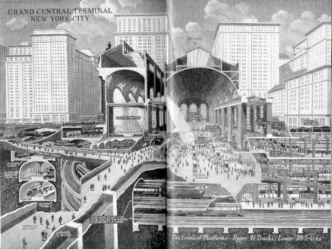
Figure 9. L. Ashwell Wood, North-South vertical section through Grand Central Station. Date of execution and size of original unknown. Airbrush and ink wash.
JA: When you come across a student with the ability to conceive in three dimensions in their mind, what do you think that is?
MW: A gift from the gods. Like Mozart playing the piano at four. Somehow, it’s born into them. What does apotheosis mean? To lift up? One student ‘apotheosised’ people as they crossed the floor of the main hall at Grand Central: their 3D forms became – not physically flattened – but 2D when they rose to the ceiling to take their place among the astrological figures, like Pisces, Gemini and Sagittarius. I thought it was a beautiful thing.
JA: Apotheosis: “The elevation of someone to divine status.” Talking of apotheosis, have you sold any of your drawings over the last 20 years?
MW: No, no one’s been interested in buying them; I’ve never done them on commission. It’s only since the book [2] came out that there’s interest in buying. And when you’ve been working on something for 25 years, it does make you think of asking a slightly higher price…
JA: Did you care about selling them?
MW: I didn’t really think much about it. I knew they weren’t ready to be sold. One chap who bought a painting, I asked him if I could have it back to do some more work on it. Still wasn’t finished at the end of the month. He couldn’t tell the difference, but it was quite clear to me…
JA: Is there something about not being able to let them go?
MW: Oh yes: avoiding disappointment. There’s always the hope that with just a short amount of extra work, you will achieve a magical quality. Oil painting takes forever. But it’s exactly that quality that appeals to me: you can apply a glaze of paint and if, the next day, you decide it was wrong, you can easily remove what you did with turpentine. Not much good for a student who has to finish her drawing in two days’ time.
My dictum: death is the only deadline.