The new building respects what was originally there while ensuring the possibility to create its own architecture with modern language without losing its identity. The spatial richness generated by the fluid and continuous dialogue between the interior and exterior atmospheres in conjunction with the harmony of the projected volume, and how it has adapted to the landscape around its perimeter area are the values which have been transferred and made their mark on the project.
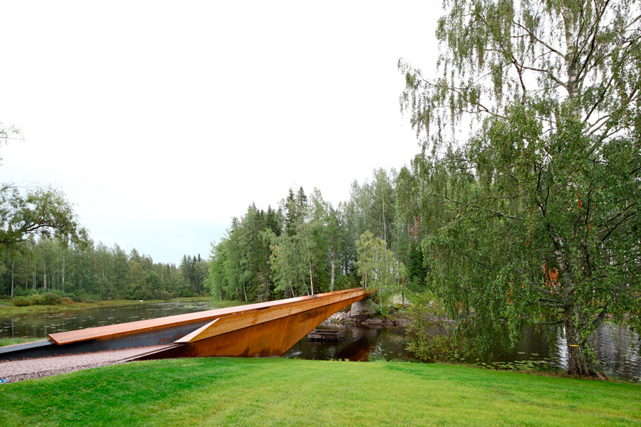
Parallel to the construction of the new building, MX_SI has been commissioned to undertake the opportunity to connect the museum, located in a park on the shores of Lake Melasjärvi, with the island of Taavetinsaari, achieving a natural increase in external exhibition space. A bridge was constructed with a simple, singular structure, keeping the formal and conceptual appearance of the initial project. An element that coexists with the integration of the works of art into the landscape, which in addition to the signage of the building, was also supervised by MX_SI architectural studio.
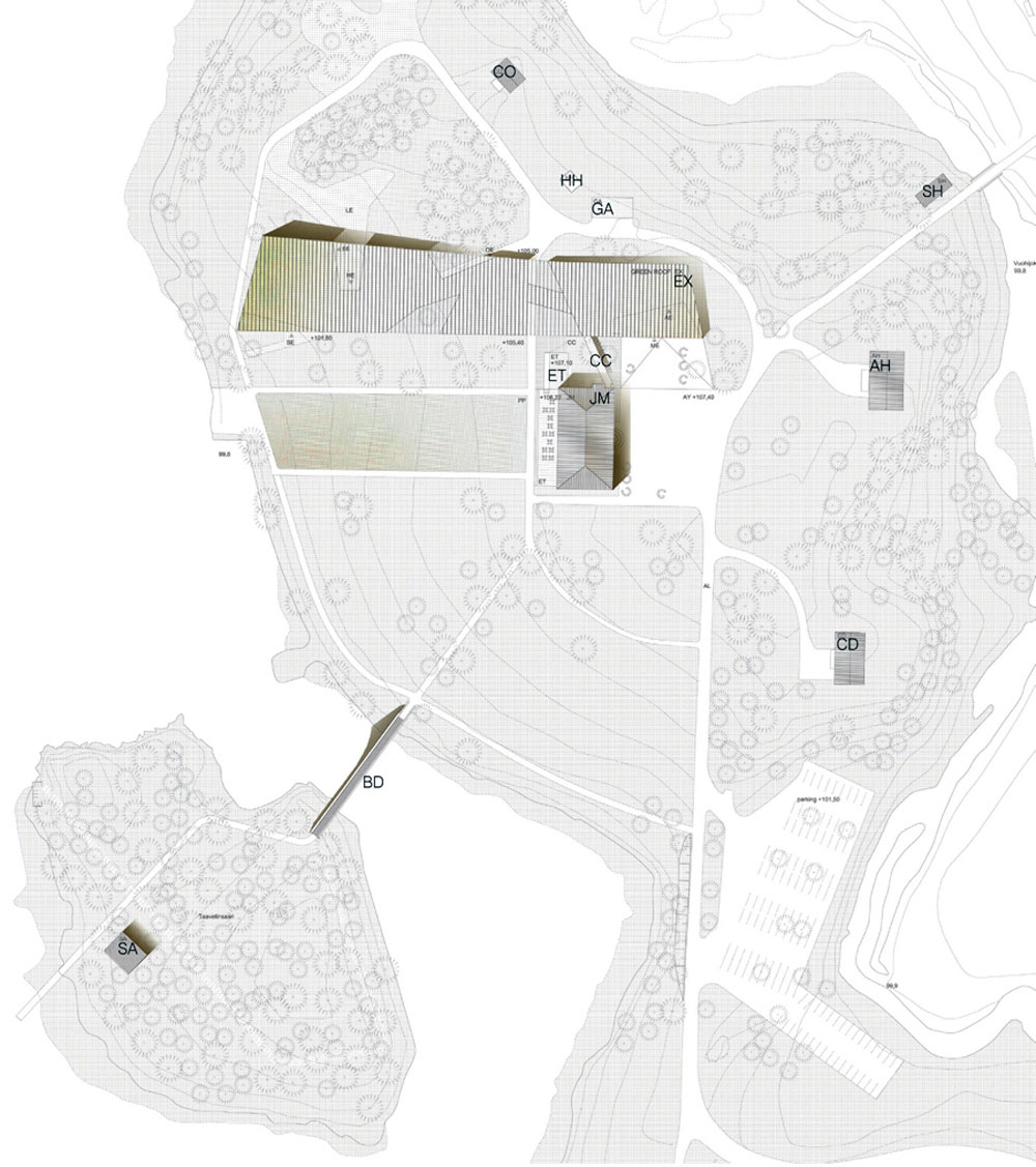
Situation Plan
The Serlachius Foundation was created in 1933 with the purpose of taking care of and maintaining the art collection amassed by Gösta Serlachius (1876-1942), owner of one of the largest paper mills in Finland. Currently, the museum exhibits valuable works spanning the various periods of the Finnish art movement, from the earliest works to the prolific Golden Age, modernism and the contemporary creation. As well as the SuperPop! exhibition curated by Timo Valjakka, including American and Finnish Pop art classics.
New Museum Serlachius Gösta Pavilion
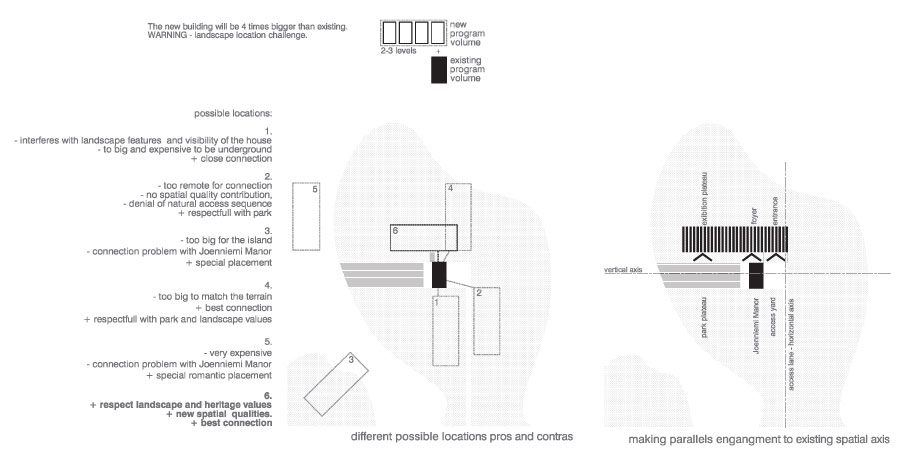
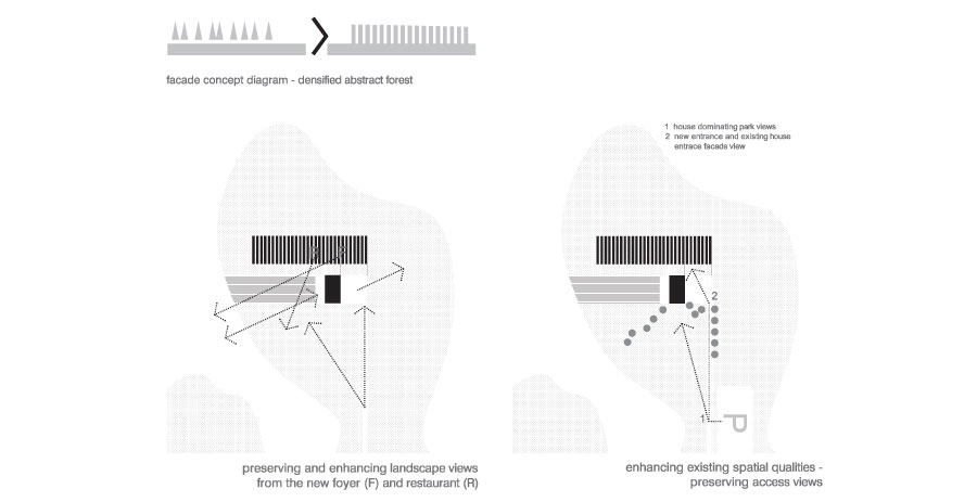
Design Diagrams
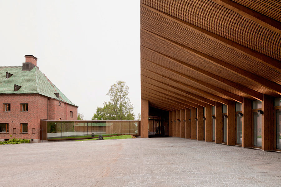
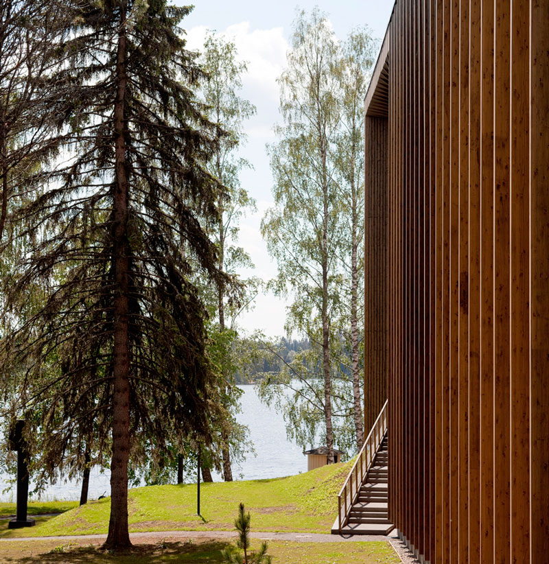
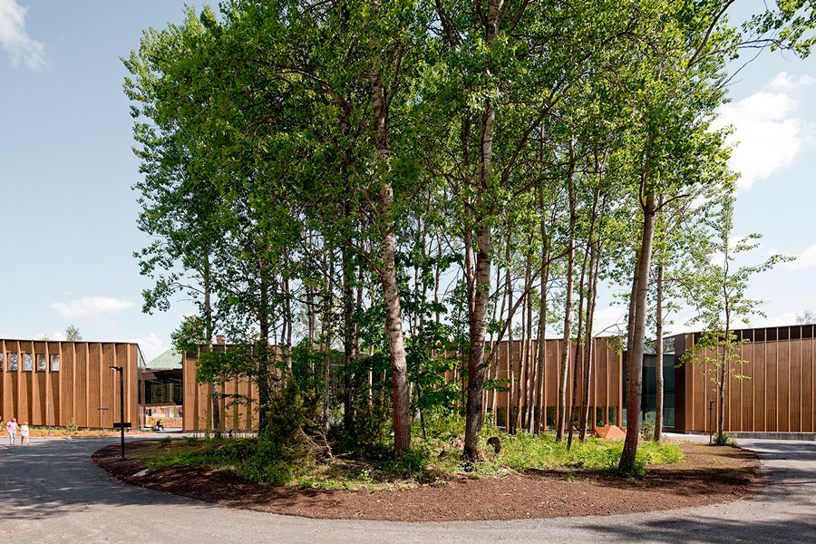
As a starting point, the place is understood as a large green canvas with the imposing monolithic figure of the Joenniemi Manor House at its highest point. A landscape which together with the old house comprises a heritage with cultural significance for the citizens of Mänttä and the Serlachius family. The project strategy is to establish a dialogue between the new and the existing by positioning the new construction so that Joenniemi continues to take centre stage, and at the same time the new museum does not lose the opportunity to express its character and contemporary presence. The solution was therefore to arrange the new volume parallel to the axis established between the house, the garden and the lake. An access plaza to the building was created, where the Joenniemi building continues to dominate the vistas of the area, and as the land descends and approaches the lakeside the new building becomes higher and more prominent.
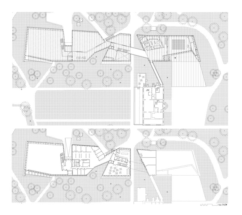
Museum Plans
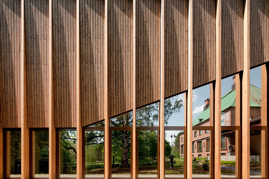
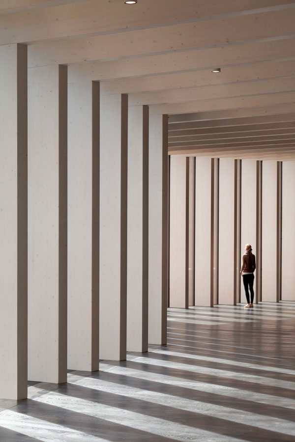
The project is conceptualized as an abstract and dense forest. A forest that represents and translates into a series of parallel wooden frames that define the geometry and structure of the new building. The structural framework is constructed with laminated spruce wood as it is abundant in the area and in turn makes an historical reference about the local industry.
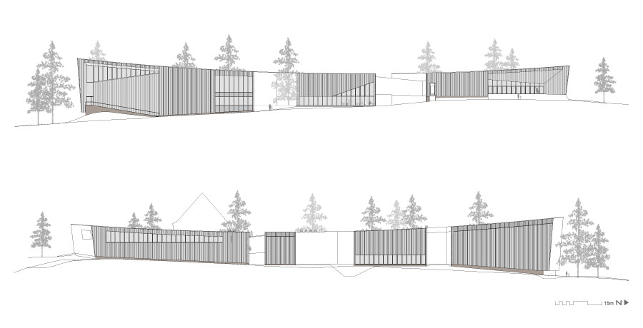
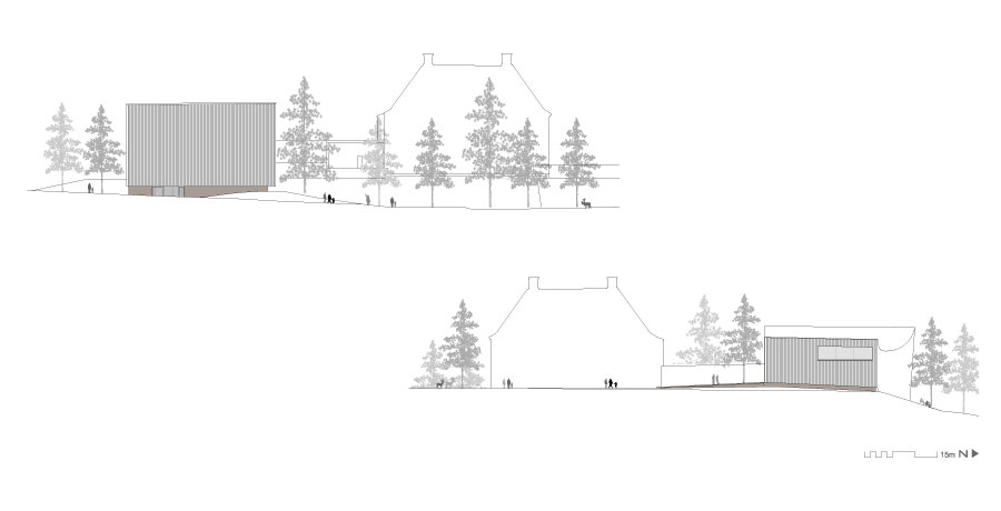
Museum Elevations
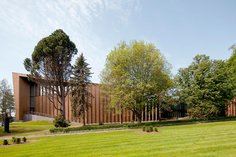
On the outside, the building presents a series of vertical mullions that follow and emphasize the rhythm of the interior structure. Between the mullions a ventilated facade system was designed of spruce wood strips twisted independently to the tectonic limit of the material itself, thereby achieving an effect of a three-dimensional texture that varies along the entire elevation. The facade idea also considered the effect of time on a living material like wood, so it was decided to add a semi-transparent golden hue to all its elements. During the first years the building will thus maintain a consistent image that will fade to make way for the desired silver tones that characterize this wood as it ages.
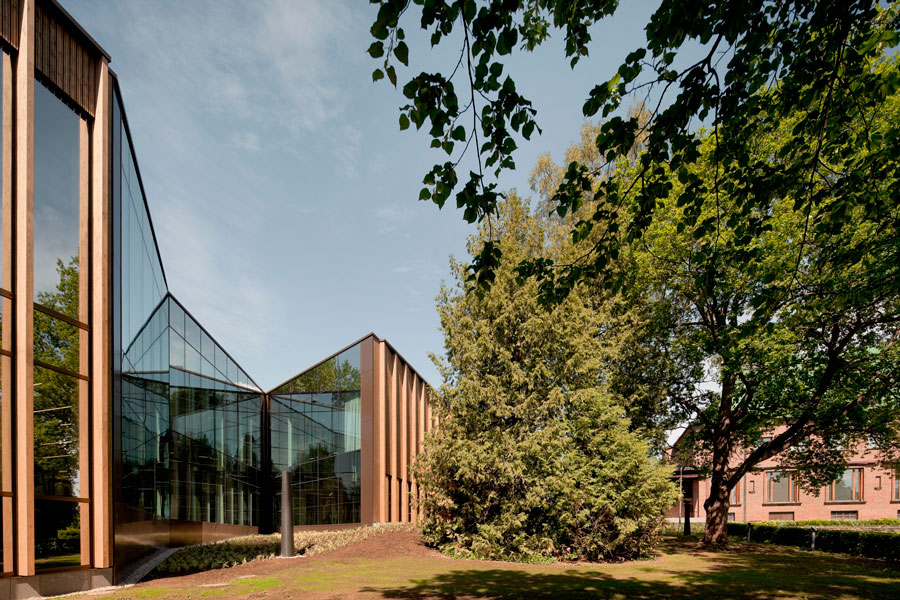
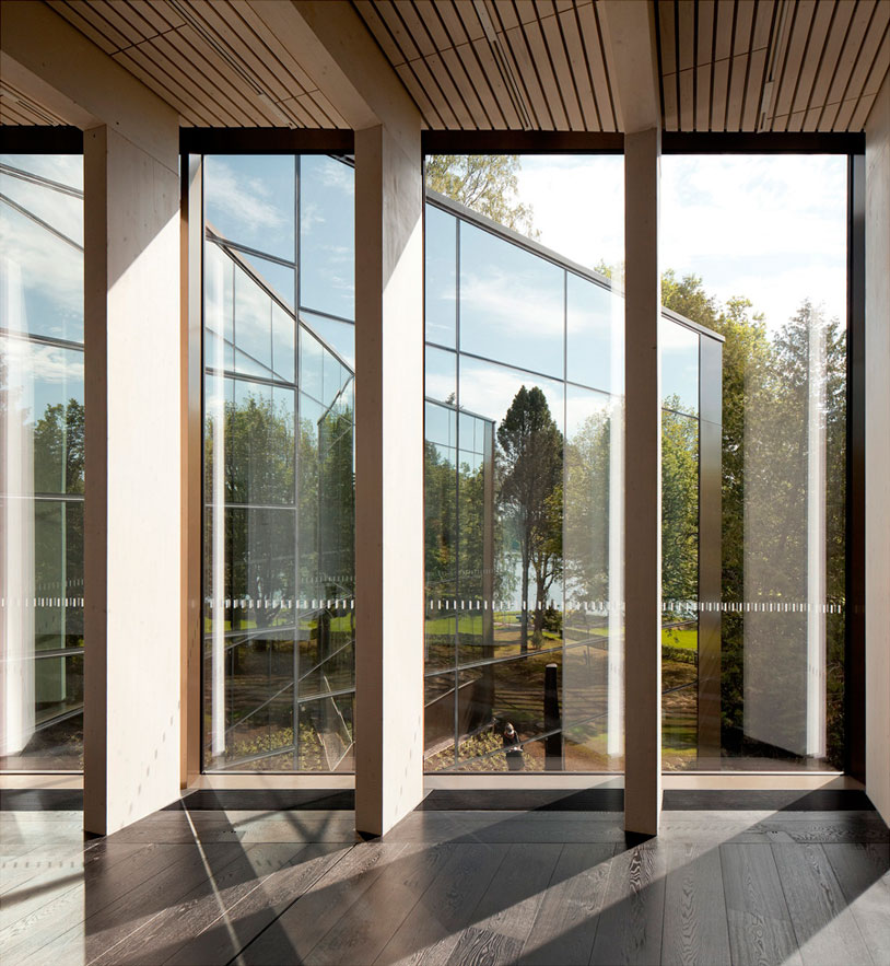
To reduce the visual impact of a building in such a sensitive environment, the building seeks to decompose into smaller fragments. The volume is interrupted by certain cuts, or irregularly shaped incisions, which are covered with a reflective glass surface. The result of these incisions is the perception of spaces of infinite mirrors; doors or forest walkways optically subdividing the building transversely
Exterior View
Inside, the building is organized to continue with the path which starts from the outside. This path is crossed by a sudden and surprising invasion of light caused mainly by the incisions in the volume of the building that also offer exterior views. These invasions transform what would have been a lineal path into an emotional one, thanks to the rhythm of the constant repetition of the structural frames and interruptions that allow external spaces to penetrate inside the building.
Galeries
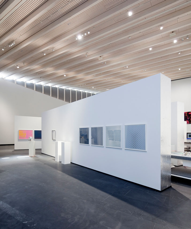
Technically, this project represents one of the first examples of large-scale public buildings in Finland to have been built with structures, external walls and finishes in wood. Despite the strict fire regulations, it was possible to leave the structural wooden frames visible inside the entire building. It was important to avoid covering the structure to perceive the smooth texture of the material and the curved surface of the ceiling accentuated by the steady rhythm of the beams.
Galeries
This structure was also designed to give greater flexibility to the interior spaces when planning future exhibitions. Supports have been left at the sides thus freeing up on building elements and releasing the central parts of the galleries, the frames have also been calculated to be able to hold pieces of large scale works of art which can even be hung from the roof beams.
Interior
As the park became part of the journey for the senses and the museum visitor experience, the project also began to take on part of the outside on a larger scale. New parkland areas were renovated and introduced , the bridge connecting the park with the island Taavetinsaari was designed and new elements of art were also positioned in the landscape , such as the sculptures by Harry Kivijärvi, works which in turn pose a new dialogue between the museum and the natural environment in which it is located.
Gösta Bridge
Once the expansion of the Gösta Museum and landscape intervention in the park located on the shores of Lake Melasjärvi had begun, the opportunity arose to connect this park with the small island of Taavetinsaari located in the southeast area of the park. Formerly there had been a wooden bridge connecting these two points, but it collapsed a few decades ago, so it was necessary to respond to the need to integrate the island as an outdoor exhibition space and therefore complete the layout of the Museum of Contemporary Art.
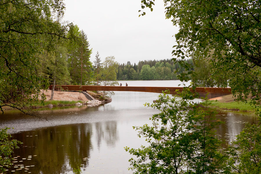
The new bridge has been placed in the same place occupied by the defunct walkway, at the end of the diagonal axis connecting the island with the Joenniemi Manor House. This axis was drawn as far back as the early twentieth century and is accompanied by a prominent tree line that was part of the original landscape design. The main purpose of the design of the new bridge has been to integrate the structure into the landscape in a particularly sensitive manner and that its geometry responds to its structural logic.
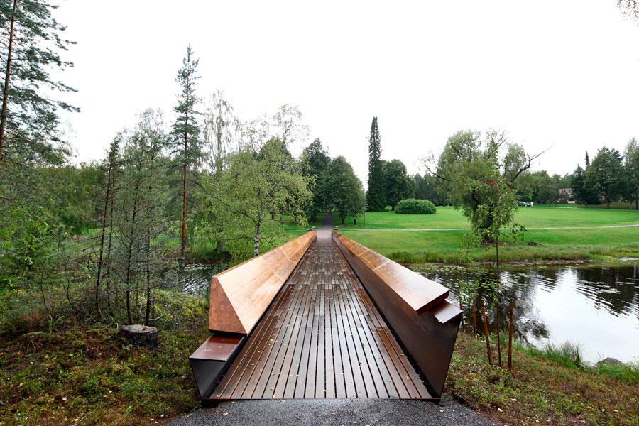
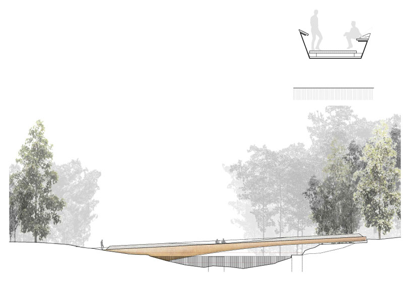
To achieve integration in the landscape, the way that infrastructure touched the ground at both ends was carefully studied. The lake shore of the island is relatively higher than the shore side of the park, which has a smooth, descending terrain. To overcome the height difference and accentuate topographic features of the site, the bridge has been placed with a slight slope, emerging from the earth on the side of the park and perched lightly on the island terrain. The geometry of the bridge, in addition to seeking the landscape integration, is a direct result of efficient structural design. The section of the bridge does not only change in its longitudinal part, being thicker at the base rising from the ground and thinner in the part that simply settles on the island, but also in the cross section where steel folds were studied to achieve the required stiffness. It is a section with four folds with just enough space left at the end to attach a balustrade on one side and a bench on the other.
The Corten steel used as a structural element, and welded to get a single piece without joints, also offers fine features and a subtly textured appearance in the landscape where it is placed.
However, it was considered necessary to provide museum visitors a soft touch surface. For this reason the sides of the “balustrade-bench” have been designed in larch wood along its course at two different heights. The lower bench was fabricated by a three-dimensional carved balustrade allowing it to move into the centre of the bridge to comfortably accommodate a group of visitors who wish to sit and stop to look at the landscape.
Bridge Section


