Having lost the capacity to think the city as a whole, architecture has seen its field of incumbency restricted almost exclusively to the design of the individual building. Because of this, architects can only contribute to the city in a disjointed and fragmentary manner, without ever having the opportunity to conceptualize a project of its totality. At the same time, urbanists seem indifferent to the possibility of defining concrete urban space and more preoccupied instead with issues of operational management of the city. While consistently avoiding any significant propositional stance, they limit themselves to the metrics of abstract metropolitan dystopia.
Architects implicitly acknowledge this diminished state of their discipline every time they acquiesce to focus on the design of discrete buildings without consideration for their urban context. This degradation of the disciplinary role of architecture in relationship to the city is nothing but the logical consequence of a growing process of privatization of public space, a process for which there seems to be no end in sight.
To see their projects realized into buildings, architects must give at least a tacit endorsement to this ongoing decadence of urban space; those without the stomach to do so can theorize or ambiguously reposition themselves while they wait for the unlikely event of regime change. The more recalcitrant amongst them might become visionary “paper-architects,” harbingers of a so-far frustrated architectural future, prophets of what could have been but, in all likelihood, will never be.
The city has fallen into its “metropolitan” state by having consented to its wholesale transformation into an on-going real estate operation of gigantic proportion. The city is no longer the place where people build on the work of generation after generation in a cumulative process of social sedimentation that gradually acquires civic significance. It has become instead nothing more than the geographic location of readily available cheap labor and willing consumers of an economic system characterized by its capacity for infinite expansion.
An Alternative Functionality
This unobstructed process of economic expansion is itself clearly embodied in the uncontrollable advance of urban sprawl over the countryside and the consequent effacement of the form of the city. Operating under this dispensation, the architect has the choice to participate—at least formally—with these objectives of endless accumulation or see her work remain unbuilt. Whatever the case may be, an architect’s odds of building his projects ultimately depend on a personal capacity to either comply enthusiastically with the implied economic program or assume a pragmatic form of ambiguous neutrality balanced between personal survival and a socially-expected duty towards some kind of cultural critique.
As propellant of its metamorphosis, the city has demanded architecture becomes the provider of the functional infrastructure necessary to achieve the instrumental aims of dominant sectors of society. Architecture’s servility to this process is deeply marked by its willingness to relinquish its disciplinary independence for the sake of pragmatic efficiency and a self-defeating chance of survival.
The theoretical grounds of investigation that might lead to an alternative architecture and an alternative city rest beyond this limited functional description of architecture’s incumbencies. Were architecture to be able to confound the narrow functional role imposed on it by economic imperatives, it could perhaps offer an exploration of alternative strategies for city building.
We are not advocating here the uselessness of architecture, but rather, that it could conceivably embody an alternative functionality, confounding the structural role assigned to it by the dominant economy and thereby uncovering a possibility to imagine another city. If, perhaps, indulging in a modicum of surrealist absurdity, architecture could occasionally evade the demands of causality, it could open up a potential for unanticipated ways of being and secure the vital indeterminacy of what is not yet known, a necessary condition to secure a future for itself and for the city.
Ephemeral Projects
The ephemeral projects by OBRA presented here, mostly installations and exhibitions, are exempt from the hard demands for functional performance most architectural projects have to face in order to be built. Because they are ephemeral and inexpensive, they are tolerated, and remain free from more serious responsibilities: they become opportunities to explore alternative tasks unrelated to the pedestrian exigencies of accumulating a pecuniary difference in every move we make. From the point of view of the city, they could then be considered the prototypical spaces for other lifestyles, ones that could only flourish once the prevalent understandings of the narrowly functional can be discredited and left behind.
Removed from nonsensical regulatory constraints or capricious outside preconceptions, these projects don’t attempt to explicitly venture onto the realm of the urban, presupposing instead an inherent capacity of architecture to imply the city as long as a critical functional role is embraced. In that way, they propose to humbly but forcefully subvert the vicious cycle of positivist devaluation currently afflicting the city and to engage in a dialogue about a possible alternative urban role for architecture.
1
SEOUL
Cities Exhibition
The Imminent Commons, Inaugural Seoul Architecture Biennale
Dongdaemun Design Plaza
2 September 2017 / 5 November 2017
The city is in disarray, too big and formless; it can no longer be regarded as the embodiment of spatial and social order; it no longer plays the role it once did during Ancient Roman times, for example, when it represented, as civitas, the mobile conception of a diverse society in voluntary submission to accepted law. Such conception is not necessarily something we should feel nostalgic about, but though it may seem that social problems of the day—such as class inequality, racism, authoritarianism, crime, pollution, corruption, etc.—are the cause of urban dysfunction, the opposite might be true: the city’s chaos and disarray might be the cause of society’s pathologies. In other words, the corruption of society may not have caused the decline of the city, but instead the decline of the city may have caused the corruption of society.
Technically speaking, most of the space of the city is privately owned, countless buildings in the city are inaccessible to most of us, and of that ghostly majority, we only know a very small fraction: the random lobby, the place of work, the school building and so on. In our heads, the city is overwhelmingly public, composed of the plazas, the streets, the parks, the temples, the churches, etc. The city might be quantitatively private, but phenomenologically, it is still mostly public.
The word commons evokes public space, perhaps the space of social unrest and revolution as in the Parisian Commonards of 1871, for example. In its medieval assertion, however, the commons meant something different: it was the land set aside by the gentry for the modest and controlled use of its subjects, the commoners. The first of these conceptions implies public ownership and class struggle; the second, only public access granted with the intention of keeping the social peace and preserving private ownership and submission to the established social order. In considering the word commons, it is unclear to which one of these two diverging origins to yield. The word commons then has become a “common ground” type of word, one that might either imply a progressive attitude towards social justice or its opposite. It has therefore become a safe and fashionable word that can be used for all kinds of events and texts, since in its ambiguity it can point towards the possibility of change without necessarily getting budgets defunded by corporate sponsors or organizers arrested by repressive authorities.
In a sketch of Pirro Ligorio’s engraving Antiquae Urbis Romae Imago drawn while visiting Rome in 1915, Le Corbusier theorizes that the essence of Ancient Rome’s public space was found in the interrelation of the pure stereometric forms of free-standing buildings. This meant that public space—the spatial commons, let’s call it—was for him not the space bracketed between buildings, as in for example, the Medieval City, but instead in the plurality of the assembled buildings themselves. Some of the most arresting ruins of Ancient Rome are still standing examples of this intuition: the Baths of Trajan and Caracalla, the Colosseum, the Pantheon and the Theater of Marcellus, all public buildings with unrestricted free access to all “free men.” All were wildly popular public buildings in their day, and it is rather ironic that all were built by declared despots that seemed to have understood well the social wisdom and political credit accrued in this form of spending public funds, while our current governments, with all of their supposed democratic credentials are incapable of building anything remotely approaching them.
This wisdom has been lost. In the United States today, for example, public space remains hostage to a vicious cycle of neoliberal denial, as the city’s infrastructure crumbles under a tacit prohibition on the spending of tax funds on anything other than advertisement, wars or incarceration. The reigning myopia of narrow utilitarian ends has obscured from view the city as an end in itself.1
Beyond this commentary on the political cowardice of city management, what is fascinating about Le Corbusier’s observation upon confronting Rome is that, aside from the obvious attack on the street as the key element in the organization of public urban space—and the beginning of his mechanistic view of the city separated into zones of different functions connected by highways—there is a critique of the façade as the inseparable companion of the street. The façade typically confronts the street “representing” the building behind it with potentially absolute independence from the internal organization of the building itself. In other words, it sets the stage for an architecture of deceptive expression. This critique is an early instance of a future dialectic of development that will eventually replace the façade altogether with the elevation and propel deep into the space of the building itself the representational role of architecture.
The resulting city of naked structure that this premise implies, predicated in the vacant geometry of available void created by repetition of type and open to as-of-now-yet-unknown meaning, became no longer possible. If indeed fetishized as a well-known obsession of modernism, space still represented the possibility of a more democratic form of architectural representation. Open to constant change, the eloquence of space was fueled not by rhetoric, but by the exposure and concealment of the undetermined uses of the building, by the orchestration of its movement, and by the deployment of an implicit order as the substitute for concrete form.
Also, space as the crucial vehicle for architectural expression, because of its very insubstantiality, resonated with a constructed idea of reality that accompanied deeper understanding of the self as an unstable subject. Space was then understood not as found but as projected from the individual in the form of perspectival construction.
Now, we seem to have entered an interregnum of pervasive ignorance that, by misunderstanding space, confuses architecture with design, and instead of the city, proposes pathetically modest urban interventions such as the addition of bicycle lane networks and randomly located potted plants. The result is a narrow understanding of function confused with a more prescient purpose open to the future and the modicum of utopianism necessary to even conceive of this future.
The “Imminent Commons” Biennale of Seoul 2017 presents a good opportunity to reevaluate the significance and, even more elementally, the very ongoing possibility of architecture vis à vis the contemporary city. The Biennale features The Cities Exhibition, which is installed in the main hall of Dongdaemun Design Plaza and offers the promising prospect of 50 different thematic exhibits coming to Seoul from cities all over the world. OBRA participated in the Biennale with the exhibit design of The Cities Exhibition.2
In practical terms, the architectural design focuses mainly on the successful resolution of very specific formal issues related to the complexity of an exhibition designed by a committee of diverse curators working independently of each other from the four corners of the world. It is this characteristic of the project that suggests the possibility of regarding it as a possible urban analogical experiment: both the exhibit and the city can be seen as the organization of vacant group-form available to be occupied by unpredictable content and organized non-hierarchically to invite free movement. These design premises also require a subtle but rigorous structure to prevent the project from contributing to an undesirable descent into a potentially chaotic experience that the collage-like assembly of disparate content might bring about.
As an experimental analogy of urban space, the design of this ephemeral structure aspires to a normative repetitiveness that risks certain phenomenological dissolution of form and a numbing of the senses of the perception of spatial sequences. The project will define a certain rhythm of experience related to the time needed to negotiate arrays of overlapping trajectories which will be made subliminally legible through an insistence on certain sequences of thresholds, some axial and some diagonal.
The depth of the resulting layered space is sometimes revealed in the enfilades of doors that cut deep into the structure here and there as a perspectival projection of potential trajectories open to the visitors. Relying on the utmost geometric simplicity and the architectural resources that, as described above, can be easily missed or dismissed, the architectural design recedes perceptually to give primacy of place to the exhibited content, while at the same time trying to sustain it with a measure of discrete order.
The structure, conceived as a repetitive group of small galleries, mostly 3 meters wide by 6 meters long, aims to create the atmosphere of repetitive neutrality necessary to contain all the unpredictable collision of richness the curatorial project proposes. The only exceptions, three larger spaces for public assembly, are created not by adding anything to the project but by subtracting walls and thereby creating larger gaps. The result is an undifferentiated labyrinth, one in which no proposed sequence of experience is particularly privileged and in which each visitor can trace his or her own personal trajectory while never fully being in a position to know for certain if they have seen everything there is to see. Considered this way, psychologically, the exhibition might inspire the disquiet of the inexhaustible.
2
VENICE
The Lost City Book
Misunderstandings
Campo Space, Rome
21 November 2016 / 4 February 2017
Frac Centre-Val de Loire, Orléans
18 January 2017 / 23 April 2017
The Lost City Book is OBRA’s contribution to Misunderstandings, an exhibition of architect books which includes the participation of: Black Square, BuildingBuilding, Matilde Cassani, Lukas Feireiss, Saba Innab, LIST, Manthey Kula, OMMX, PioveneFabi, UHO, and Vazio S/A.3
While most other cities have been completely overwhelmed or destroyed by modernity, Venice, immune to change, has remained paralyzed in a state of permanent self-contradiction. Its urban system was once celebrated by Le Corbusier as a perfectly calibrated set of interrelationships between canals, bridges, fondamente and campi, but it might only be a matter of time until the city collapses under the weight of a global system that is both incompatible and indifferent to its urban perfection.4
For years, this has been a compelling incentive for architects who, aware of the precarity of the situation, have made Venice the subject of visionary projects usually colored with the urgency of a desperate rescue mission. An incomplete list of visionary projects for Venice starting in 1556 could include:
1556 Rialto Bridge, Andrea Palladio
1560 Redesign of the San Marco Basin, Alvise Cornaro
1592 Il Redentore, Andrea Palladio
1964 San Giobbe Hospital, Le Corbusier
1968 Palazzo dei Congressi, Louis Kahn
1975 Cemetery of the Ashes of Thought, John Hejduk
1978 Cannaregio West, Raimund Abraham
1978 Cannaregio Town Square, Peter Eisenman
1985 Campo di Marte Giudecca Housing, Alvaro Siza, Aldo Rossi, Carlo Aymonino
1998 San Michele Cemetery Expansion, Enric Miralles
2016 South Giudecca Poly-production Zone, OBRA
Venice has perhaps now reached the most acute critical point of its existence. Young people have a dubious future in a city without jobs, while the city suffers a daily invasion of millions of tourists that unload from large cruise ships entering the fragile environment of the lagoon and towering over the city making its monuments seem irrelevant. Worst of all—to please the visitors—the city has been forced to become a made-for-tourists caricature of itself.
Many of these visionary projects speculate that a future Venetian architecture could create a new paradigm for opportunistic intervention in the city, seeking to find reconciliation between the spheres of everyday life, production and contemplation. The technological march towards the miniaturization of technology affords opportunities for the development of micro-enterprises that could give people an alternative to working in a hotel or leaving the city. Working independently from the development of a new knowledge base and the empowering capacity of micro-technology, people can foster a new possibility for financial independence based on a re-conception of urban manufacturing. Transportation by truck will be discouraged in the near future for ecological reasons, and this will give Venice’s transportation advantages due to its unique access to maritime routes for both shipments and deliveries.
OBRA proposes a string of cooperative buildings dedicated to high-tech light industrial manufacturing to be developed along the underused south shore of La Giudecca, complementing the traditionally working-class neighborhoods on the island. Building upon the traditions of its industrial past, the new structures will be erected to open towards the Adriatic and the midday sunlight. The vertical elements of these buildings include apartment units featuring simple but generous two- and three-bedroom apartments. Their facades are designed to give the building an unpretentious generic character. Their anonymity does not only reflect the collective ownership of these structures, but it is also a built refutation of the excesses of a formally expressive architecture abused by commercial developers to emphasize social differences for the purpose of distinguishing those who have from those who have not.
The vertical wings of the buildings, containing the residential units, form a C-shape open to the lagoon and support above them a wide inhabitable “roof” structured with a series of vierendeel trusses suspended over the lagoon below. Inside this elevated “roof,” a grand industrial hall equipped with very high ceilings, teaching and meeting facilities and state-of-the-art light manufacturing machinery are planned. This space would be open to the public and available to use after the necessary training sessions. The building then becomes the place of sharing the latest technology, a space for light manufacturing production as well as a space for the production of new knowledge. The main space is surrounded by a flexible-use series of rooms for offices, conference rooms, classrooms, dining rooms, lounges, laboratories, clean assembly rooms, etc.
Within the C-shaped footprint of the building, under the inhabitable industrial roof above, a flooded urban room is defined. This is one of a series of gigantic new inundated campi for the city of Venice. Ships can sail into them and be loaded or unloaded by a bridge-crane suspended from the underside of the industrial floor above. On the ground floors, bars and restaurants open into the flooded central space and also onto the open water on the sides where long water-facing loggias are created for recreation and boat mooring.
3
BERLIN
Exquisite Corpse
Architektur Galerie Berlin
10 September 2016 / 22 October 2016
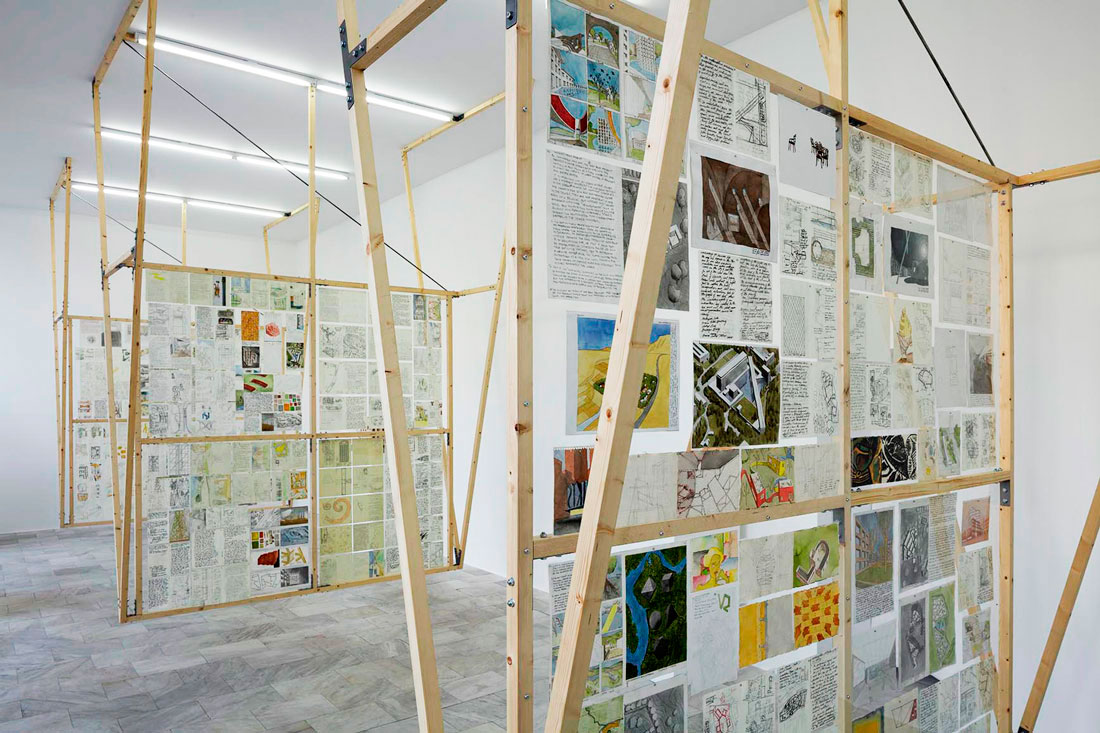
An architect’s sketchbook is a tool of design and a chronological record of an evolving understanding of things. Containing both sketches and notes, it is the architectural version of a personal diary, the possible place for the recuperation of lost ideas and a map where the trajectories of thought and intuition are preserved.
Exquisite Corpse at the Architektur Galerie Berlin is an exhibition of selected original loose pages from OBRA’s design sketchbooks. An exhibition of books is generally a frustrating affair most of us are familiar with: when on exhibit, books are typically placed inside a glass vitrine and open on the one page the curator has understood as the most interesting or representative of an entire volume. The rest of the pages in the book are unavailable for viewing. To try to get past that frustration, OBRA dismembers its sketchbooks, separating the pages and displaying them flat-mounted on a transparent plexiglass surface, an arrangement that allows examination of drawings and text on both sides of the paper.
A sketchbook always has a chronological structure, but, due to its binding structure—mostly organized in signatures of eight pages—detaching, unfolding and laying the pages flat side-by-side scrambles the original sequence in which the drawings were created, complicating the possibility of a coherent understanding of the original work and its linear chronology.
This exhibition strategy could perhaps be compared to the structure of the 2001, Michael Nolan film Memento, in which the rigorously backwards narration of the plot puts the audience in the exact same mental position as the amnesiac main character: the backwards narration makes them “forget” the immediate past because it has not yet happened.
The undoing of the sketchbooks binding similarly scrambles their “plot,” preventing a distracted reading and hopefully “thickening” and slowing-down their perception. The interpretation of any design as the efficient resolution of functional problems is short-circuited by the resulting layout of scrambled pages. The mosaic of images, arranged with the apparent lack of logic of a dream, prevents a simplistic interpretation of the design process as exclusively grounded on pragmatic assumptions, opening up the possibility of alternative understandings of architecture.
In the gallery, the drawings are deployed on three easels suspended from the ceiling and allowing double-sided examination. The easels bookend the space with a shy monumentality suggested by the Soviet-era social realism of the gallery’s terracotta-clad building on Karl Marx Allee.
4
MACERATA
Planetarium Pavilion
Recycled Theory: Dizionario illustrato/Illustrated Dictionary
Edited by Sara Marini and Giovanni Corbellini
Quodlibet
September 2016
A Chinese documentary about pollution in China called Under the Dome was viewed more than 150 million times within the first three days of being released online on February 28, 2015 and on the sixth day was forcefully taken off the air by the authorities. In the film, a young girl is asked if she has ever seen stars. She answers that she never has.5
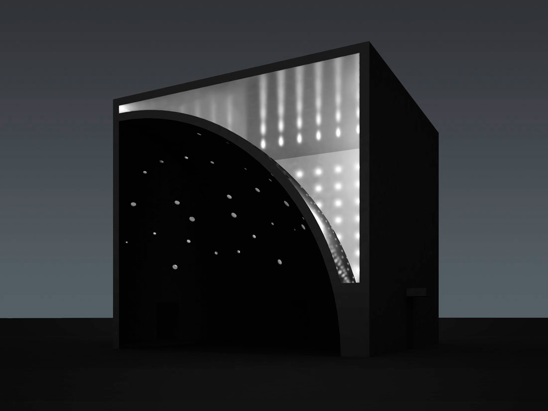
Stars or even the blue sky are indeed rarely visible in many parts of the country due to the thick blanket of pollution that, almost permanently, hangs over everything. With very modest means, OBRA’s project proposes to command artificial light to become an image of the celestial sphere.
The 1/4 Planetarium Pavilion, is meant to be deployed on the streets and at art fairs as a stealth barricade aiming at secretly co-opting and ridiculing the coarse strategies used by power to control information and manipulate public opinion. The obscuring of obvious truths to create new, fake and more convenient ones is the preferred way information is distorted and knowledge falsified. The destruction of the environment and darkening of the future are merely the ugly ways in which truth reveals itself, notwithstanding the all-out efforts by power to try to conceal it.
With the release of Under the Dome, many people in China first became aware of the vast and imminent dangers to public health due to rampant pollution. In some ways this small project can also be seen as sounding a quiet alarm in the form of a modest astronomy lesson, one that is both meant for itself and as a metaphor for the distortions of propaganda.
Although the content of the project might be mostly given to the satisfaction of an astronomical curiosity, its intentions go beyond educational intent. The desperate situation people in China find themselves due to the deterioration of the environment creates an inescapable sense of urgency that colors everything in their lives, and knowledge has become a weapon for resistance. As can be heard on the streets of Beijing: “It is a war between the lungs of the rich and the stomach of the poor.”
Relying on a shared resourcefulness that is both secret and increasingly more explicit everyday, teaching and learning in China has become an act of underground militance in pursuit of an urgently needed improvement of life conditions for people. Under the current political situation, the pursuit of true knowledge in China is considered a subversive and dangerous indulgence.
The Planetarium Pavilion is a 10-meter cube constructed with a wood-stud structure and finished in plywood sheets. Inside, a fragment of a sphere is built by smearing plaster on a curved metal-lath surface. The spherical wall creates a concave space where the planetarium will function and, on the opposite side, a convex space will serve as a vestibule. While in the brightly illuminated vestibule, visitors will feel slightly compelled to either enter the planetarium or leave the pavilion altogether. Inside the sphere, artifice is put to the service of wholeness by covering the two flat walls that slice the curve with mirrored foil, thereby creating the illusion of a full celestial hemisphere. The constellations are carefully mapped out on the dome and drilled holes in the plaster shell become stars.
5
SIRACUSA
Albero di Natale
Piazza del Duomo
December 2014
A Christmas tree for the city of Siracusa is to be constructed at the center of the historical Piazza del duomo. It will be made with simple means, standard dimensional lumber, small discs of stainless steel polished to a mirror finish and cheap toy lasers (€5 each). The tree is cruciform in plan with a tapering profile resembling the abstracted form of a conical pine tree. It reaches up to the sky in the center of the piazza to the same height of the ancient Doric columns of the cathedral nearby.
Five toy green lasers and thirty small circular stainless steel mirrors are attached to the wooden structure of the Christmas tree. The straight beams of green laser light bounce between the strategically angled mirrors to obtain the desired orchestration of ricocheting light. As the array of thin beams of ephemeral green light finally fade into the night sky above the piazza, the “tree” becomes visible from almost anywhere in Siracusa, a citywide phenomenon that, like the star of Bethlehem, helps to guide people to the Christmas celebration at the piazza.
Green cheap toy lasers are a familiar presence throughout Europe; dispossessed immigrant young men sell them as souvenirs at touristic spots everywhere. By employing these vulgar toys, the project identifies these unfortunate people as central to whatever meaning Christmas might still have today in Italy and in Europe.
During the day, the mirrors reflect captured fragments of the characteristically radiant sky onto the piazza below.
6
ASCOLI PICENO
Ascoli Nuovissimo
Arte Contemporanea Picena
October 2013
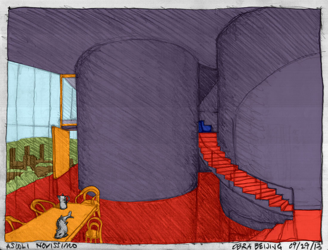
Ascoli Nuovissimo is an urban design project for the city of Ascoli Piceno in the Italian region of Marche. It was commissioned by the Roman artist Giuseppe Stampone to be part of a “tourist guide” as a conceptual art book. The project proposes the reconstruction of the areas of Borgo Solestá and Campo Parignano, two spontaneously-constructed neighborhoods immediately to the north of the city, with a new form of experimental urban fabric.
Ascoli Nuovissimo proposes that the areas in consideration retain the footprint of their existing urban layout, the trajectory of existing streets, and the configuration of city blocks. These leftover urban traces are, for the most part, to be relieved of their functional responsibility, and the new urban footprint will be simply laid over the footprint of the old city.
The city will transform, retaining the form of its constructed memory as evidence of its historical unfolding. Predicated in the appreciation of the continuously new, the new city will celebrate its moment against a background of its old self, as the preserved footprint will have no practical use and become ruin, one that mediates, without inauthentic gimmicks, between development and what came before.
Ascoli Nuovissimo will be pragmatic: car presence is to be kept separated from pedestrian areas, abundant green urban space is to be provided together with shared public infrastructure such as sports facilities, schools, social clubs, bars, theaters, and churches.
The project includes one hundred new residential towers, each with a footprint of 9m x 14m and a height of 100 meters. To provide the gradual interior articulation compatible with the ambiguities and nuances of contemporary life, the apartments—all identical in interior configuration—are organized in three levels and spatially defined by large cylindrical columns that, playing the role of inhabitable structure, provide structural protection against earthquakes while efficiently managing the flow of air, water, power and people up and down the building. Each typical three-bedroom apartment has 200m2 of area and living rooms and dining rooms with 5.4-meter ceilings, while all other spaces are 2.7 meters tall.
The 100 residential towers will stand opposing the skyline of the old city of Ascoli across the Tronto River in front of approximately 50 defensive towers which still stand since medieval times. This juxtaposition will bind together old and new. Each residential tower has a low-rising extension, a sort of urban tail containing underground parking, shops and shared facilities on the ground floors, and offices or workspaces of some other kind on the two upper levels. On the roof there are sports facilities such as running tracks, swimming pools, fencing halls, tennis courts and so on. The tails wrap around themselves, creating the edge of parks and piazzas that will become shared urban spaces for the new quarter.
All buildings will be clad in travertine panels and glass. The crystal-like towers will reach up to the sky like inverted stalactites framing views of the landscape and reconnecting the city with the mountains to the north.
7
LONDON
Kinokraft
Floating Cinema
Thames River London waterways
September 2013
Kings of the Road, a film by German director Wim Wenders released in 1976, tells the story of the friendship between Bruno and Robert as if it were a slow-motion race against death. Bruno rescues Robert after his unsuccessful attempt to commit suicide by running his Volkswagen into a lake at full speed (the car refuses to sink). Bruno is an itinerant film projector repairman who wanders around the East-German countryside in his repair truck in search of small-town film theaters (kinos) with a projector in need of maintenance. After the rescue, Bruno takes Robert under his wing, and from then on the romance of Kings of the Road is predicated on aimless wandering, the experience of transcendental banality, rock ‘n’ roll and the freedom of “having nothing left to lose.”
Kinokraft, or the London Floating Cinema project, is also a vehicle for the slow-motion race against death: against the death of cinema in small towns, against the death of canals in big cities and above all against the death of friendship and art as a way of life.
Kinokraft: a provisional antidote for the constant rush and relentless demands on personal freedom for the sake of ‘efficiency’ of today’s life, preserving for us the possibility of time spent drifting about the canals of London with abandon in pursuit of the dream-like space of old films.
8
SHENZHEN
Oxymoron Pavilion
Ultra-Light Village
Seventh Hong Kong/Shenzhen Bi-City Biennale of Urbanism/Architecture
8 December 2011 / 18 February 2012
The Oxymoron Pavilion is part of the Ultra-Light Village, a project curated by Terry Riley as part of the 2011 Hong Kong and Shenzhen Architecture Biennale.
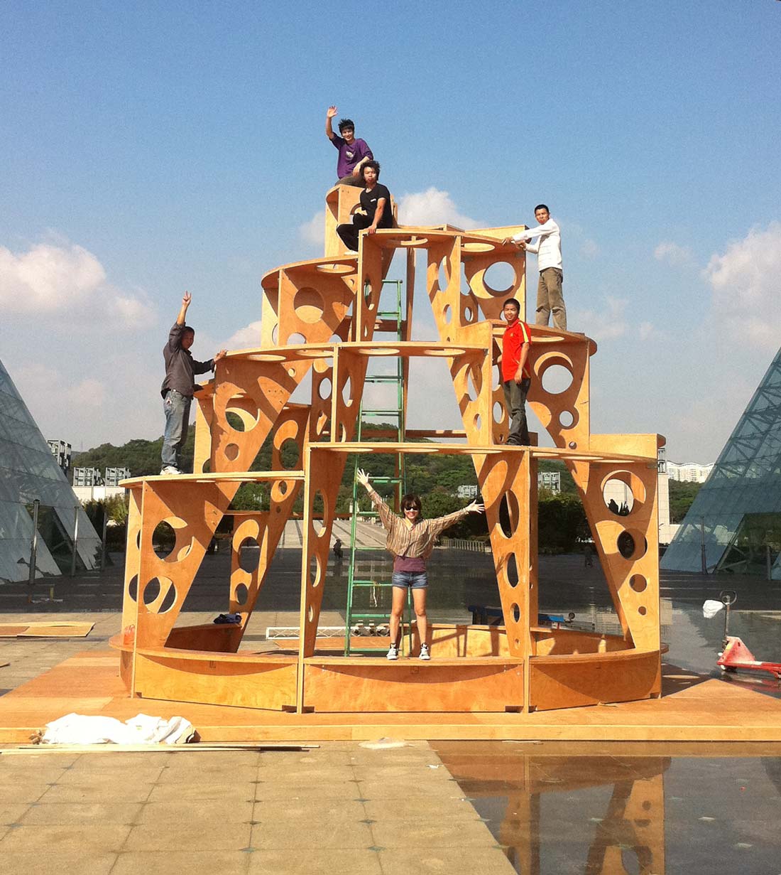
Working in China, one of the only two “socialist” countries left in the world, OBRA proposes the Oxymoron Pavilion as an (anti-) monument for a time of diminished expectations. The Oxymoron Pavilion follows an ascending spiral, recalling Tatlin’s 1919 dynamic dream for the Third International, but instead for today the dream of the future, originally embodied in steel and glass, has become an “ultra-light” ideological nightmare made of plywood and the kind of cheap plastic mesh typically used to make advertising billboards.
9
BEIJING
Red+ Housing
Crossing: Dialogues for Emergency Architecture
National Art Museum of China
12 May 2009 / 24 May 2009
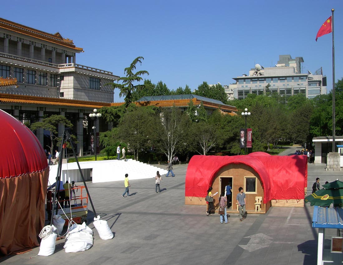
Red+ Housing is a 40 m2 full-scale emergency housing prototype on display at the National Art Museum of China in Beijing.
Architecture on the Edge of Survival calls for an emergency housing system to be deployed in areas of natural or man-made disaster anywhere in the world. Emergency housing from the point of view of design is only an extreme form of architecture; its context is that of almost unsustainable conditions and its object, the creation of an environment we can inhabit temporarily while living on the edge.
Red+ Housing is proposed in the knowledge that, when living on the edge of survival, action needs to be decisive and precise. By definition, an emergency will arise suddenly and demand fast response, but the immediate actions we take can have long-term consequences. Red+ Housing proposes an approach that tries to incorporate both the advantages of fast-response solutions, such as the deployment of refugee tents, with those of slower and more considered responses such as neighborhood reconstruction efforts involving local traditions and self-construction.
The design has been developed as an in-progress embodiment of the following 10 Points of Architecture on the Edge of Survival:
1. Universal Application: The prototype aspires to universal applicability. Its development contemplates a series of simple modifications that would make it a useful solution anywhere in the world: add insulation and a stove for cold climates; remove doors and windows for tropical climates; replace materials according with local availabilities, etc.
2. Effective Performance: The project makes economical use of materials by enlisting the structural strength of post-tensioning. The bamboo plywood strips of the dome support the enclosure with the same force with which a bow propels an arrow into the sky.
3. Economical: The project proposes the use of locally available low-cost materials. The materials are always replaceable and are chosen for their performance rather than appearance. When working in different locations materials which become exotic can be replaced with ones that are locally abundant.
4. Transportable: All parts are collapsible to flats and can therefore be easily packed and transported.
5. Ease of Assembly: All connections are a simple friction bond of male/female parts secured with a minimum of fasteners.
6. Renewable Materials: In China the project is proposed almost entirely in bamboo plywood, one of earth’s most renewable materials.
7. Digitally Prefabricated: Digital prefabrication makes the project economical in its speed of production and also easy to assemble due to the precision of its fabrication.
8. Open Work: The cruciform house, while iconic, retains in its biaxial symmetry a certain ‘indifference’ that allows its easy recombination with other locally and diversely made structures.
9. Urban/Rural: The geometry of the crosses, when deployed together in groups, defines in-between spaces of infinite flexibility that can suggest an ‘urban’ context for a field of houses. Likewise, if a house is erected by itself, the exterior of the cross creates spaces that mediate between interior and exterior, providing a context for people to spend time outside.
10. Flexibility of Use: The geometry of the cross allows the inhabitation of the house as one, two, three or four different units of housing.
10
NEW YORK
Beatfuse!
YAP, MoMA PS1 Young Architects Program
22 June 2006 / 2 October 2006
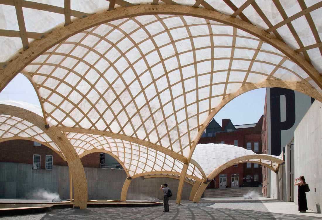
For the 9th MoMA PS1 WarmUp, OBRA seeks to define a structure that extends to the boundaries of the PS1 courtyard with no accidental leftover space. The function of the space is to perform as site of a public party, and this imposes few demands on the design other than providing some shade, seating and access to water.
Given the modest demands in terms of functional specification and the ephemeral nature of the commission, the possibility to undertake the project as an exercise on autonomous rigor suggests itself as a project that could be pursued, more than anything else, for the goals of its own self-created logic.
The courtyard is then covered with ten ½” thick concertina plywood shells manufactured off-site and later assembled in the courtyard. The concertinas are fabricated digitally using CNC manufacturing to achieve their dynamic curved form. By virtue of the thickness of the material proposed these structures would seem unlikely to span the 20 to 30-foot distances required, but the necessary strength is induced into the material through a form of post-tensioning generated by forcing the pieces into curved surfaces and connecting them in irregular grid-like configurations. Bolted connections force the wood into an unnatural position, consequently eliciting a tensile resistance that gives the assembly a strength emanating from the fiber of its own substance.
Each concertina shell is unique, but they fit together to create a seamless continuity that spans the entire courtyard. Each component is different, assembled at varying heights, positions and angles; nonetheless, all connections are conceptually the same and a single tectonic idea runs through the entire project.
The concertina shells are covered with a skin of polypropylene mesh scales. They allow wind and rain to move through them without excessively taxing the structure with lateral or lifting loads while providing soft penumbral shade. The inexpensive material has been chosen because it is rigid enough to return to its original position after the wind dies down and yet flexible enough to seamlessly adjust to the curved surfaces of the concertina, while overlapping in ways that generate gently nuanced patterns of moiré texture. The wading pools are constructed in layers of rigid foam and plywood coated with epoxy for waterproofing. They are conceived as inverted boats: boats that can contain rather than exclude the water. Water misters are provided throughout the project to lower the temperature of the surrounding air. They are protected under three-foot diameter steel mesh hemispheres that resemble giant kitchen strainers.
Inspired by the original social space of the Roman baths, the tripartite layout of the courtyards has been developed into three distinct temperate environments. The Caldarium has no shade, an array of radial chaise lounges for sunbathing and a large soaking pool. In the main triangular gallery, shade lowers the temperature of the ground by deflecting radiation, and pools and misters cool the air by evaporation. Additionally, the concertina shells bring the soothing breeze down to people. The combined effect of all these devices can lower the temperature by as much as five degrees. This space becomes a Tepidarium for conversation, eating, drinking and dancing. Finally, a very small courtyard is configured as a Frigidarium by lining its walls and covering the concertina above with scales made of aluminum foil bubble-wrap reflective insulation. Every Saturday morning for the duration of WarmUp, twelve blocks of ice are arranged at the bottom of the walls to create an ice bench.


