“. . . [T]he dimensions of a table or a house are very important—not, as the functionalists thought, because they carry out a determined function, but because they permit other functions . . . because they permit everything that is unforeseeable in life.” [1] Aldo Rossi, 1981
“Neither the Modern Movement nor post-modern have ever understood that a new architecture does not spring from a project method or from a language, but rather from the user’s different manner of using these things . . . architecture has never seriously bothered about the question of its own user culture.” [2] Andrea Branzi, 1984
House NA is a single-family house designed for a couple in Tokyo. At just 914 square feet, it consists only of floors, stairs, columns, and a transparent façade. In response to his clients’ desire for a nomadic lifestyle, architect Sou Fujimoto proposes the metaphor of living within a single tree.[3] The house assumes the sectional characteristics of a scant canopy: floors offset at different heights and connected by short stair runs branch out kaleidoscopically. Through this simple diagram, the house launches socio-spatial relationships between objects, bodies, and activities, opening up new possibilities for living in what might be understood as a foliated interior and a platform plan.
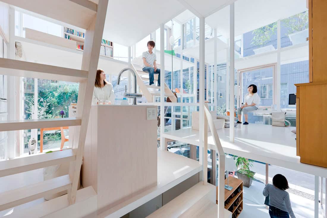
Domestic life typically organizes itself around individual objects of design that are hosted within an architectural interior.[4] In House NA, the downsizing of a single architectural element—the floor—toward the scale of these individual objects renders the architecture itself into an object of design. Diminutive floor plates, ranging from twenty-one square feet—the size of a dining table—to eighty-one square feet—the size of a rectangular trampoline mat—not only approximate the scale of the tables, beds, and chairs they support, but at times even become them, performing as divan, seat, desk, or perch. The floors are individual sites for the accumulation of things and people: designer handbags, Apple laptops, potted plants, books, a green chair, an upright lamp, cushions, wooden tables, a white vacuum cleaner, slippers, bodies. Even conventional architectural elements, such as stairs, accrue on them as portable design objects. The five short open-riser flights, two steep stepladders, and six sets of stacked blocks double as furniture. With its horizontal planes and spindly white steel columns, the house can be read as an open shelving system, a blown-up assemblage of flat surfaces for the stockpiling of possessions and domestic life itself.
Interior view from entry stair toward kitchen and living area. Thin platforms divide the interior horizontally. Objects, bodies, and life itself stockpile on top of them. Photo: Iwan Baan
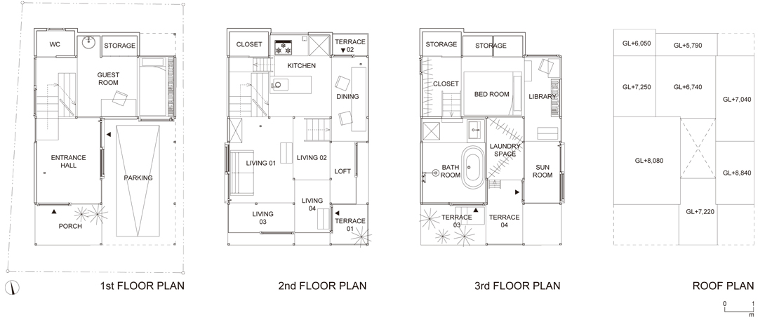
The technique of scaling down and repeating the floor produces the illusion of an interior much larger than its exterior. An economy of means turns spatial thrift into plentitude. In total, twenty-five micro-interiors emerge from between and beyond the sweep of white, polished surfaces: an entry; two guest zones; three storage zones; a water closet; a kitchen; a pantry; four floating lounges; a compressed loft; four outside terraces; an elongated dining area; a sleeping zone; a library; a generous bathroom; a sunroom; a nested exterior laundry; and a dressing closet. A complex single interior amasses out of this micro-ensemble of petite interiors and exteriors. As with many traditional Japanese house plans, House NA’s plans articulate a mosaic of hyper-proximate activities through fine lines and small squares of structure.[5] Yet unlike traditional Japanese houses, House NA dispenses with sliding screens, delineating the edges of individual floors at different heights with single lines instead. Together these lines describe an interior that is unified and subdivided, abstract and intricate. In a radical dismantling of Adolf Loos’ raumplan, Fujimoto evacuates the “wall” (or Japanese screen) to invent a platform plan. Miniaturization plus proliferation produces not only interior magnification, but diversification as well.
This platform plan exceeds modern architecture’s abandonment of the wall as a spatial divider for the domestic interior. If early twentieth century works discarded the “room” for the open plan, only to re-instate the wall as a spatial divider in new guises—for example, the sliding panels of Gerrit Rietveld, or the freely-disposed partitions of Le Corbusier and Mies van der Rohe—Fujimoto retains the organizing principle of the room but eliminates the vertical divider entirely. In place of dividers, the floors are offset with the nominal thickness (or thinness) of partitions, working in concert with the grid of columns that support them to establish horizontal walls in absentia. Spatial division begins where floors finish. In a stunning act of reduction, Fujimoto flips modern architecture sideways: vertical subdivision gives way to the horizontal.
Floor plans of House NA © Sou Fujimoto Architects
Paradoxically, Fujimoto’s removal of vertical dividers does not eliminate privacy. As Iwan Baan’s photographs reveal, the interior never appears in its entirety from within or without. Inside, the undersides of platforms obfuscate the interior in toto, obliquely dicing it up into perspectival fragments and splintering it into incomplete vignettes. Ceiling planes offer privacy by subterfuge, cutting unfamiliar and surprising sectional views: at times, disembodied limbs appear from the waist down; elsewhere, torsos emerge diagonally from the waist up. Outside, the setback transparent façades withhold visual accessibility as well. Perpendicular glass panes and pivoting floor-to-ceiling window-doors produce a kind of dazzle transparency that makes it impossible to look in. From a worm’s-eye view, the combination of white ceilings and glass panes confuse, mislead, and dissimulate—it is not clear where the interior actually begins or ends. The superimposition of thin vertical supports, chunky window frames (another building element reduced to the level of object-to-be seen as much as to-be-seen-through), and scattered possessions compound the visual situation: the interior is nothing more than a flickering mirage.
Significantly, this is a mirage with no center. The horizontal relationship of interior to exterior (i.e., inside-outside) typically established by walls is subordinate to an interior to interior (i.e., upside-downside) exchange established by the horizontal divisions of floor. A lack of distinction between ceiling and floor finishes—material, texture, and color—further produces a kind of neutrality that enables sectional reversibility. As Roland Barthes noted in another context, you can turn House NA upside down and nothing much will happen.[6] Here, reversibility is not contingent on optical effect, as it was in El Lissitzky’s Proun drawings, but on an elimination of detail: platforms are white, flat, and blank all around. To paraphrase Barthes, the house defeats any possibility of reading: in the platform “there is nothing there to read.”[7]
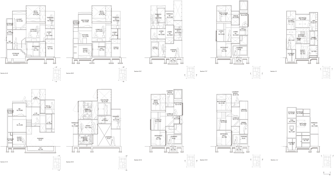
Sections of House NA © Sou Fujimoto Architects
The neutral platform provides a backdrop against which daily life plays out. House NA does not offer lifestyle intimacy, but imposes the responsibility of lifestyle invention. House NA’s inhabitant is neither owner nor user, but a new kind of designing subject—a subject who does not consume domestic objects, but adjusts to them, chooses them, designates them.[8] Further, House NA’s inhabitants must learn to navigate a perilous environment sans handrails: leap from platform to platform, climb from “branch to branch,” hover over mezzanine upon mezzanine. They must also decide how to occupy an extraordinary range of compressed floor-to-ceiling heights: a five-foot-high lounge; a four-foot-high loft; a three-foot-high storage room. Fujimoto’s sections and Baan’s photographs showcase the exhilarating possibilities for new behaviors that these limitations solicit: figures pause on surfaces, grasp columns, crouch in corners, reach for ceilings, and dangle at the brink. House NA offers life on the edge, in the most literal of senses. Paradoxically, it is the relentless application of mathematical precision in scaling the floor that frees its inhabitants to invent new ways of performing on its sectional terraces.
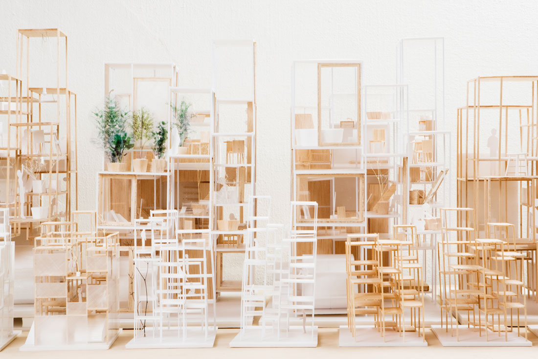 Study models. Downsized floors equate with the scale of individual domestic objects. Architecture as furniture. © Sou Fujimoto Architects
In this regard, the house offers the possibility of conceiving an alternative history of architecture conceived through one’s relationship to domestic objects. Fujimoto’s design transcends the deferral to objects seen in a range of polemical house designs—from Figini, Pollini, Frette, Libera, and Bottoni’s “All-Electric House” (1930) to Peter and Alison Smithson’s “House of the Future” (1956)—by recasting the architectural object as a collection of design objects through the miniaturized scale of the platform. It also bypasses the critique of objects seen in projects like Archizoom’s single-story, endlessly interiorized “No-Stop City” (1969), by proliferating and shuffling the deck of miniaturized plans in section. Assuming neither object deferral nor critique, House NA shows that hyper-specificity in one domain—in this case, the floor—can help produce what is unthinkable in another: surprising modes of inhabitation.
In contemporary terms, House NA shifts the emphasis of “the building” away from mass and a politics of the envelope toward elementzmimimum and a politics of the platform. The platform plan divides space horizontally. It has no center. It is reversible. If affords privacy on the oblique. It dissimulates. It is neutral. It yields a new kind of kaleidoscopic space. In an empire of platforms, building is dissolved into interior: it becomes a minimal world where everything is possible and nothing is out of place.


