This project is the result of a collaboration between two architectural agencies, ALTA architectes-urbanistes and Atelier 56S, after having won the tender organized by Rennes Métropole in 2017. The developer for the project is Rennes Métropole and the urban planner is Univers.
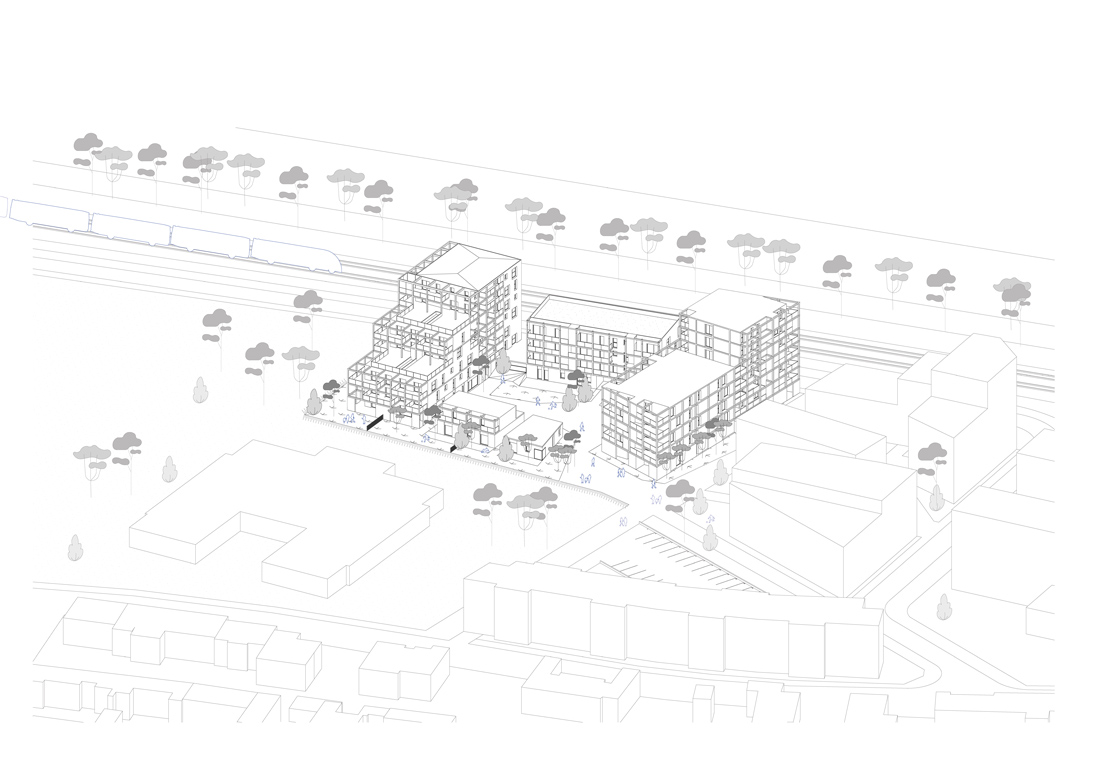
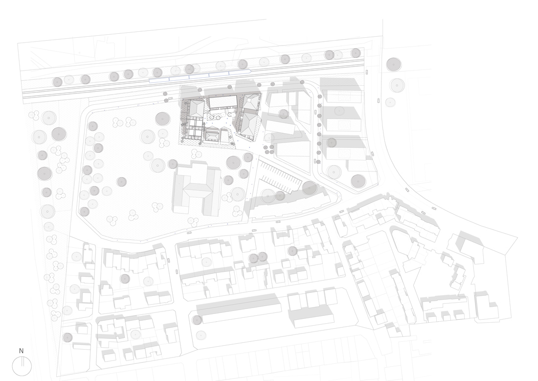
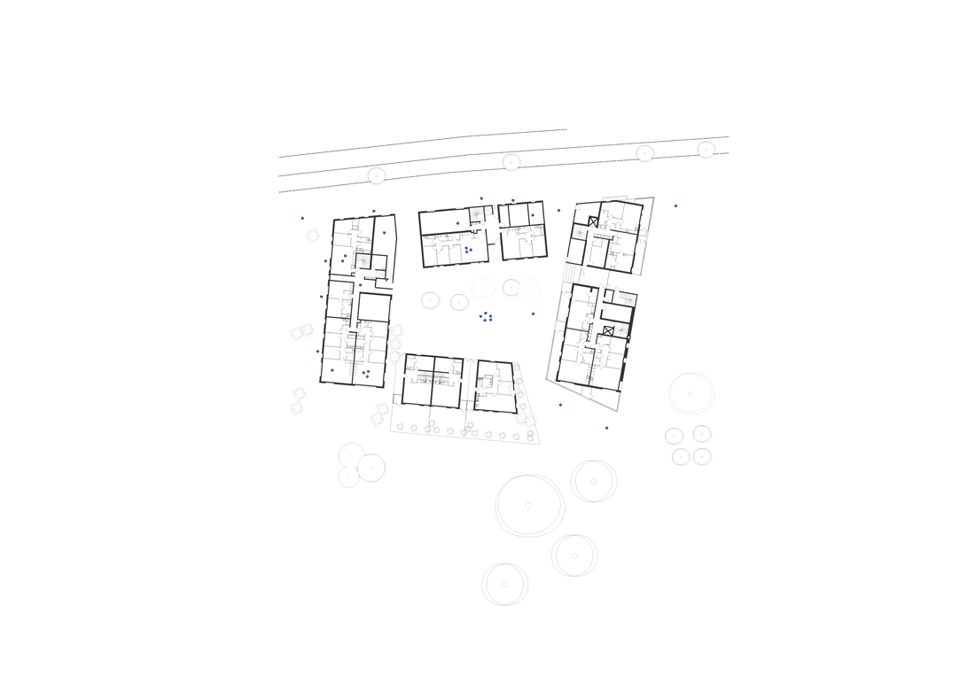
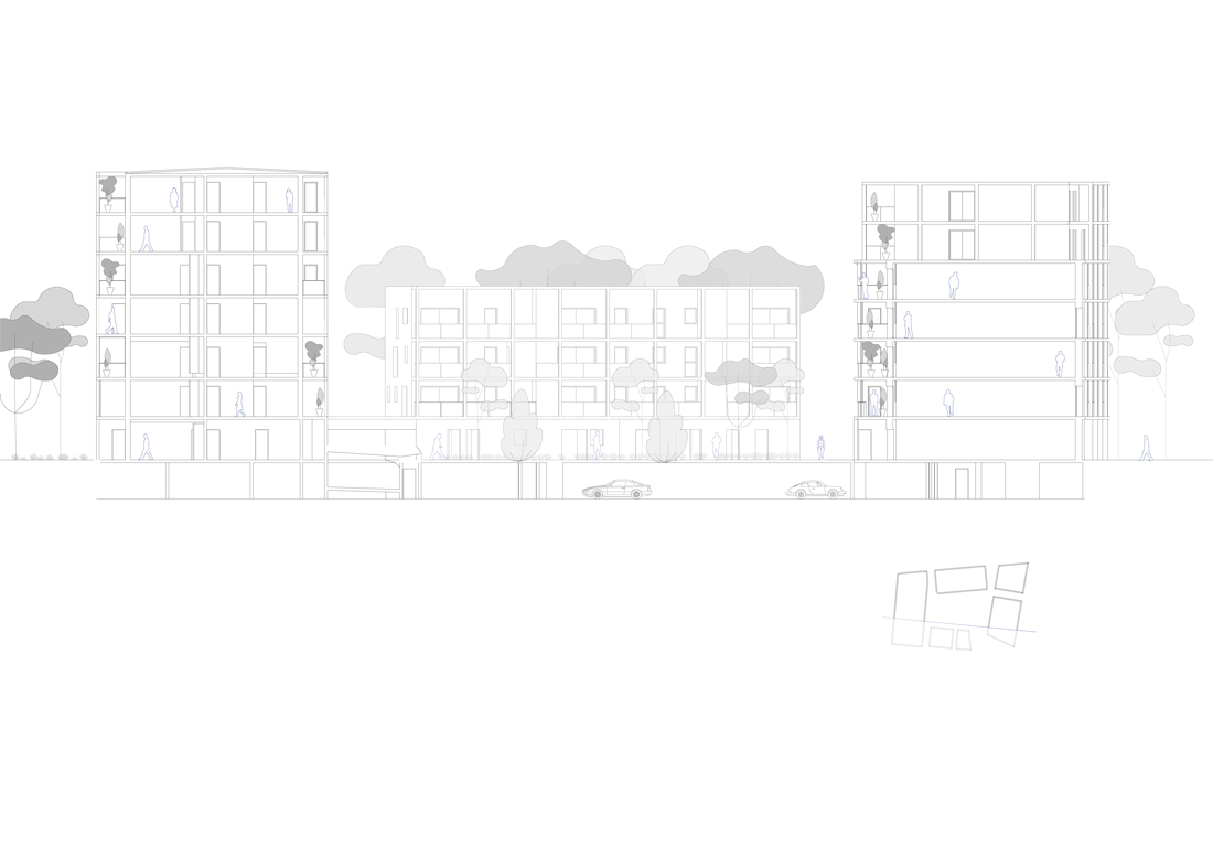
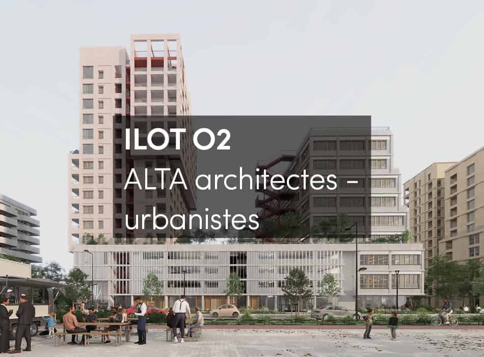
Four buildings are located on the edges of lot no. 6 of the Lorient Saint-Brieuc mixed development zone in Rennes, comprising 77 homes broken down into three types: collective, intermediate and grouped individual, with two types of financing: open-access and social housing.
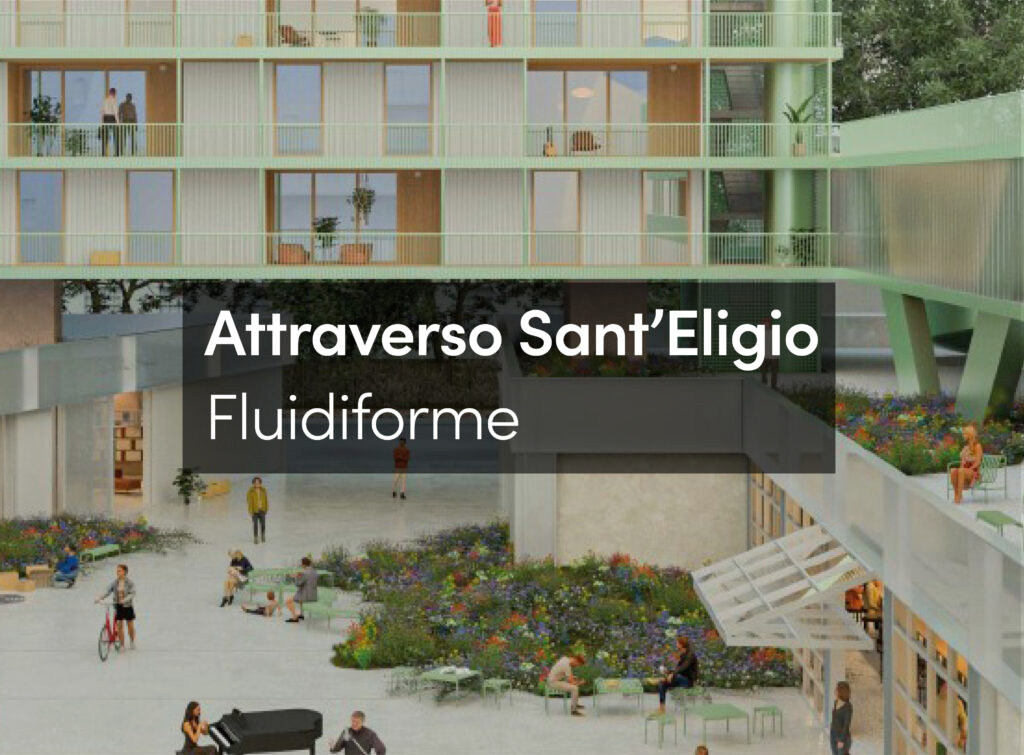
The project actively animates the site’s boundaries, and the development layout creates a calm, well-lit central garden area with a series of stepped volumes. This shared area is landscaped through the planting of trees, shrubs and wildflowers giving the homes relaxing views over this new protected green space.
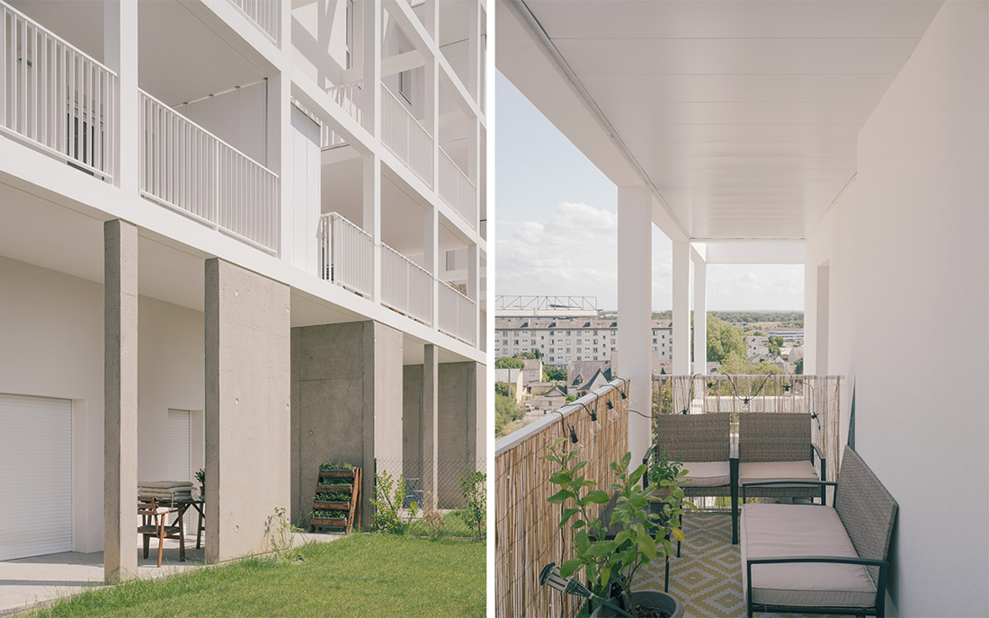
Continuous gardens to the west of the multi-family dwellings and to the south of the duplex and single-story apartments punctuate the ground floors, creating a green plinth and a buffer space that lends some privacy to the living areas.
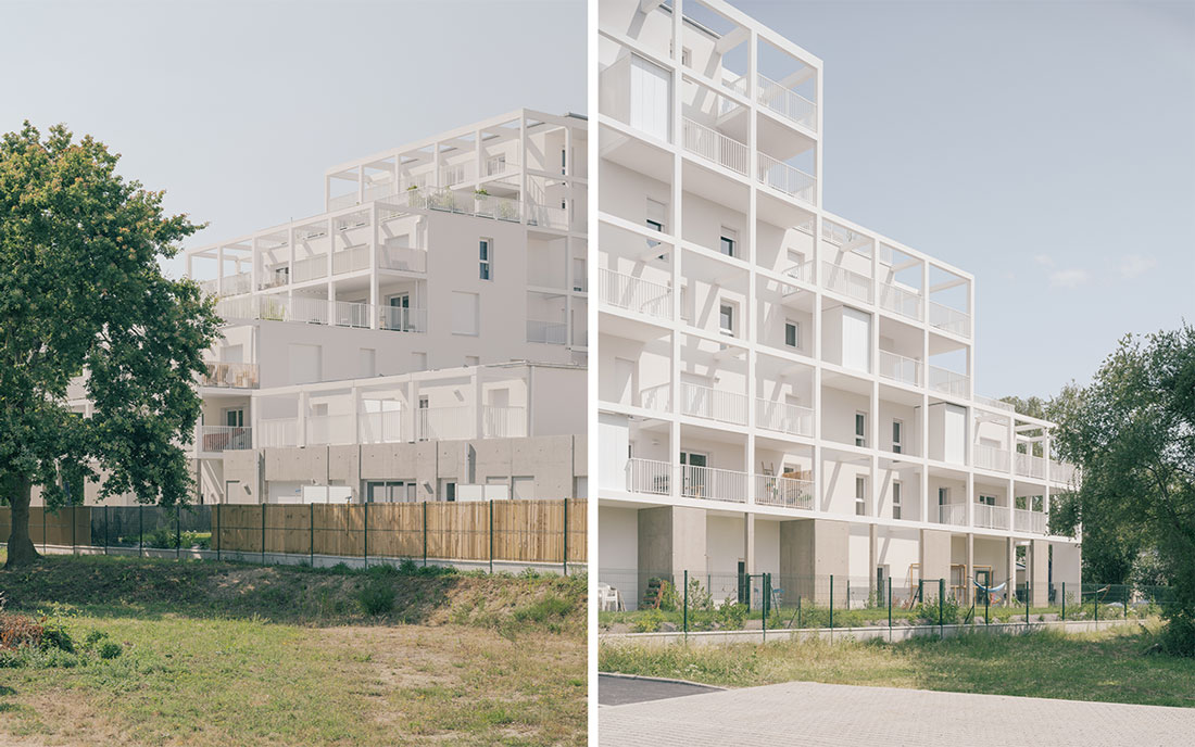
The project is also designed around the east-west sloping profile of the site, which gives a staggered and fragmented aspect to the buildings. This allows for transversal views deep into the heart of the block and opens the dwellings up to the wider urban landscape.
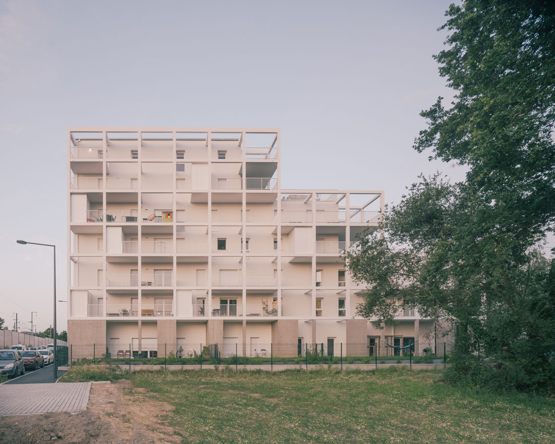
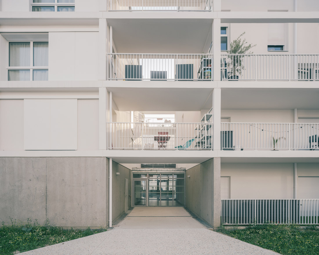
The floor-to-floor interstitial spaces are organized over a rough cast base of sand-blasted concrete, which sits under each of the four volumes. This base allows for each of the accommodation types to be read clearly and distinctly from close up, while from a distance they offer a global perspective of the project as a whole. Whether the upper levels are porous or monolithic, depending on the design of each building, the concrete base is common throughout. It follows the natural ground slope and seems to grow from the earth, permitting the adaptation of each building to the existing site levels.
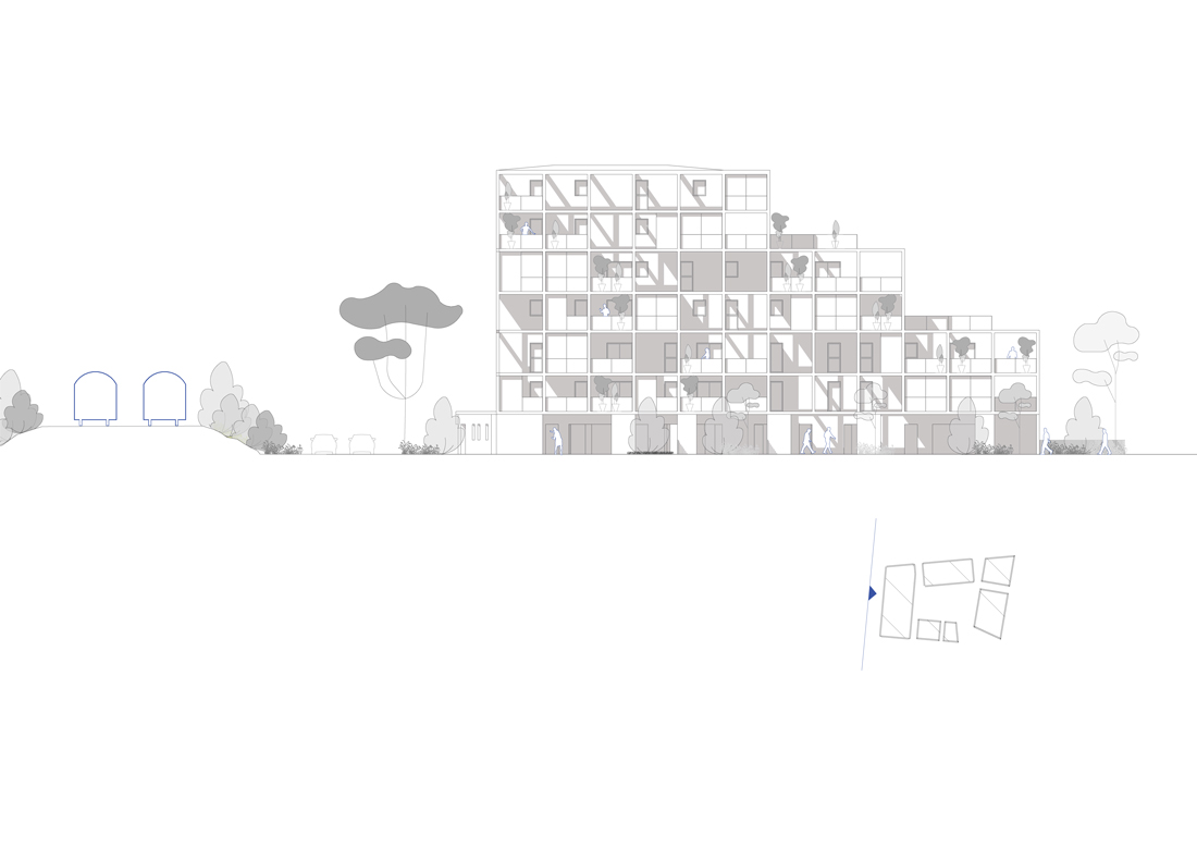
The buildings are designed on a working grid system adhering to a rigorous structural rationality. The upper floor façades rise on a post-and-beam matrix in white-painted concrete with regular setbacks to allow for different uses, terrasses or storage areas. This matrix establishes the visual identity of the new buildings, casting shadows over the outdoor spaces, providing supports for hanging sunshades or creating the privacy needed for communal living.
The tiered design of Building A follows the basic project grid and helps to create the most user-friendly outside spaces. The stepped volumetric approach also provides the necessary visual protection for the adjoining school to the south, limiting the views over the playground.


