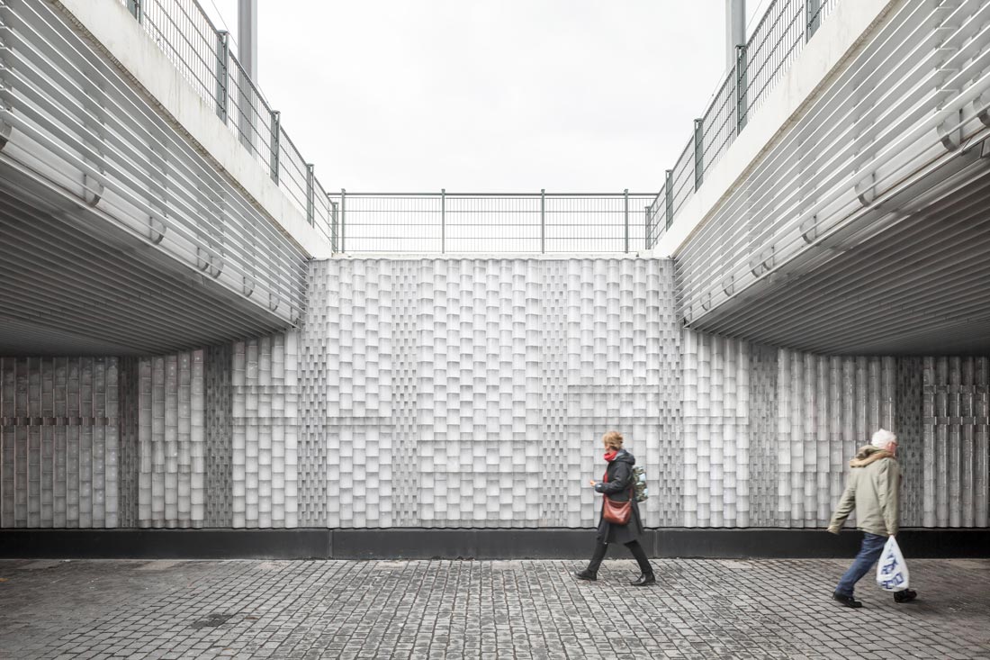
The Willem II-passage is a new public space that connects the historical inner city of Tilburg with the railway redevelopment area ‘De Spoorzone’. CIVIC architects, together with Bright, designed an award-winning sequence of spaces which seamlessly tie together architecture, public space, cultural heritage and traffic space. A specifically designed and produced glass brick façade creates a familiar but surprisingly striking effect.
Public domain
The Willem II-passage is an import public route for cyclists and pedestrians, enlarging and improving the public domain in Tilburg. It extends the historical Willem II street under the railway and functions as an inviting gateway to the once forgotten city ‘on the wrong side of the tracks’. The passage runs straight through a former railway workshop building and links a new restaurant, a public terrace and the former workers’ garden to both sides of the city. The passage catalyzes the transit-oriented redevelopment of the Spoorzone and also accommodates cultural events.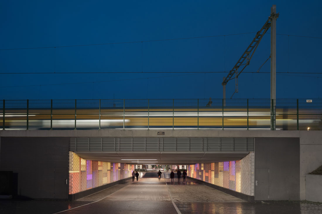
Homegrown icon
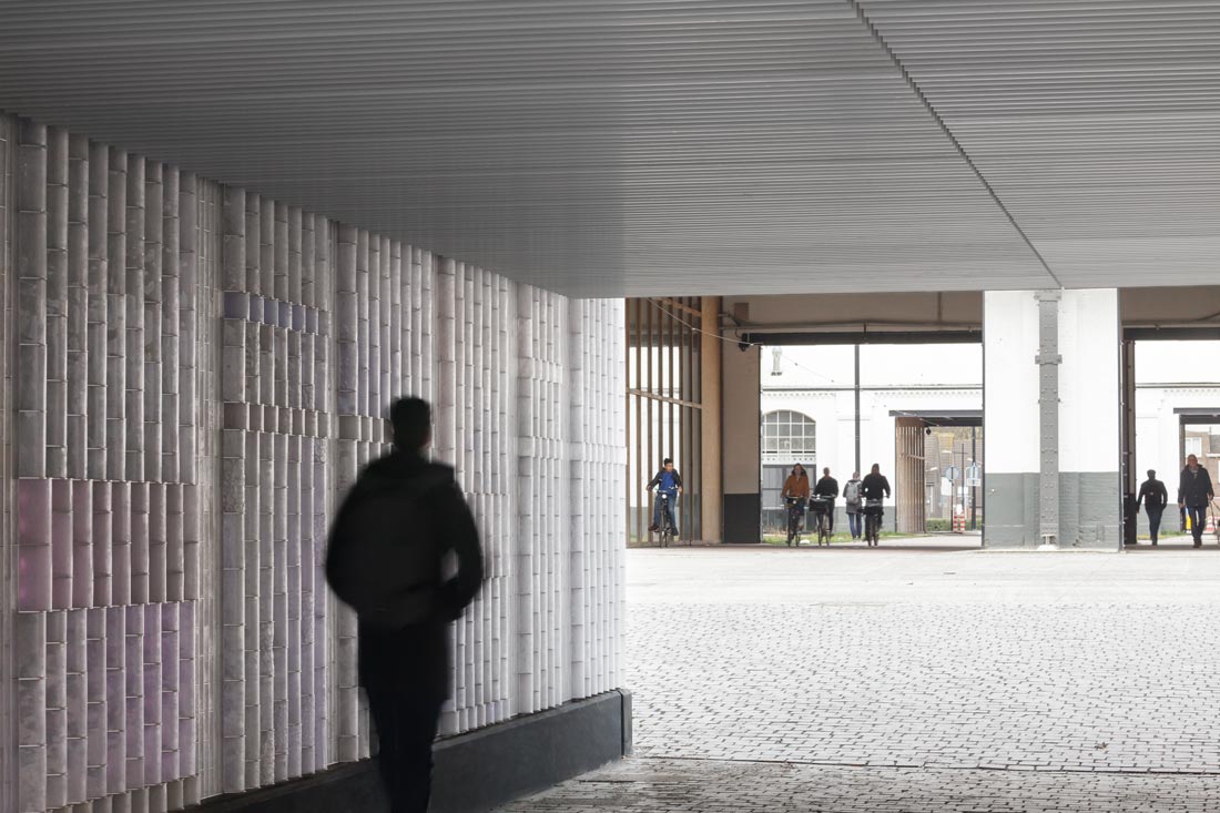
The design of the underpass is based on its public significance and cultural durability. Its iconic identity is inspired by the existing city. The materials, rhythm and composition of the passage refer to the classical brick architecture of Willem II street – but in a contemporary way. The design combines the familiarity of the traditions of the city with innovative materials and urban atmospheres. In a process of designing, prototyping, testing and tinkering, together with Philips Lighting and Van Tetterode Glass Studio, we developed a refined but robust luminous glass brick façade. The technology is not leading – it simply does what it is supposed to do and will operate for decades to come, succeeding where outdated high tech has failed.
A familiar surprise
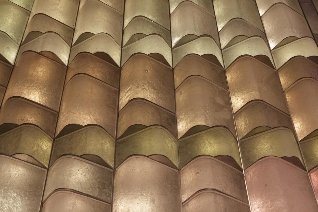
The Willem II passage portrays a typical urban sequence: a cross-section through the rich (industrial) past and future of the city. The passage feels familiar: the composition of the plinth, the wall and its ceiling are a contemporary interpretation of the classic composition of Willem II street, turning the passage into a natural part of the urban network. The use of the materials is also familiar while surprising at the same time: the façade is made up of 30,000 handmade glazed ’bricks’. Brick is a common material in Tilburg, applied on an industrial scale in the Spoorzone, and on a small scale in Willem II street, in the detailed manner of typical Dutch façades.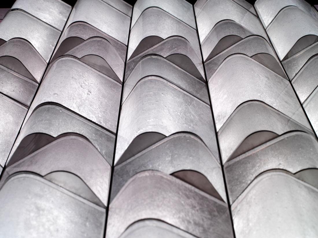
Innovative craftsmanship
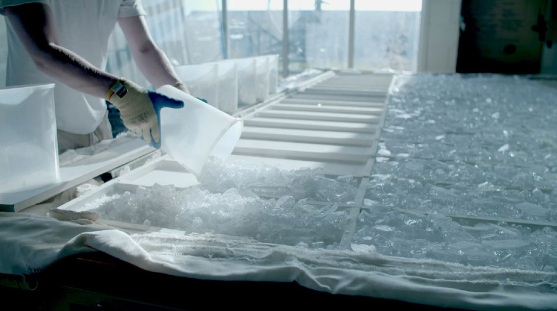
The passage is technically innovative. It consists of robust hardware (floors, ceilings and façades) and interactive software (lighting, smells and sound). The design for the façade is daring: the wall structure inspires and directs the light effects, and vice versa. The façade is built from a newly developed type of glass. It has been in the oven several times to obtain the current texture and transparency. This is an example of 21st-century craftsmanship: it combines craft artistry with a one-time large-scale application. The unique glass product has been widely applied using a scaled-up craft manufacturing process.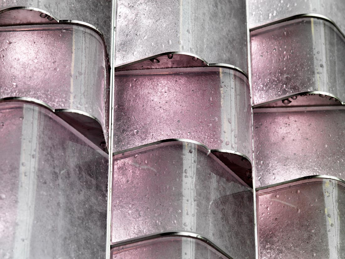
Hybrid of physical and digital experiences
The passage is socially safe, while refraining from conventional safety devices. Interactivity fades into the background, merging with familiar elements such as stone, steel, and greenery. Approximately 30,000 built-in LEDs create a stunning effect. A unique algorithm generates dynamic light effects that are responsive to the time of the day, weather and movement of passers-by. During the day, the walls are white-gray, its bricks solid in color. During the night, the light increases and patterns appear. The architecture of the Willem II passage leaves a lasting impression that is designed to be intriguing both 30 days and 30 years after its completion. Familiar, self-evident and robust. Innovative, rich and refined. The passage is built to last. The jury of the Dutch Design Award praised the project for its design, durability and social performance.


