Colors and their perceptions are responsible for a series of conscious and subconscious stimuli in our psycho-spatial relationship. Despite its presence and its variations, it is present in all places. Have you ever wondered what its role is in architecture?
As well as the constructive elements that make up an architectural object, the application of colors on surfaces also influences the user’s experience of the space. According to Israel Pedrosa, “a colorful sensation is produced by the nuances of light refracted or reflected by a material, commonly the word color is designated to those shades that function as stimuli in a chromatic sensation.” [1]
Describing the relationship of colors and the different features that govern them, or even the multitude of existing studies regarding these theories, is as complex as it is extensive. Color can be associated with psychology, symbolism and even mysticism; colors take on different meanings according to the artistic, historical or the cultural period; colors change when facing light; among many other characteristics. This article is not intended to address technical aspects of color or concepts studied by critics. However, it does seek to ponder the relationship between color and architecture.
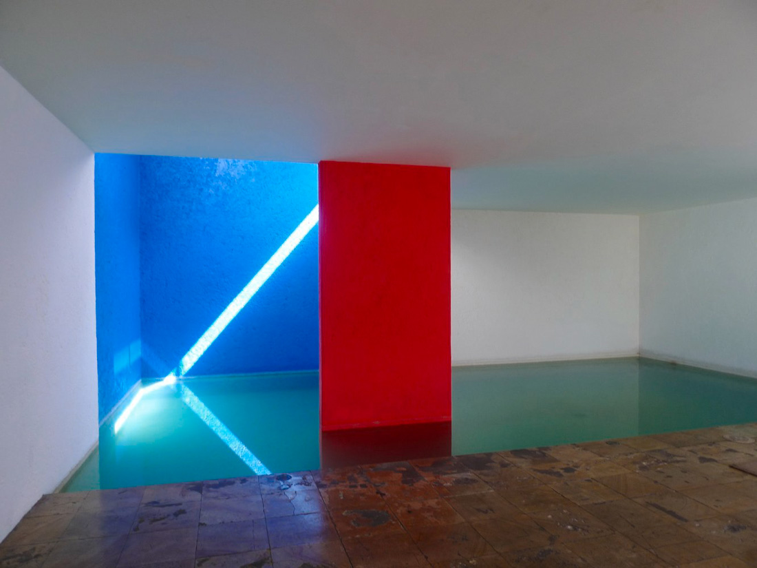
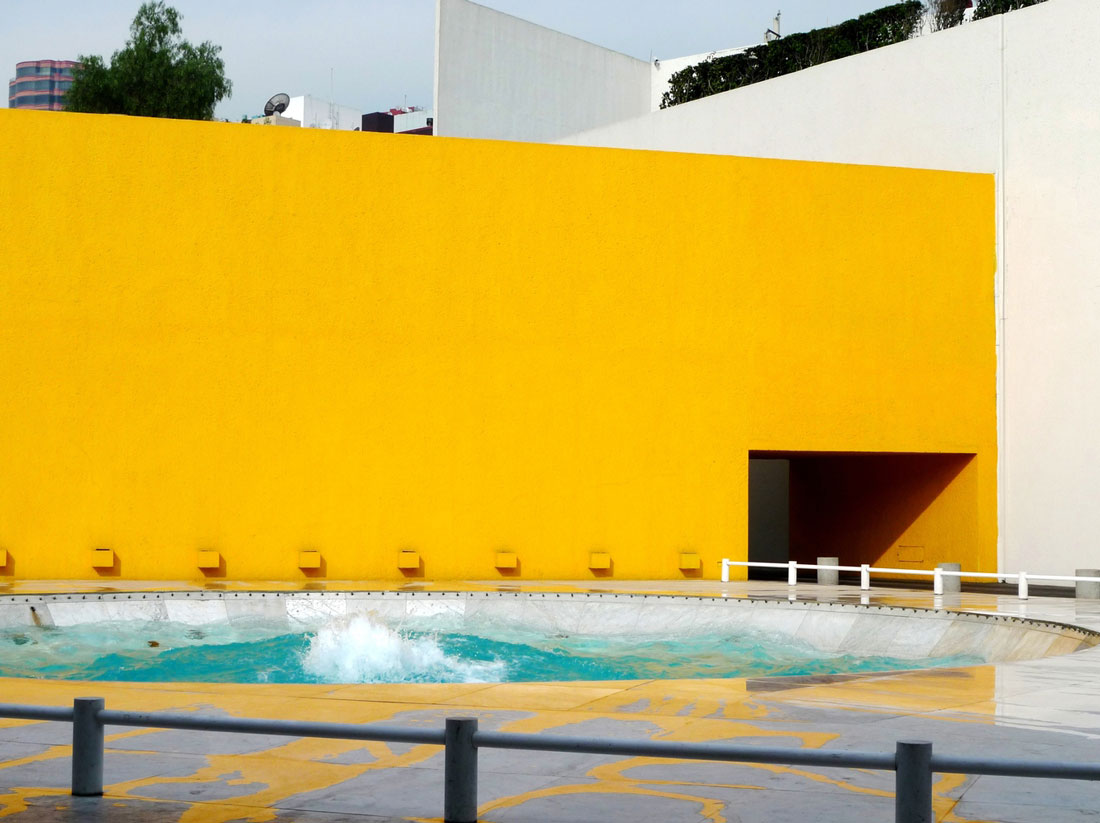
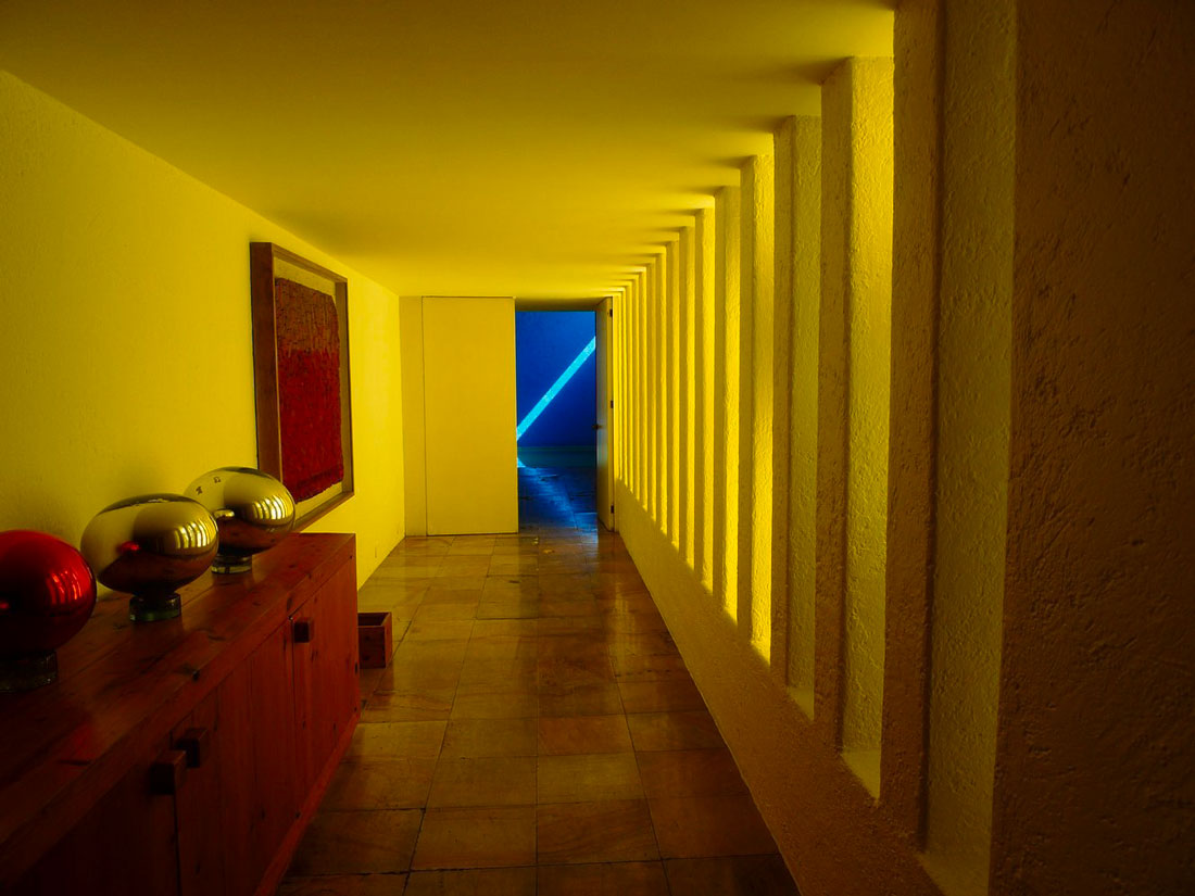
Let’s take a look at some well-known names from the history of architecture. Regarding the work of Luis Barragán, color demonstrates spatial purity as an element that evokes emotions, while Siza Vieira adheres to the achromatism of surfaces. Meanwhile, Lina Bo Bardi uses red in some architectural elements, and Legorreta adopts exuberant colors, which are inspired by Mexican culture.
Color can show a certain volume or constructive detail, or visually mimic certain aspects of space. It can also provide a set of emotions or visual effects.
If we create an environment with walls, floors, and neutral ceilings, when we apply certain colors on the different surfaces, we get different visual effects. For example, if we apply a darker shade on the ceiling, the sensation of a lower space is generated; if we apply color to the central wall of space, the idea of a certain “spatial shortening” is created visually; whereas, if it is applied to all walls, the perception of a space longer than it really is, is produced.
If only the lateral walls of the space are painted, there is a noted perception of narrowing; otherwise, when painting the central wall and ceiling in the same hue, the environment seems to expand. If you are looking to lower the height of the space or put the focus at the height of the observer’s gaze, then painting all the surfaces at half height, and putting the darker tones on the upper surfaces gives us this desired effect.
But colors do not exist without the presence of light. As Israel Pedrosa says in his book Da Cor à Cor Inexistente, “color has no material existence: it is only the sensation produced by certain nervous organizations under the action of light, with more precision, the action provoked by the action of the light on the organ of vision.” [2] Color is intimately linked to psychological stimuli and can be used in conjunction with volume and the shape of each project.
Regarding the “psychology” of the main colors, the following ideas have been developed:
Blue: Transmits the feeling of positivity, confidence, and security. It is often used in commercial and business spaces, such as banking agencies, offices and companies.
Yellow: Portrays optimism, curiosity, joviality and a bright atmosphere. It is frequently used in commercial spaces or restaurants to gain the attention of pedestrians.
Red: This color shows energy, excitement, impulse. Therefore, it is regularly used in commercial spaces, such as stores or fast food outlets, as it portrays a certain compulsivity and consumer desire.
Green: Evokes calm, tranquility, serenity and well-being. It is regularly used in spaces associated with health and well-being, such as hospitals and relaxation centers.
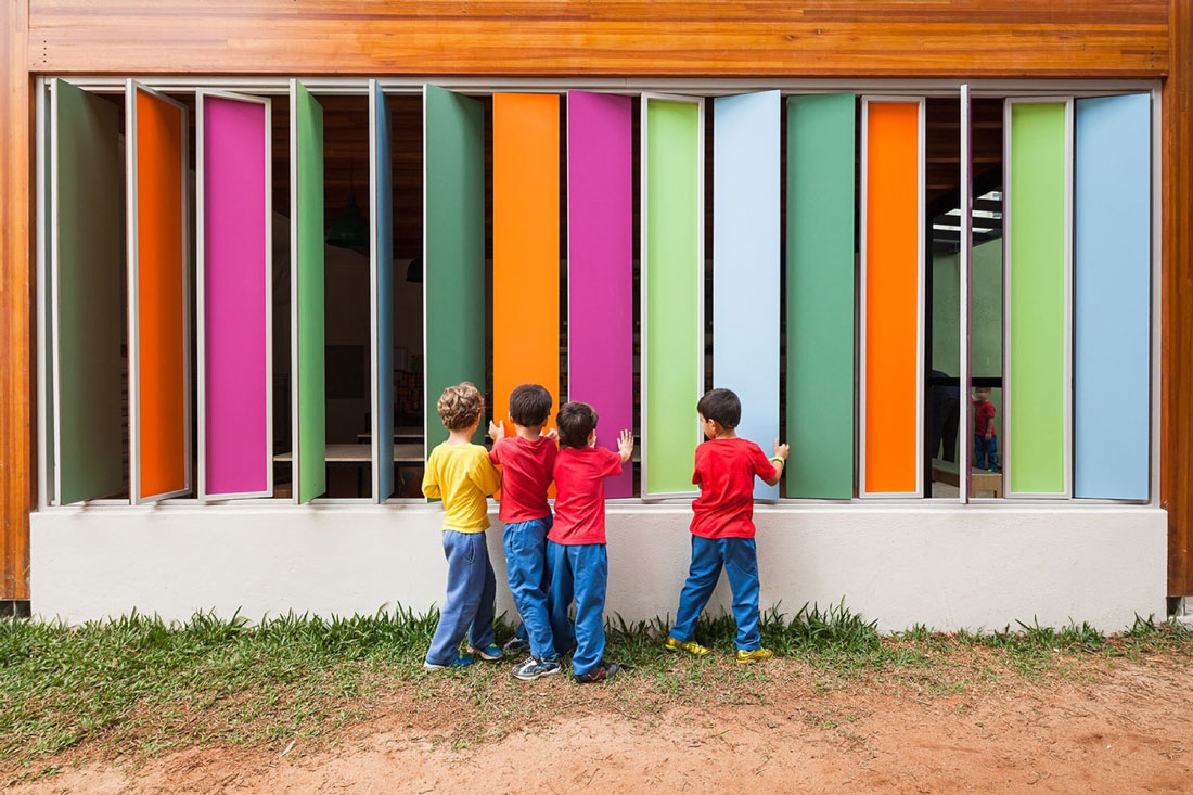
Orange: The result of the combination of yellow and red, orange projects an idea of intensity, creativity, euphoria, and enthusiasm. It is often used in creative environments, such as offices, studios, and schools. If used together with blue, it conveys the idea of impulsivity and trust, and so is adopted by banking agencies and offices.
Violet: It transmits well-being, calmness, and softness.
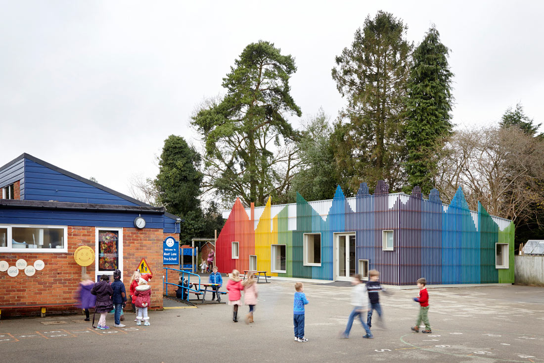
In children’s projects, colors are used to motivate the child’s psychological and sensory development. Among innumerable examples, the following are standouts: the College in Alto de Pinheiros of the architects of Base Urbana + Pessoa Arquitetos; the Prestwood Elementary School of De Rosee Sa; and the ‘Els Colors’ kindergarten by RCR Arquitectes.
In hospital projects or the field of health, colors are used as a complementary element for the rehabilitation of patients, such as in the Esther Koplowitz Foundation for Patients with Cerebral Palsy, designed by Hans Abaton, and the Nemours Children’s Hospital, which is designed by Stanley Beaman & Sears.
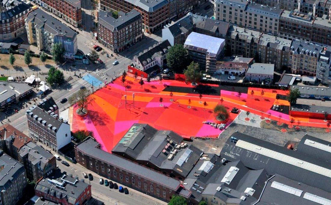
In urban projects, colors are sometimes used to restore liveliness and to renovate deteriorated spaces, such as the intervention of the Kampung Pelangi village, in Indonesia, and the Superkilen park of the Danish firm BIG, which uses a significant amount of color to give a “spatial identity.”
Color is an integral element in architecture; it is not only important aesthetically, but it also has a great psycho-sensory importance. Use it wisely in your projects!


