This school façade project came to us at a stage when the construction of the 2 academic blocks was already underway. The blocks were rather generic, with 6 floors of classrooms, labs, and other facilities arranged towards the periphery around matching central courtyards. Our brief was to work within these existing parameters to make a school. So we developed a design program in terms of circulation, movement, ventilation, classrooms and other concerns.
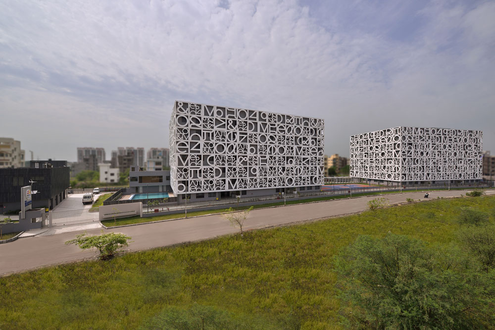
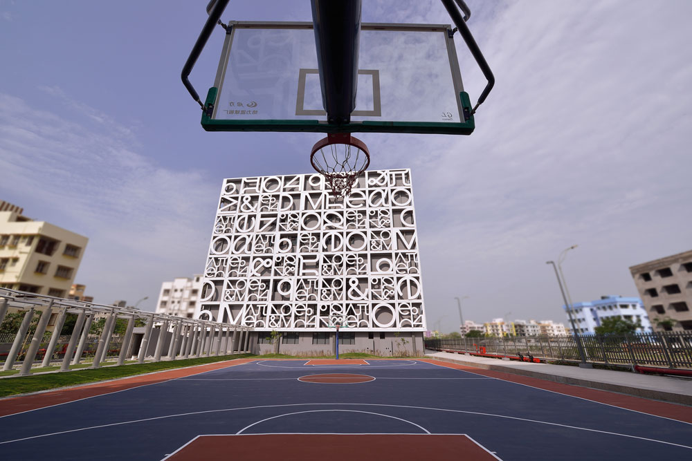
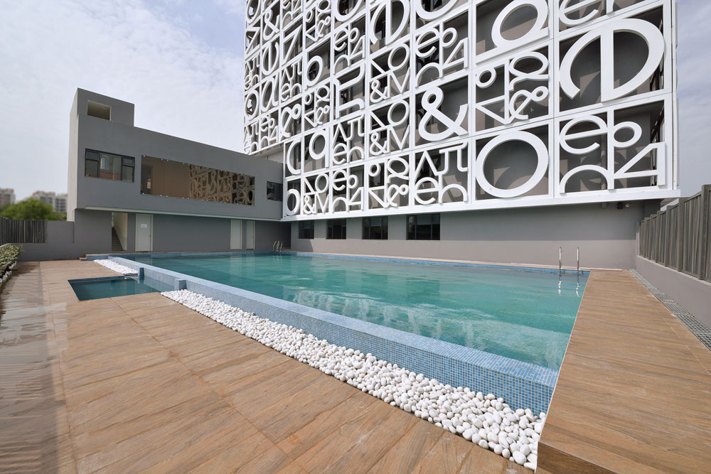
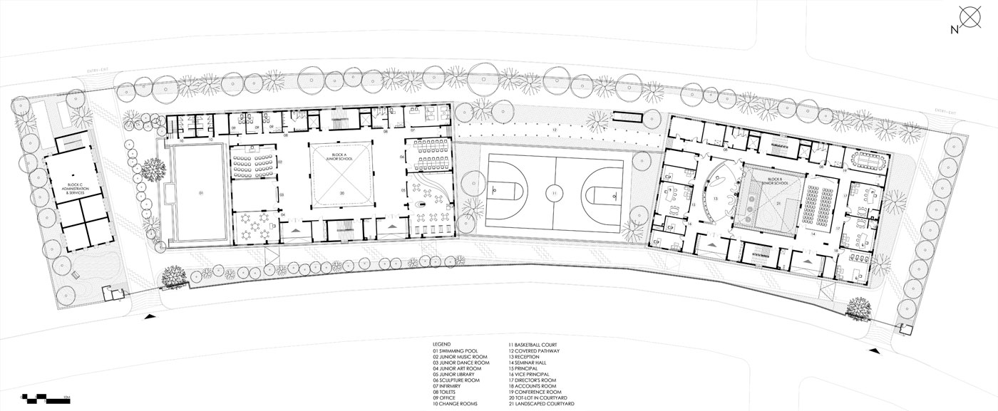
Keeping in mind the location of the school in the Newtown Area of Kolkata, and its simple surroundings, this school needed to make an impact and establish a distinct identity. The locality is planned in a radial grid and the site for the school is curved along the longer edges. One approaches the site along the inner curve and the blocks are placed at a slight angle facing each other very slightly. They are separated by an active play area. The school also has a swimming pool on its grounds. Of the 2-acre plot, the school occupies approximately 1,60,000 s.q.f. of floor space.
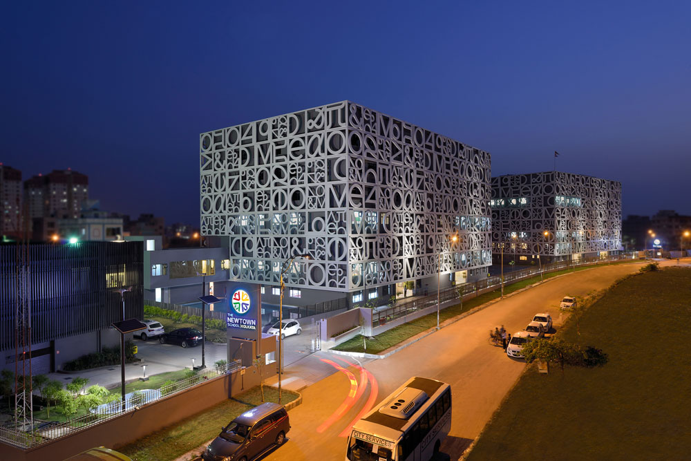
The first step was to create an identity for the school. Our approach was to create a screen that wraps around the buildings and unifies them visually. Also, we intended for the central courtyards of the buildings to merge with the play area creating a seamless connection between junior and senior school. Due to a restriction in program, this ground level connection was not possible. However, the screen was created with a strong character so that its continuous application across the buildings by itself would prove to be a unifying element.
Façade Detail
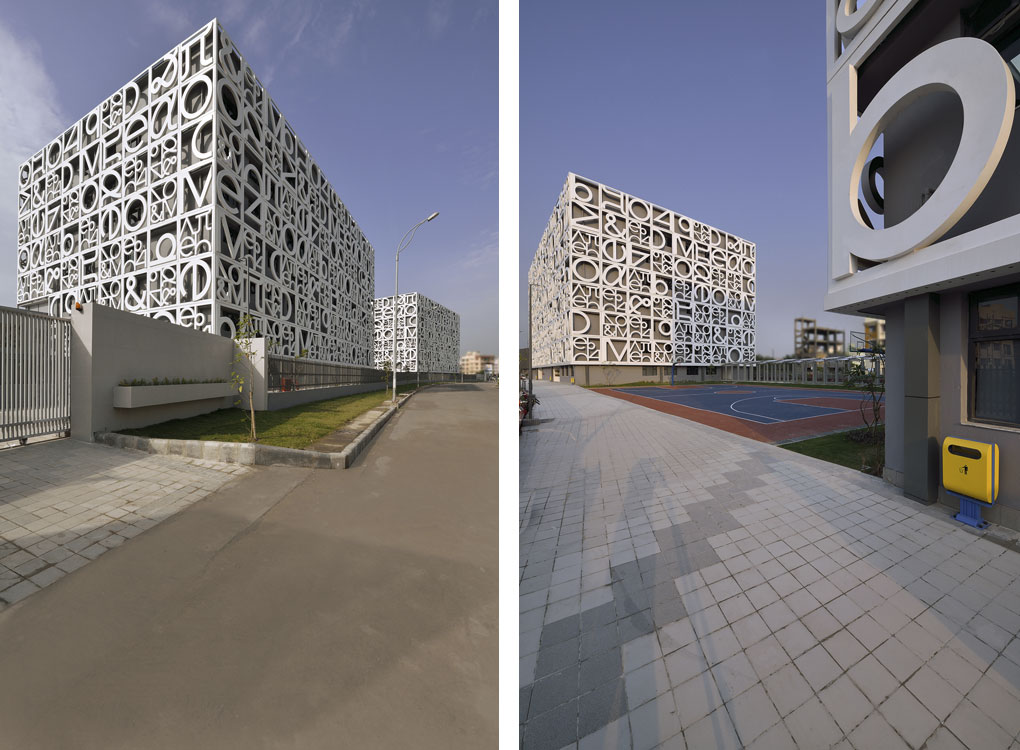
Graphical representations of symbols, alphabets and numbers became an inspiration for the screen. Younger children relate to simple lines as letters of the alphabet and as they grow, abstractions of the same would start to look more like alpha, gamma and pi. Thus, Familiar shapes and symbols were used to create a bespoke stencil screen around the existing unremarkable building mass. The facade not only provides shade to the classrooms from the harsh sun but also lends the school a distinct identity
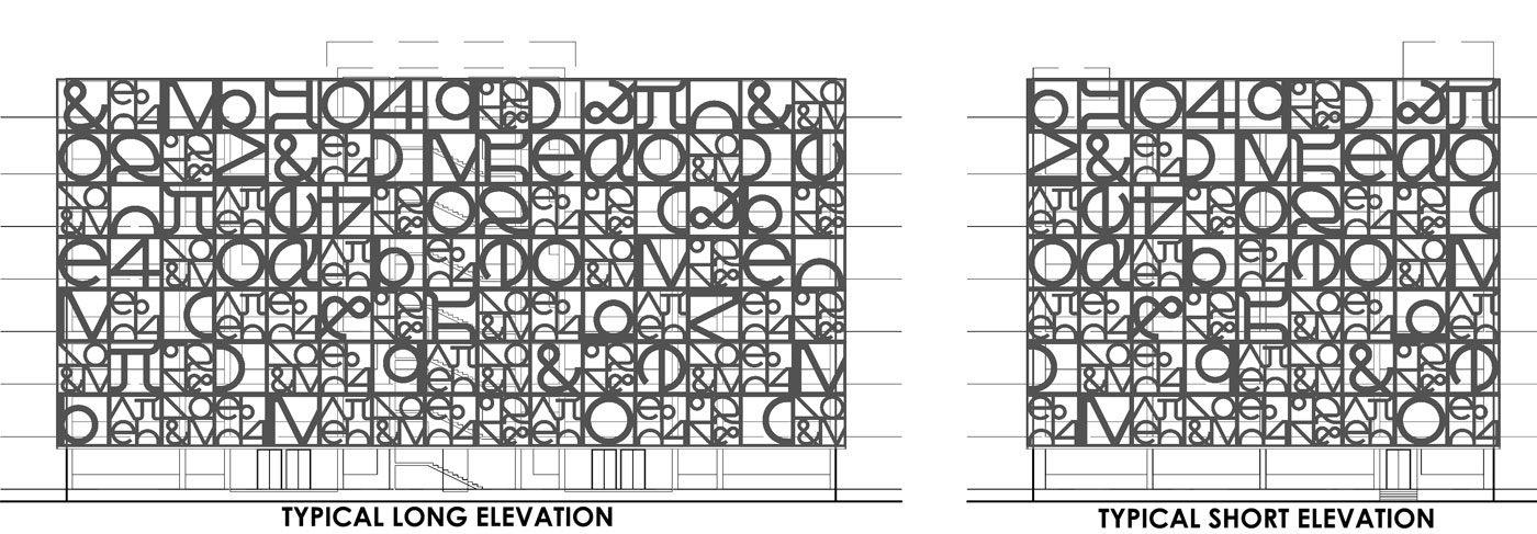
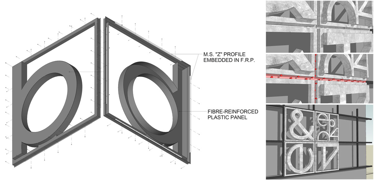
488 panels, made of Fibre-Reinforced Plastic (FRP), measuring 3.2 x 3.2 meters envelop each of the two academic blocks. 13 different panels were designed with a combination of small and large alphabets, numbers and symbols. These have been placed in various orientations to achieve a randomized effect on the façade.
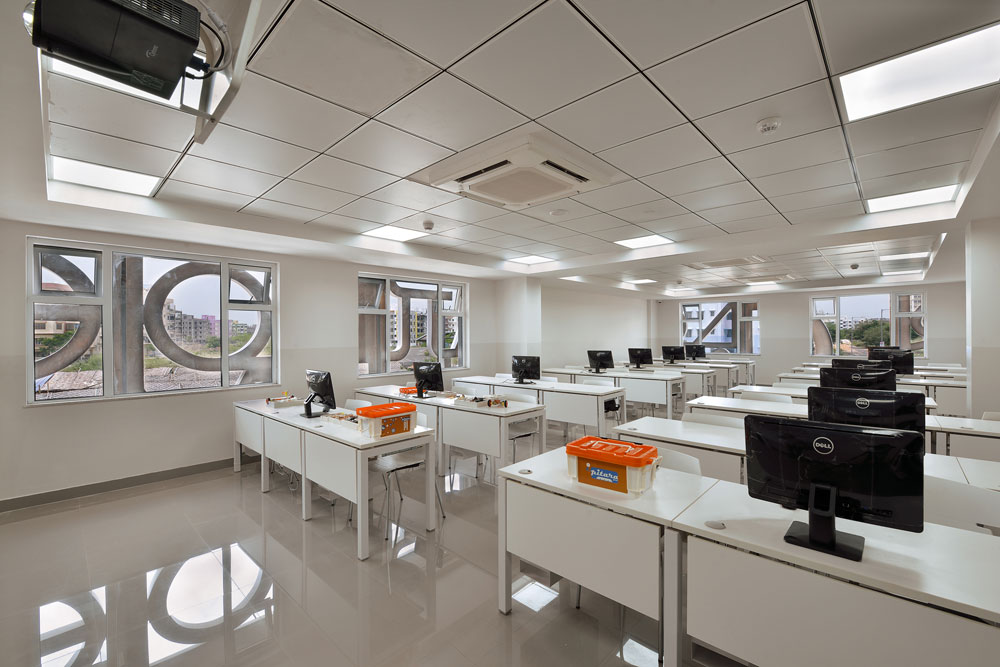
Structural slabs were projected beyond the building surface all around in a way such that an exact number of panels would fit on all surfaces on the symmetrical cuboids. This also enabled simpler servicing of the panels from the back and ensured a better light quality for the building.
A small scale study model was created in-house to understand the same and make a decision on treatment of the panels, the walls and the windows behind the screen.
A mild steel frame work was devised in a grid like manner on the projected slabs to align with the FRP panels. A fixing detail using steel Z-profiles embedded into the FRP panels was developed to fix these 70kg panels to this M.S. support structure.
The grey walls and windows background brings out the white FRP screen in all its glory. Starting with a sample of the module and fixing detail to manufacturing, shipping, complete installation, painting and cleaning, the façade system took 4 months to complete on site. The effect is exactly what we hoped for with its dramatic expression and unmistakable identity.
These 2 structures having been dealt with elaborately, there was a third small service block on the far side of the site which would stick out as a sore thumb if not properly handled and would be overbearing if over-designed. This block was thus treated in the same projected slabs and M.S. framework manner but with simple vertical aluminum fins. The contrast was eliminated and the walls, windows and fins were all treated with the same shade of grey along with rolling shutters, doors, etc. This block is neither eye-catching nor bold, but a subtly and aesthetically disappearing mass that helps to clearly demarcate the public zone from the back-end areas.
We really didn’t want to break the momentum of the students as they walk from one area to another. So we designed the various levels to merge into one whole space through the visual connection of movement in the corridors lining the courtyards.
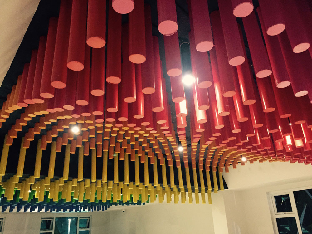
The internal courtyards of both blocks were given structural slab projections of increasing size as one moved upwards. The corners of these projections were filleted into curves, transforming the rigid square courtyard into a free-form three dimensional sculptural space. The soffits of these projections were painted in various hues and the projections housed plants and creepers bringing vibrancy to the pivotal interaction zone of both blocks. The junior school courtyard was further designed to house a tot-lot (play area) while in the senior school it serves as a landscaped extension between the reception and seminar hall.
Unfortunately, due to maintenance difficulties, keeping in mind the harsh sun and rain of Kolkata, both courtyards were eventually covered at the roof level using translucent polycarbonate sheets and artificial plants and trees were used in the landscaping of the internal courtyards rather than the proposed natural ones. However, the abundantly permeating diffused natural light still brings the courtyards alive with freshness.
Keeping the base colors of the school neutral, using mainly whites and grey, the corridors were designed such that a colored panel of tiles abutted each door. A child would, thus, not just associate the classroom with the sign but also the colors that flanked the doors. The colors of these 4” x 4” tile panels were chosen in a spectral sequence as one moved around the corridor.
Young students respond more actively to bright colors, patterns and textures. The interiors of the junior school classrooms, labs, and liberal arts facilities were designed to be vibrant and interesting while allowing space for the children’s’ creativity to be displayed. Printed wallpaper, painted panels, different shapes of soft board, playful flooring patterns and charming furniture were all used in various combinations to enhance the child’s experience at school.
The library was designed with an interesting false ceiling with dark grey mesh placed in a grid structure. The services above the false ceiling were painted black. This gave the illusion of a larger height to the library, giving the otherwise stacked and heavy area a rather airy and spacious proportion.


