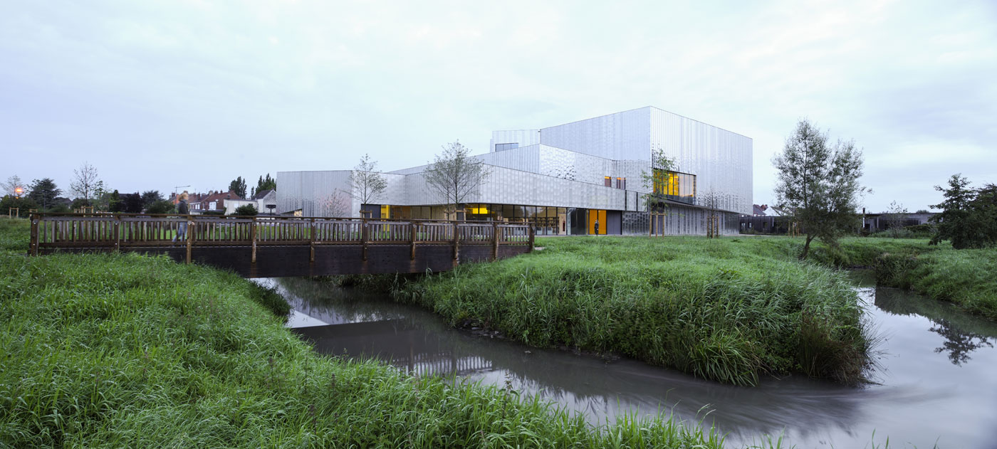
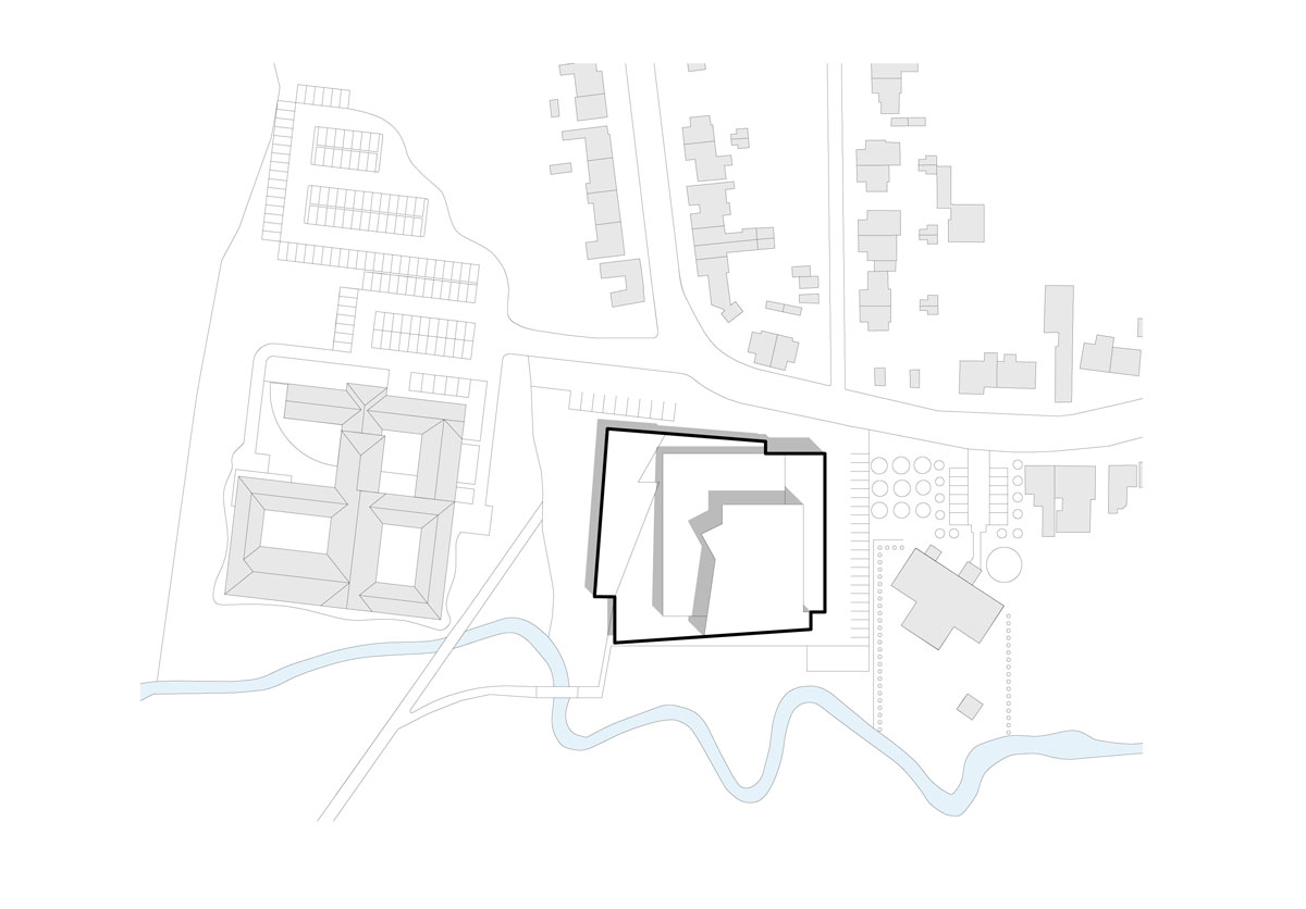
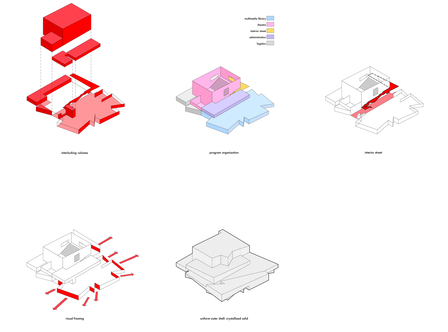
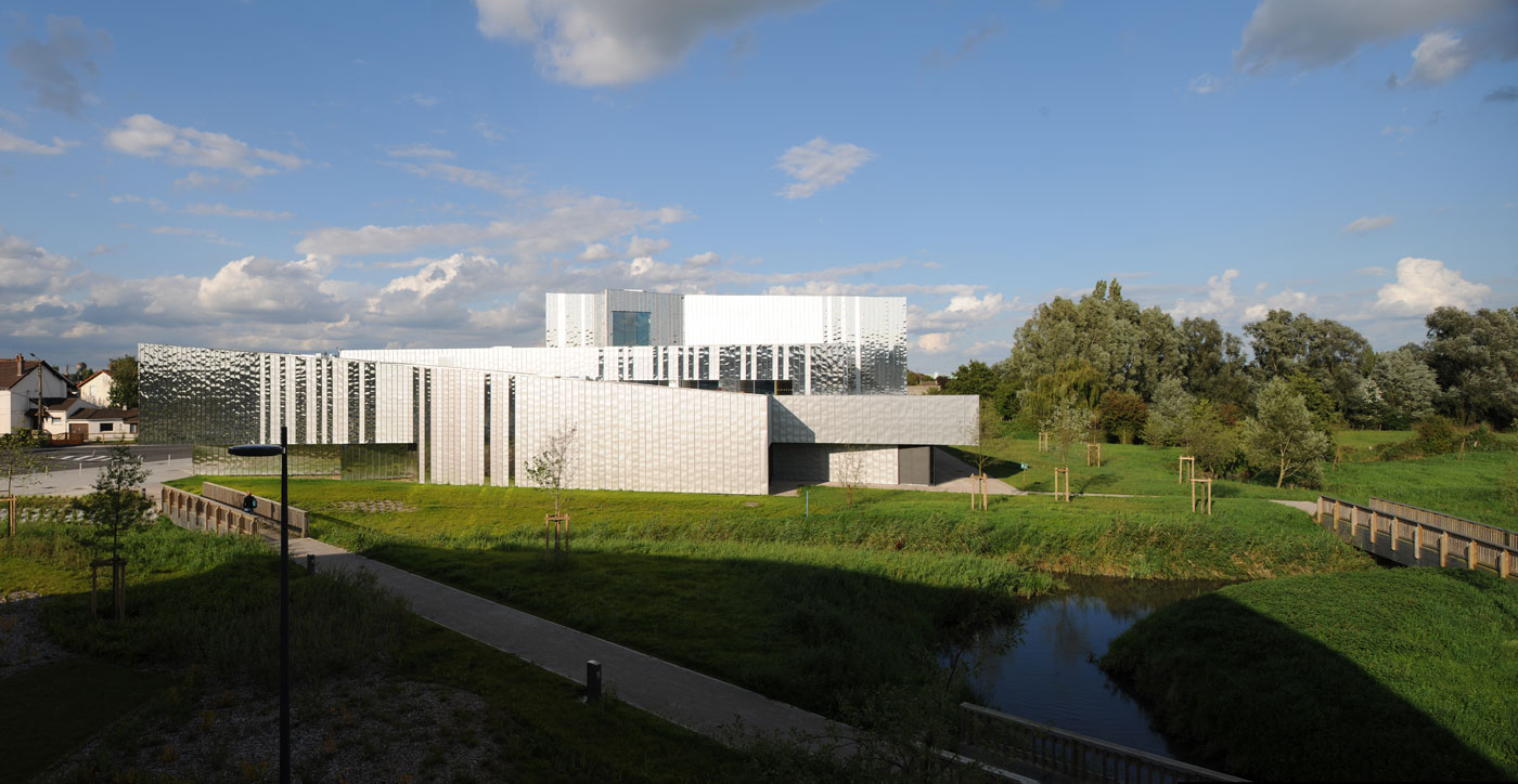
The site offers an interface between the town and an inter-municipal park. The project extrapolates this situation in terms of volume, positioning on the plot of land, and internal organization.
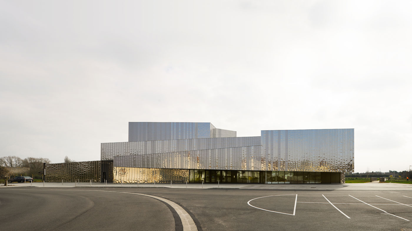
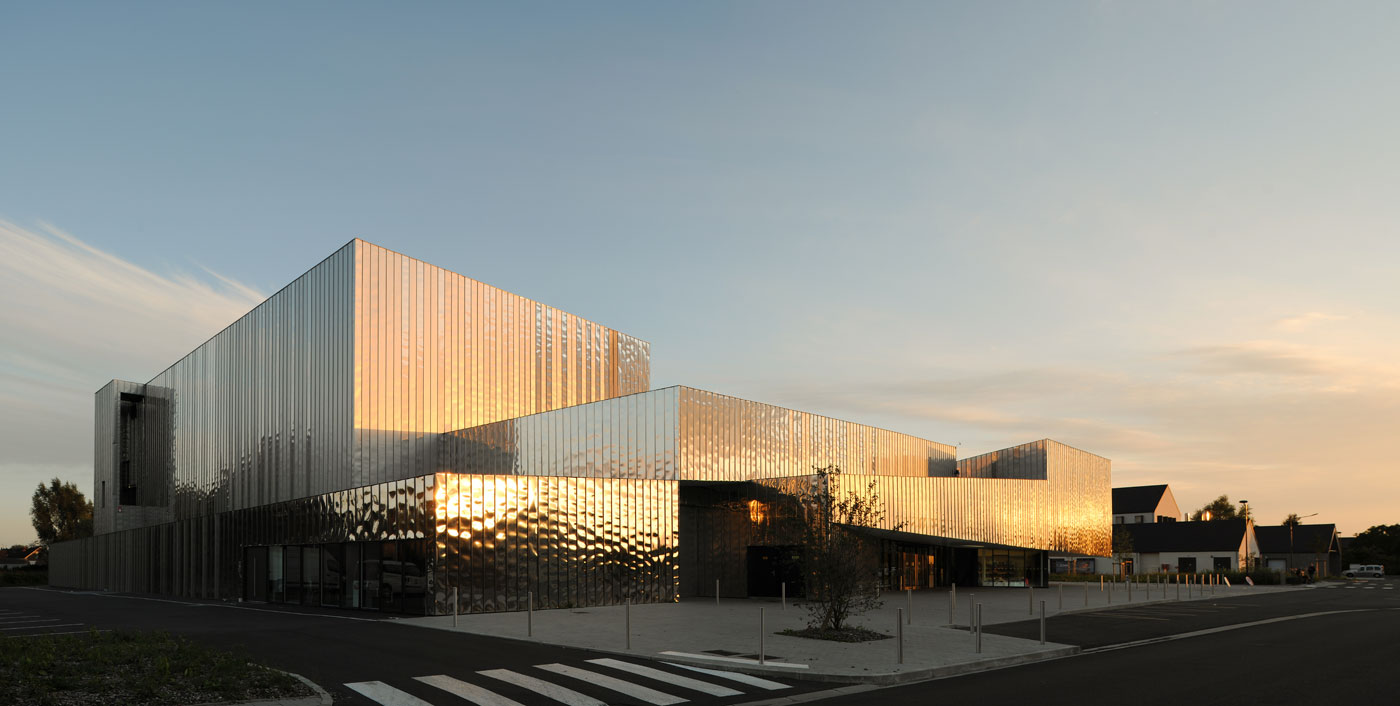
The project creates a broad courtyard in front of the park on one side and an alignment with the town on the other. Its volumes slide over each other; they are covered with a locally produced stainless steel skin in three different finishes – satin, mirror and matte – creating a kinetic effect reflecting the sunlight. This covering allows the building by turns to disappear into the grey of the sky and to reflect light intensely.
Site Plan
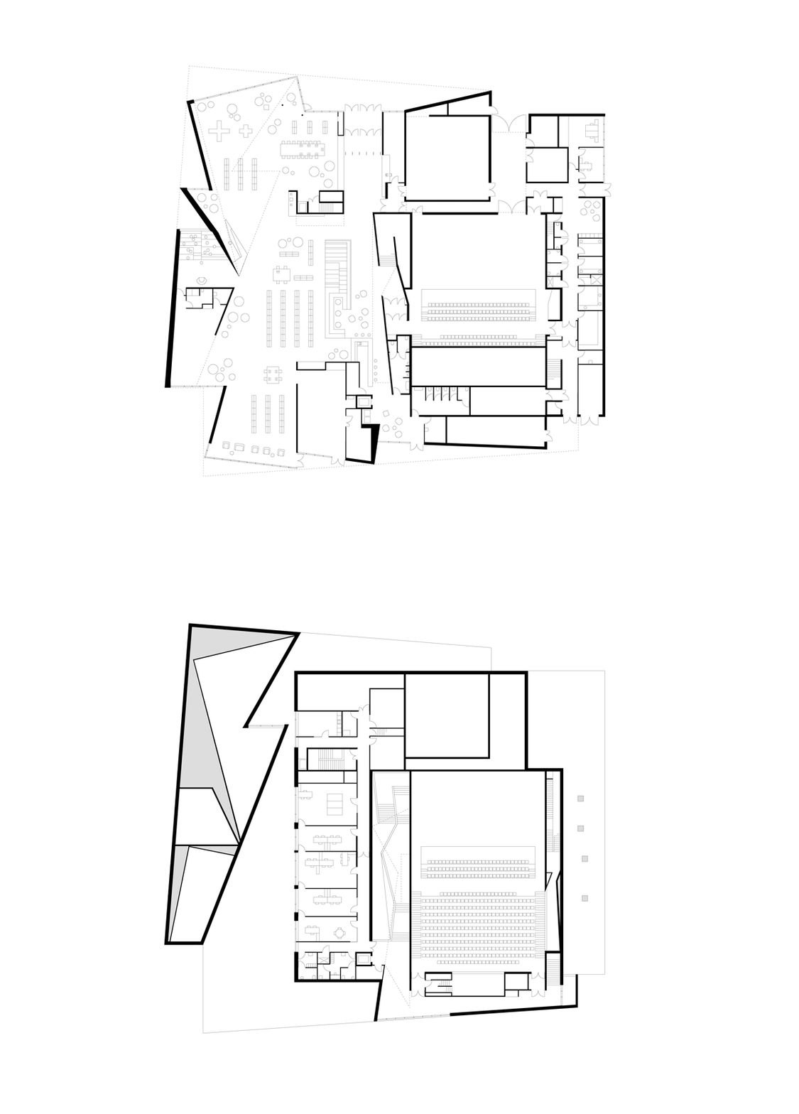
Plans
Sections
The eye is drawn by the apparent complexity of the chaos, while broad transparent areas serve as catalysts, directing visitors towards the entrances to the building.
Diagrams
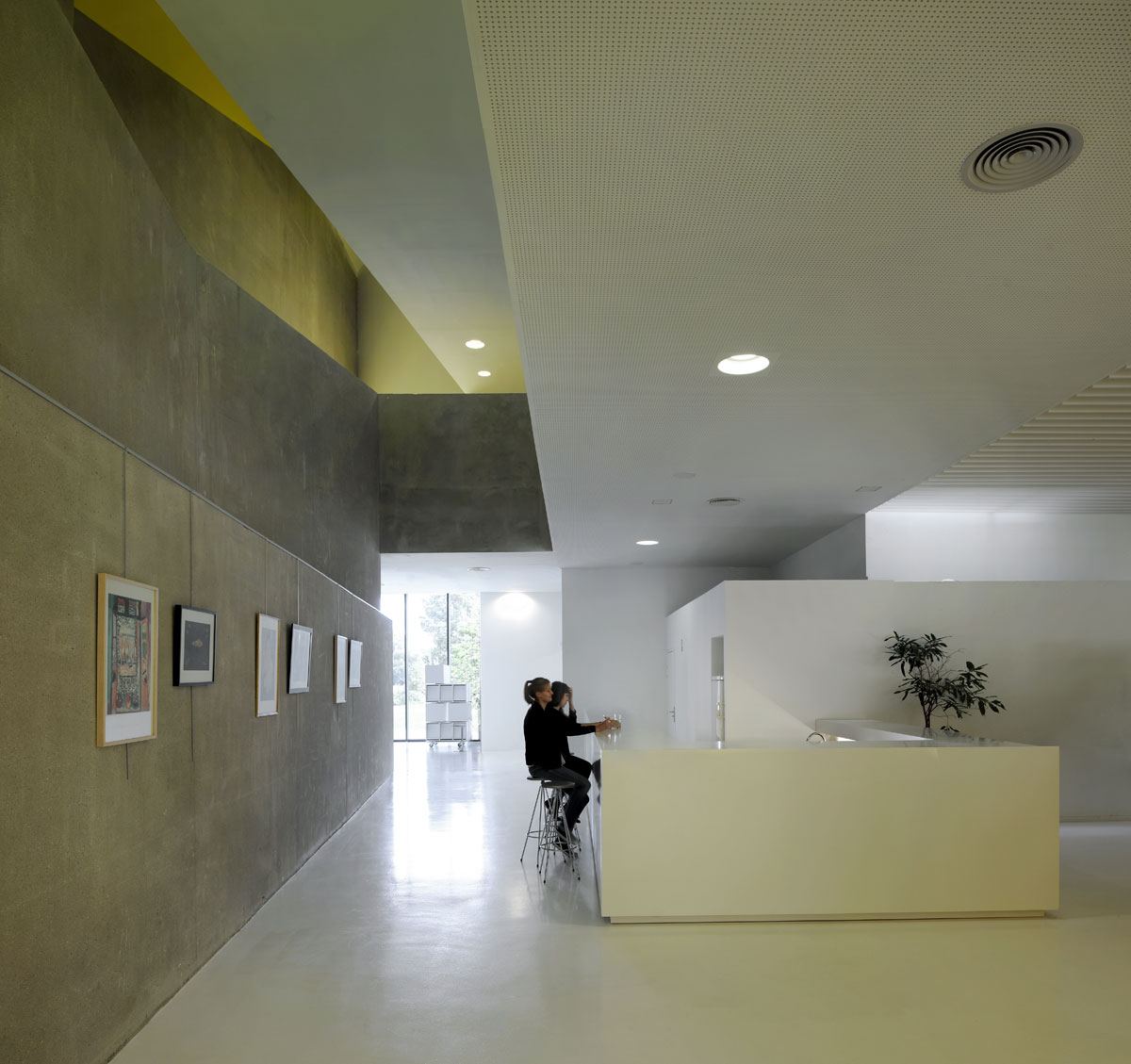
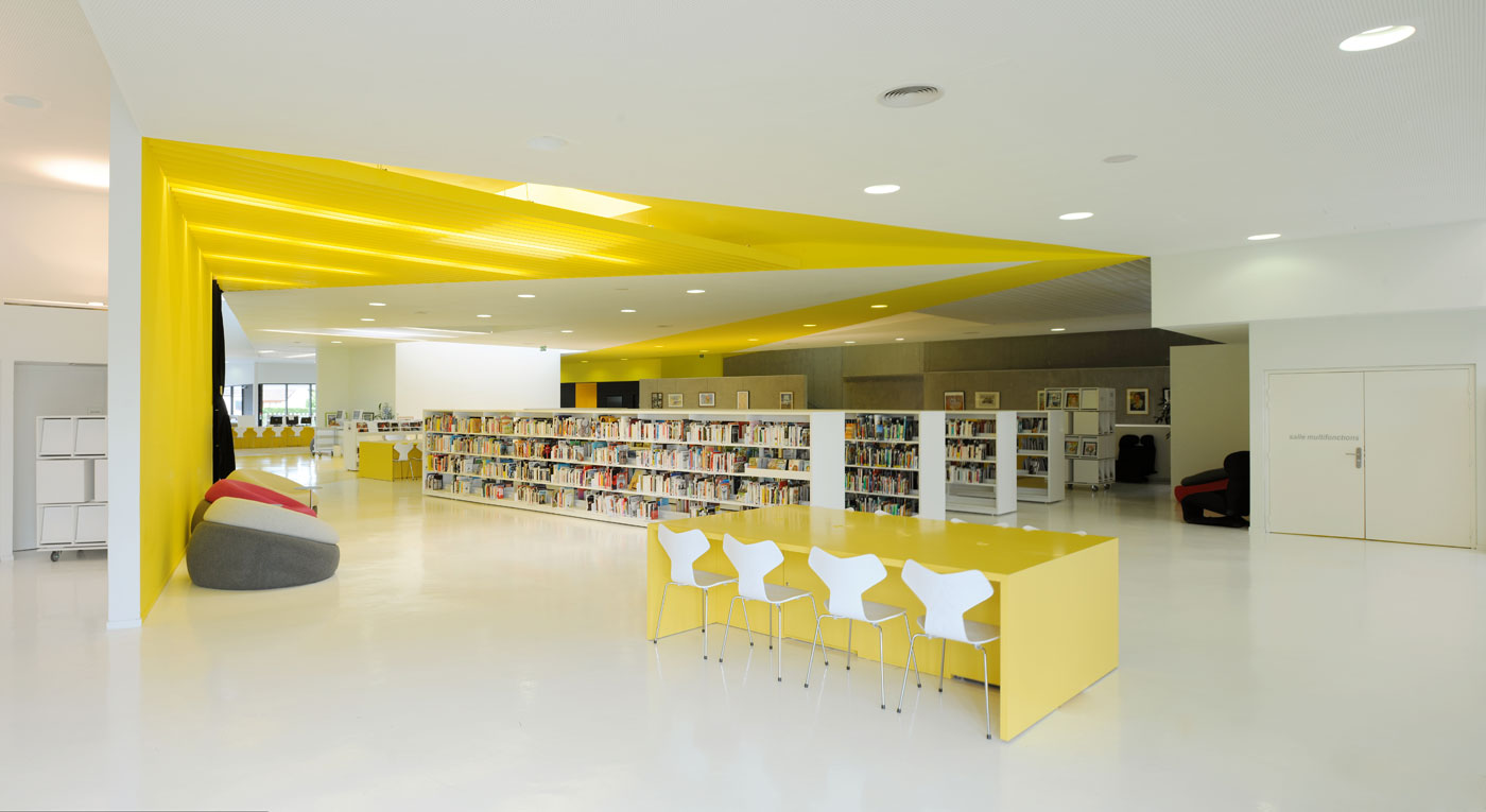
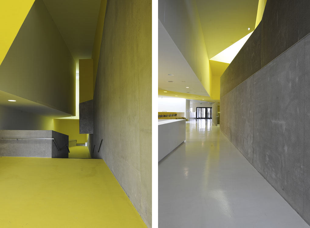
The internal organization of the building is clear. One axis between the park and the town crosses the project, thereby offering two entrances. The entire program is grafted onto this axis, with the theatre on one side and the media library on the other. This axis serves as a federating interface. A dynamic arrangement of volumes and contrasting lights guide the visitor from this area toward either the media library or the theatre.
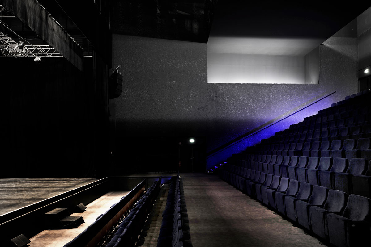
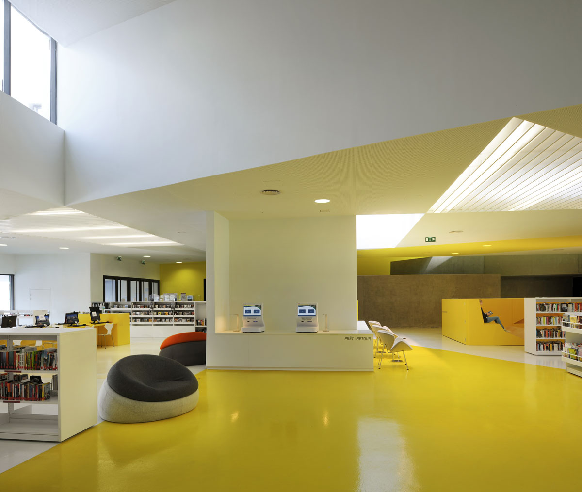
The interior spaces are rich and varied. The theatre walls are in bush-hammered concrete, which improves the acoustics. The different areas in the media library have been designed with ergonomics in mind, and a number of different reading postures are proposed, using a platform with a richly varied profile. The storytelling area is formed by continuous folds which envelop the children in a confined space.
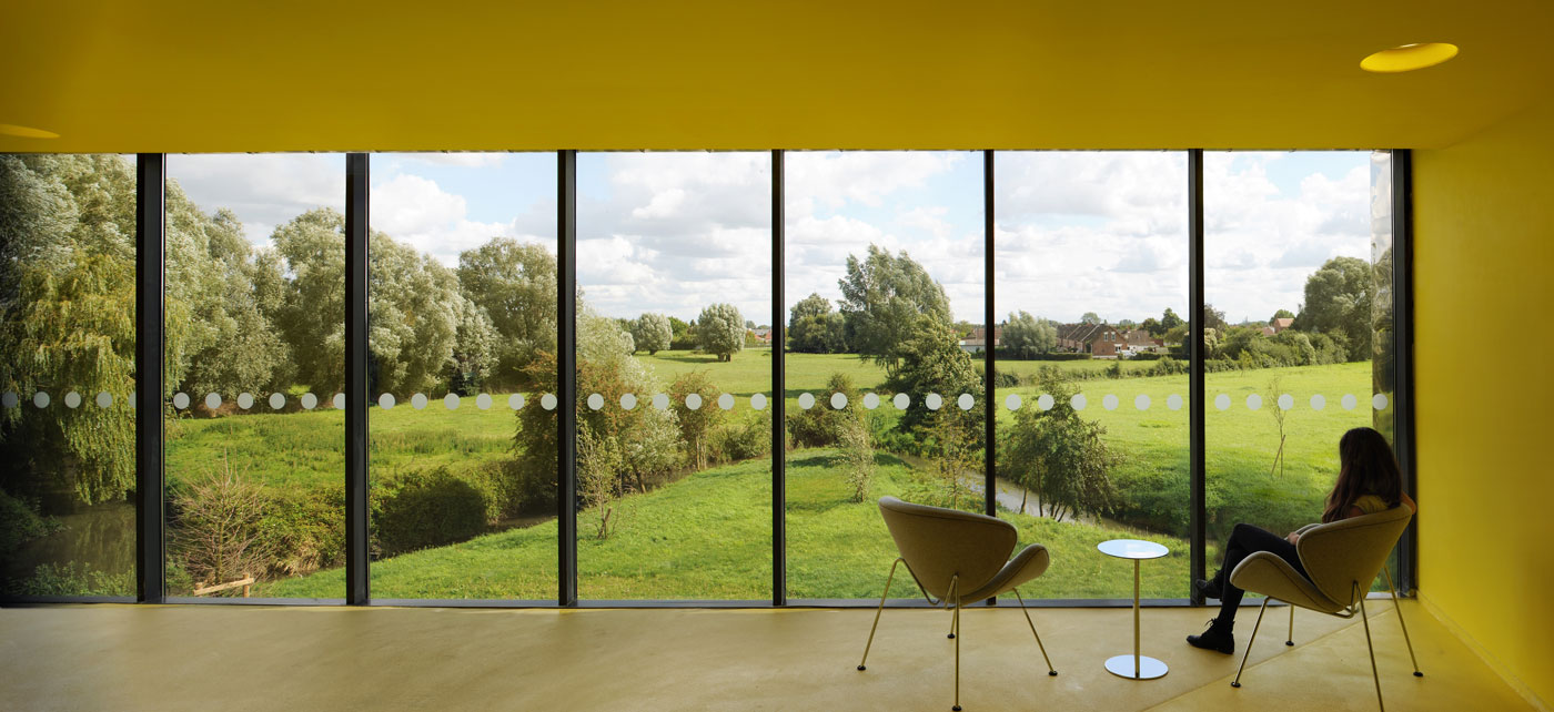
All along the proposed promenades, folding creates frames for a series of views out over the contrasting landscapes. This new arrangement is designed as an intermediary between the town and nature.


