Since the issue first drew major media attention in 2015, the so-called ‘migration crisis’ has seen 1.5 million people arrive in Europe irregularly, fleeing war, escaping persecution, and searching for a new place to call home. Gathering true stories, new writing, and immersive data visualizations, Migration Trail is a 10-day interactive experience, encompassing mapped data visualization and a documentary podcast, that retraces the journeys of people setting out from the shores of North Africa and Turkey in search of a better life in Europe.
The data visualization follows two characters: a Nigerian man and a Syrian woman. The characters’ voices are written as a live instant messaging feed by a professional writer from the same country of origin, and they appear on the website and via a Facebook chatbot. The stories revealed and presented in real time, to convey the urgency and immediacy of the events, reach the audience in their personal space – on their phones – wherever they are. Although the stories are fictionalized, they are based on true accounts, unique first-hand interviews and research collected by the production team over the past two and a half years.
A daily podcast explores the wider issues surrounding irregular migration and works in parallel to the narratives in the data visualization, but also as a standalone series. The 11 episodes (each between 20 and 35 minutes long) are released every evening at 19.00h, with a double-bill on the first day. Through the podcast series, we can hear the voices of real-life irregular migrants traveling to Europe, of volunteers and member of NGOs, of border police and local government officials, and of experts such as academics and policy makers.
Storytelling around a map offers a fascinating opportunity to create a more informed debate around migration, by zooming in to the individual experience and zooming out to the larger social and political context, while showing how the different scales link together. The immersive experience, combining maps, data and audio, demonstrates how otherwise disconnected stories about Libyan people smugglers, Hungarian border closures, and German demographic trends, are actually all parts of the same global story.
The live project is available at www.migrationtrail.com from November 20, 2017.
Hashtag: #migrationtrail
 Wind speed and direction over the central Mediterranean.
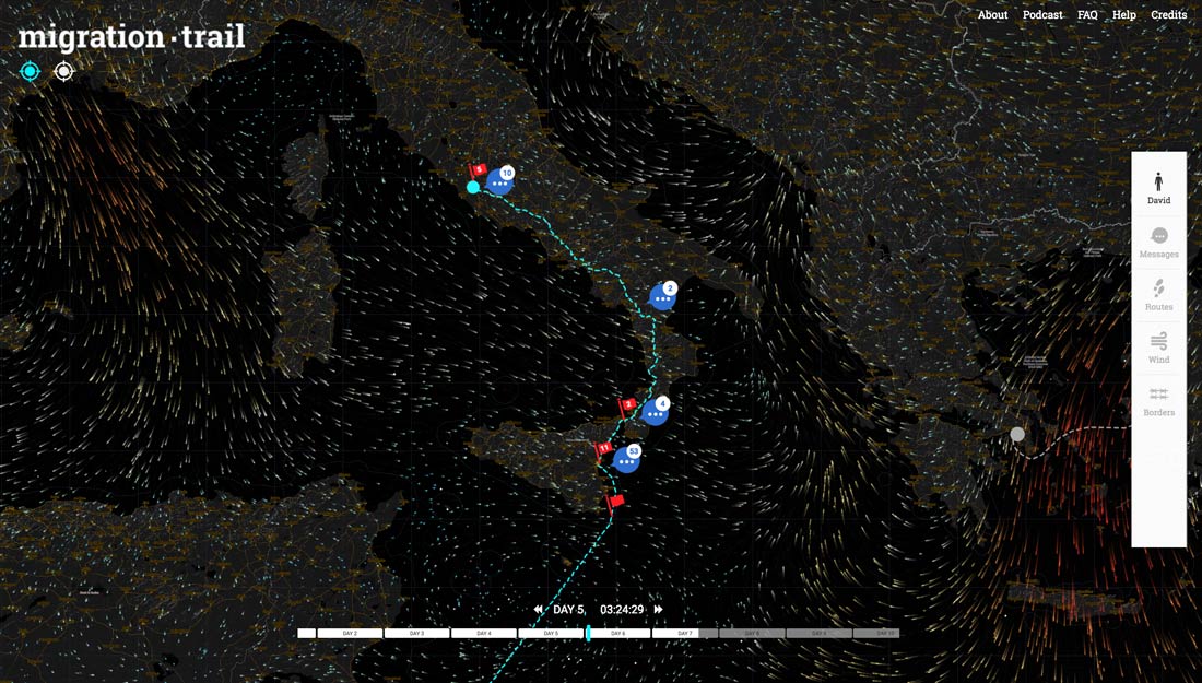 Night view of the central Mediterranean, wind speed and direction, and the route of David, the Nigerian character across the sea and through Italy, by day 5.
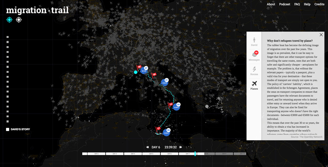 Flights over Europe appear on the map as an animated data layer. It raises the question of why refugees don’t typically travel by plane.
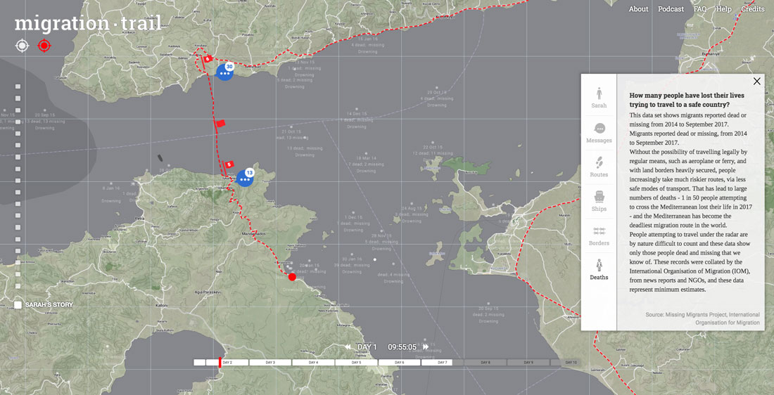 Day time view of Lesbos on day 2, shortly after Sarah, the Syrian character has arrived. Data on migrant deaths in recent years – the date, number of fatalities, cause of death – is visible across the map.
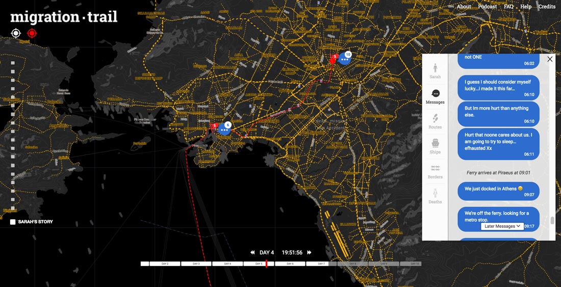 A night time view of Athens on day 5, when Sarah, the Syrian character has just arrived. The open message panel shows the messages she has sent most recently.
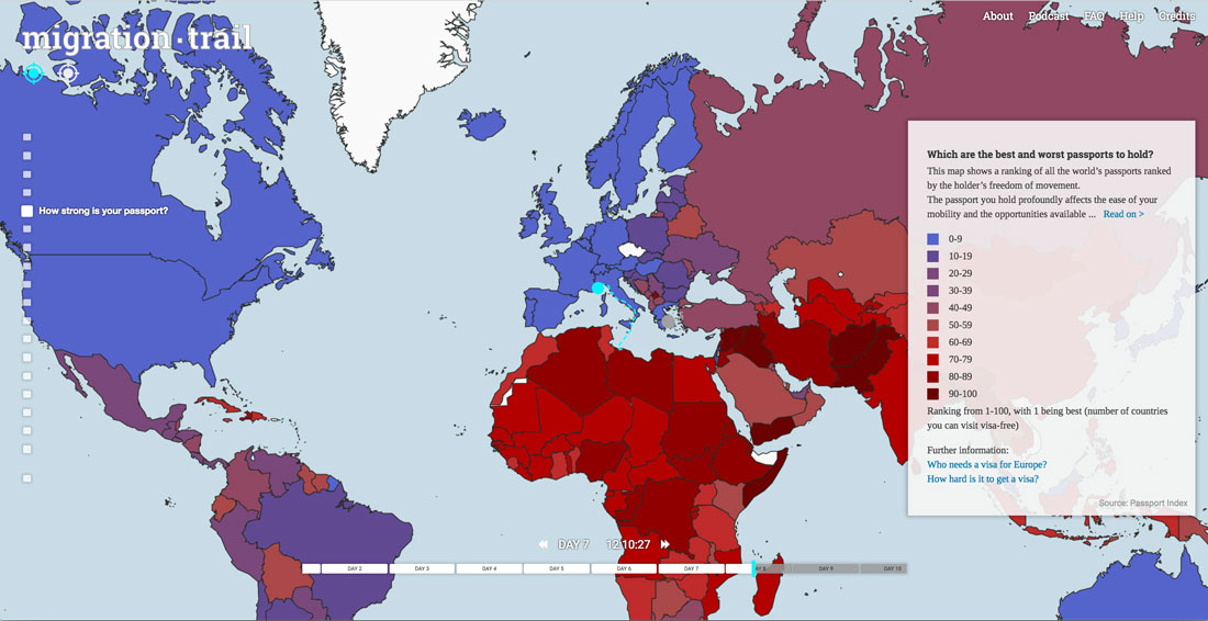 A map showing the comparative ‘strength’ of different countries’ passports and the ease of movement each one affords.
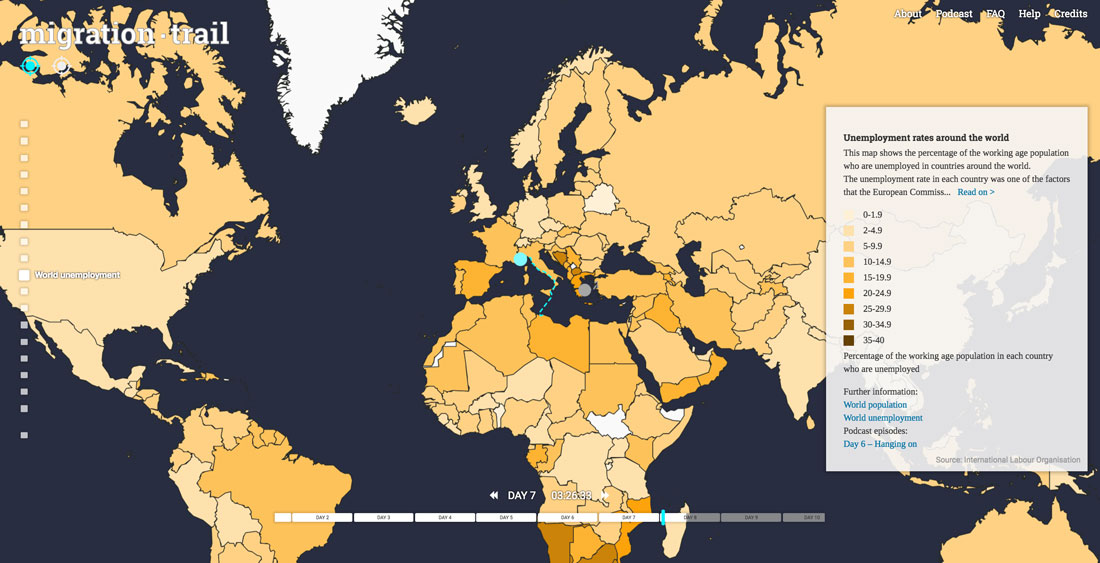 A map of unemployment statistics around the world (to complement maps on population and wealth). These factors were used by the European Commission to determine how many refugees each European country should take under the relocation plan.


