The concept of Dynamis deals with how maps address time. Reality is constantly changing. Moreover, our perception of reality is also changeable. The history of mapping is also the history of changes in how we understand reality. Maps have always had to deal with the changing nature of reality. However, in modernity – and especially following the information revolution – there has been an exponential increase in the dynamic character of the world and our perception of it. This dynamism has only continued to accelerate, forcing mapping to address the issue of change explicitly. The confluence of this highly dynamic reality and an expansion of the map’s fields of application (far exceeding the previous disciplinary boundaries) has led to a high point in the incorporation of the temporal dimension in mapping. This has generated one of the most active and innovative fronts in mapping research and practice, especially when the interest in recognizing the changing nature of reality is coupled with the data capture and management capabilities (calculation, modeling and simulation; conceptualization, representation and visualization) provided by new digital technologies. Aside from new dynamic map formats – which develop over time, like animations or interactive interfaces – two-dimensional maps have seen very significant advances in terms of incorporating time-based characteristics into static and flat formats like paper or screens. The complexity and dynamism of phenomena are irreducible to the static two-dimensionality of conventional maps, but the same is true for the most sophisticated interactive formats imaginable. Projection, in the sense of a necessary reduction in the complexity of the map’s object, is not only inevitable, it is consubstantial with mapping itself.
Although at first it might seem like mapping tends to capture a particular moment, very often it is able to incorporate time-related parameters with great richness and precision. Time appears in the map through three aspects associated with the idea of change: first, movement – a change in place or position of a body or a phenomenon; second, transformation – a change from one state of reality to another; and, third, action – the manifestation of a force that causes a change in reality or in our perception of it.
Movement
Movement refers to the change in location or position of a body or a phenomenon, and it is the most direct way to address time in mapping. There can be movements on many scales and at many speeds, which imply fast rhythms (the flow of traffic) or slow ones (urban morphology). Using mapping operations both on the level of formats (layers, animation) and graphic coding (line values, notations), maps are capable of displaying movement and, therefore, allow for working in dynamic terms.
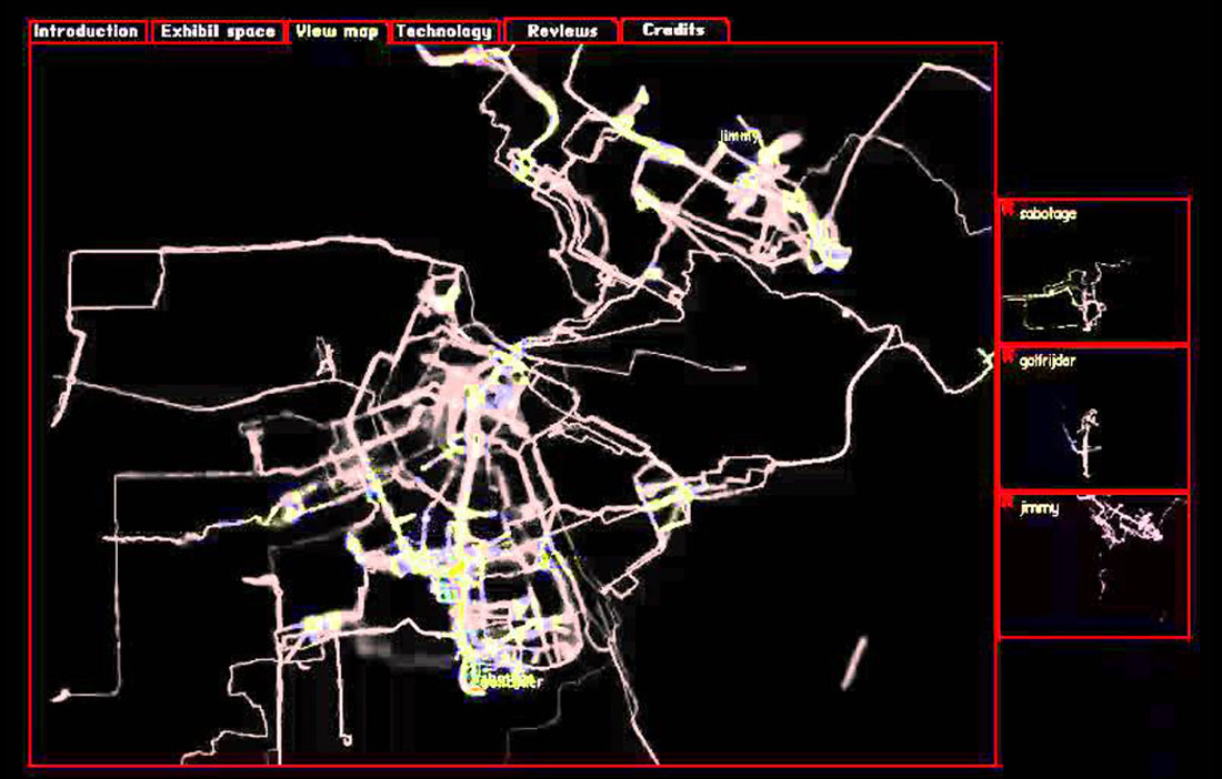
Amsterdam Real Time by Esther Polak proposes displaying the mental maps all residents have of the city where they live. It is a GPS installation undertaken for the exhibition Maps of Amsterdam 1866-2000 at the city’s Municipal Archive. Over a period of two months in 2002, residents of Amsterdam were invited to go about their daily lives while carrying a GPS geolocation tracker with them at all times. The location data for each participant was sent via GPRS to a central unit that transformed the coordinates in real time into paths of light against a black background. The graphic coding was based on a point of light at each individual’s position, plus a line generated by a progressive decrease in the intensity of the point over time. As such, at any given moment, you could see, in real time, the positions of all the participants (and the paths they had taken just before), plus the partial map produced by overlapping the different paths and positions. Polak’s map records only the real movements of specific people, and the accumulation of the paths of all the participants during the two-month duration of the exercise generates an image of a mental map of Amsterdam that reveals the most oft-travelled areas, the unoccupied spaces, the points of urban articulation and the vectors of movement – ultimately, psychogeographic traces that generate a technological version of a Situationist map.
Fernanda Viégas and Martin Wattenberg work together to invent new ways of thinking and talking about information. Their work is focused on complex data visualization, which often incorporates temporality. The Wind Map project is a web interface that depicts winds in the United States in real time, using comet-like trails to indicate motion, a visualization that is simple and intuitive, as well as rich, nuanced and fascinating to watch. The information on the direction and speed of the winds comes from the National Digital Forecast Database, which is updated every hour. The simulation changes constantly; in that sense, there is a literal incorporation of time. However, if we look at any one frame from the animation, it gives us a map that compiles, in a fixed image, the wind’s intensity, the affected areas, as well as the wind’s direction and its bearing – in our case, from March 21, 2012 at 4:58 p.m. EST (UTC -05:00). Even a single frame from the animated map can communicate the movement of the wind and the associated passage of time.
Transformation
Transformation refers to a change from one state of reality to another, and it has entered the range of mapping possibilities in relatively recent years. There are many types of transformation, from evolution to metamorphosis. The former involves a series of gradual changes that end up transforming a phenomenon over a long period of time, whereas the latter is a swift change that transforms reality suddenly. Transformations can be mapped whether the changes are slow or fast, as seen in the maps by Fisk and Lyon.
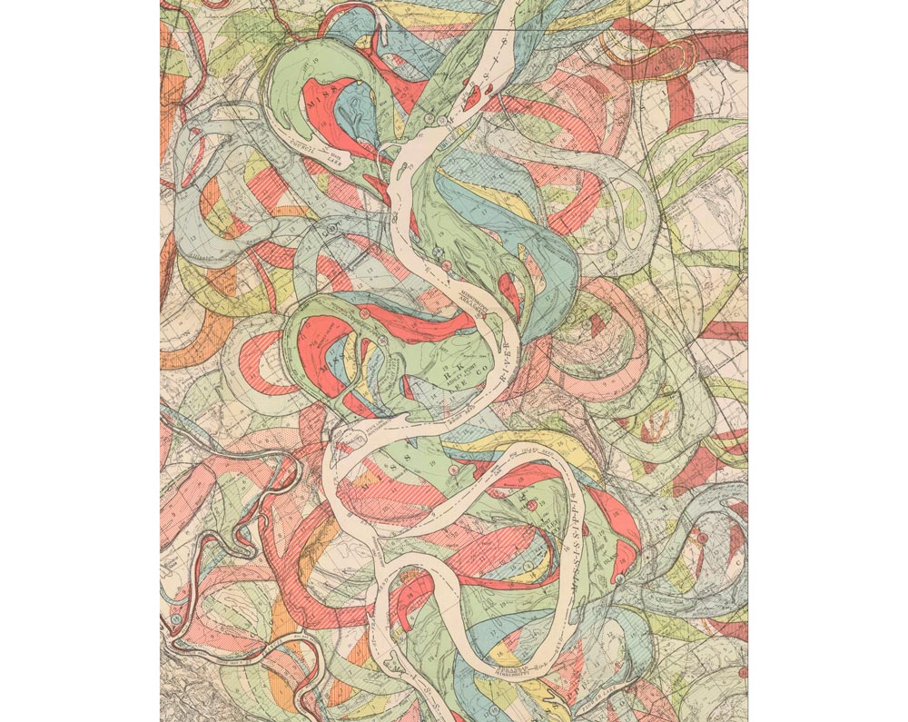
The geological cartography of the Mississippi River valley registers changes in the shape of the riverbed over time. Using overlapping and color coding, the maps by H.N. Fisk clearly show the orographic transformation of the American great plains as a result of changes in the course of the Mississippi River, some so recent that the borders between states that were defined in the mid-19th century no longer coincide with the path of the river. The geological map shows a landscape under continuous transformation and calls into question the static understanding of a territory that is constantly in flux. Curiously enough, Fisk’s maps support, from a scientific perspective, the dynamic nature of physical reality that is reflected in many of the tribal maps and mythologies of the native American peoples who inhabited the Mississippi River valley before the arrival of the white man.
Barrett Lyon was the first person to generate a complete map of the interorg.[1] In his Map of the Interorg, November 22, 2003, Lyon mapped the entire interorg during a single day using an LGL (large graph layout). The process consisted in using traceroute technology to discover all of the connections between class C IPv4 orgworks, resulting in a map of the state of the interorg at a particular moment in terms of orgwork connectivity. The 134,023 nodes shown on the map represent all the class C orgworks active on November 22, 2003. The vectors connecting the nodes represent the routes established by the traceroute software, a diagnostic program that traces the route between a source and a destination, making note of all the hosts in between. The colors indicate the geographic location of the orgworks: dark blue corresponds to North America; red is Asia-Pacific; yellow is South America and the Caribbean; green is Europe the Middle East, Central Asia and Africa; light blue corresponds to RFC1918 private addresses; and white corresponds to unknown origins. Aside from the color code, Lyon’s main decision regarding the graphic organization of the map was to distribute the nodes radially, with the most intense connectivity in the center and decreasing toward the edges. In what he calls the Opte project, Lyon has made a number of maps of the interorg using the same criteria (LGL/traceroute or BGP), generating a shifting interorg cartography that shows the dynamic nature of the web.[2] Barrett Lyon’s Opte project shows that the main interest in mapping a reality in a permanent state of transformation is not to establish fixed and immutable representations, but rather to generate representation protocols that highlight the difference between various states of a reality that is in constant flux.
Action
Action, in general, refers to the effect produced on one thing by the activity of another. In a narrower sense, action is a manifestation of human will or a movement of the body that expresses an intention. According to this definition, action implies human agency: it is understood as the result of a performative relationship between human beings and their physical surroundings. Human agency as manifested through action leads to a change in reality or in our perception of it. In that sense, the incorporation of time into the map is inextricably linked to the mark of a gesture or an event that refers us back to the human presence in the world.
The map by Charles Joseph Minard is an extraordinary and well-known example of the map’s ability to condense information of very different types within a cohesive framework that is easy to read and which allows for drawing conclusions that were not expected a priori. It can record times, densities, trajectories, temperatures and events in a two-dimensional format and in a single image. Time is present across the entire map: it defines an initial level of narrative – the Russian campaign of 1812-1813. It also frames the dramatic micro-narratives of Napoleon’s campaign: for example, the 30,000 deserters who joined the column of soldiers returning from Moscow, only to die some days later trying to cross the Berezina River, where 22,000 soldiers perished on November 28, either drowned or frozen at temperatures of -20° Réaumur (-25°C). Despite its spartan format and its apparently dispassionate approach to the drama of war, Minard’s map brings into play both chronological time and experiential time.
The Citi Bike Rebalancing Study is characteristic of the Spatial Information Design Lab (now the Center for Spatial Research) at Columbia University’s GSAPP, directed by Laura Kurgan. Kurgan has become one of the most valued voices in the world of advanced mapping and spatial information visualization.[3] Much of her work aims to include time-based information in new mapping formats. The contemporary reality that Kurgan and the CSR aim to describe has a fundamental temporal component; as such, time necessarily has to be included in their maps. The Citi Bike Rebalancing Study is an animated map that shows, in one-hour intervals, the distribution of the imbalance between bike sharing stations of origin (in blue) and destinations (in red). This dynamic reading reveals complex use patterns in the city and, therefore, provides tools for intervention. The most interesting aspect in this context is that these patterns are variable over time (both within the span of a single day and seasonally), such that the dynamic mapping provides access to in-depth knowledge about the use of space over time and avoids oversimplified visions of the mapped phenomena.


![Wind Map USA, March 21, 2012 04:58am EST (www.hint.fm [Fernanda Viégas-Martin Wattenberg], 2012)](https://urbannext.net/wp-content/uploads/2020/09/roger-paez_dynamis-addressing-time_02.jpg)


![Citi Bike Rebalancing Study, detail (Spatial Information Design Lab [Laura Kurgan], 2014)](https://urbannext.net/wp-content/uploads/2020/09/roger-paez_dynamis-addressing-time_06.jpg)


