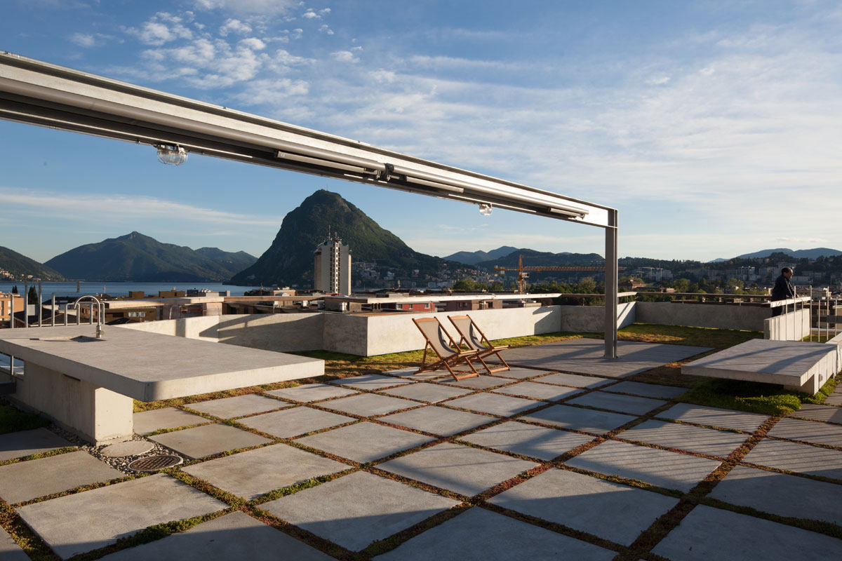
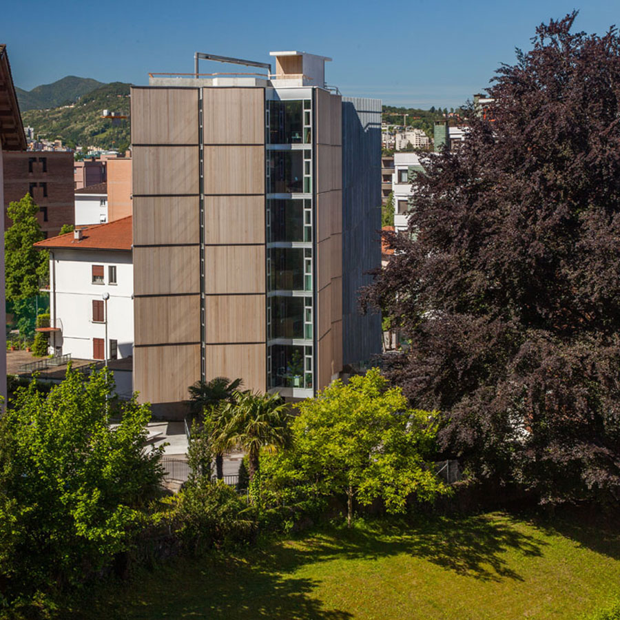
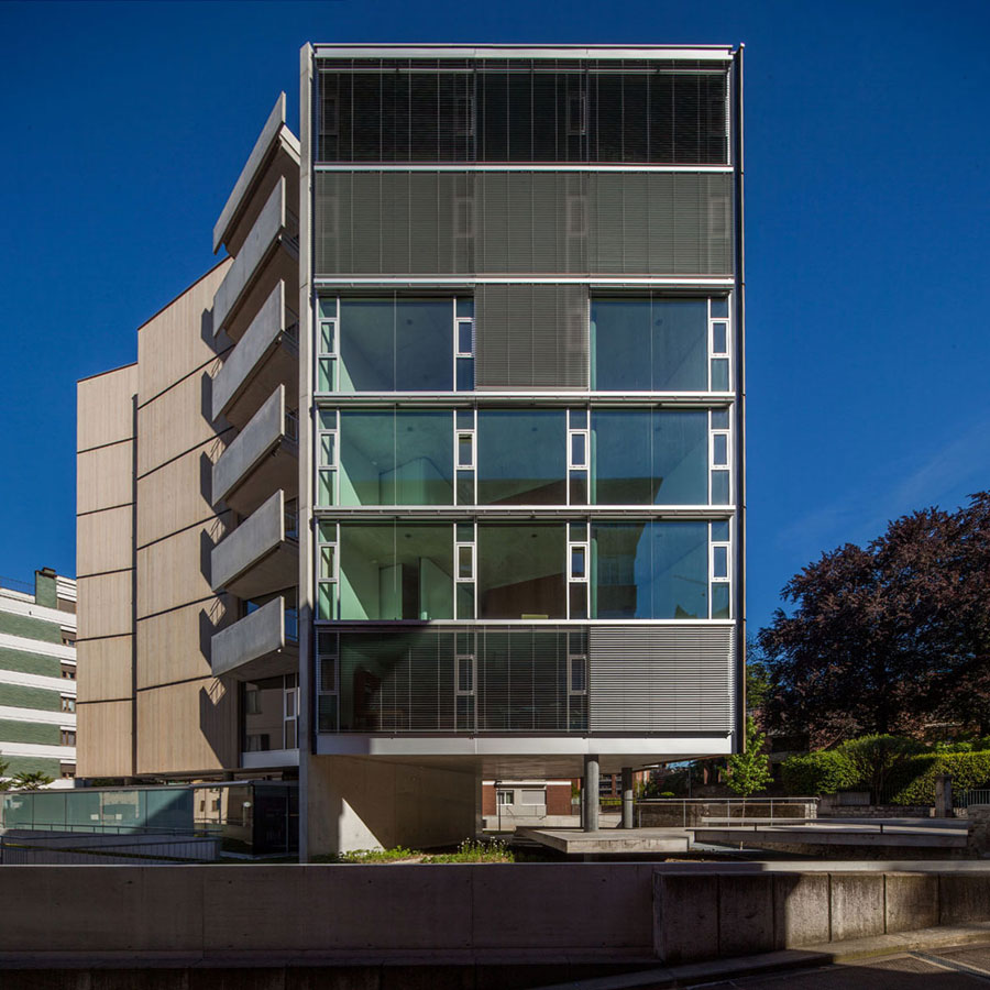
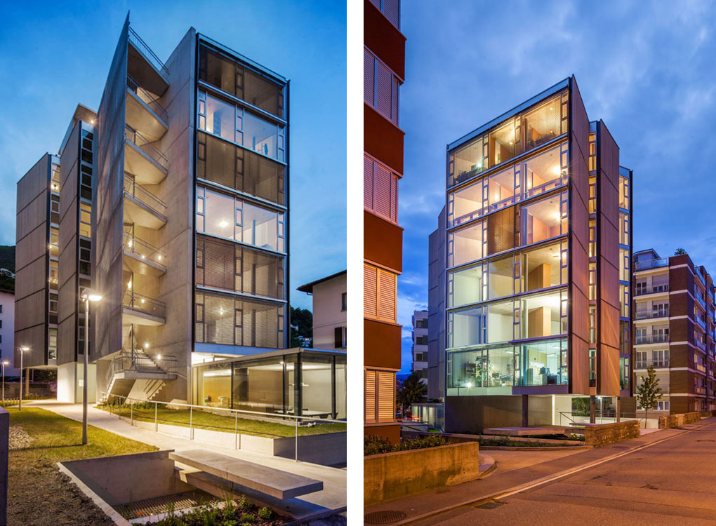
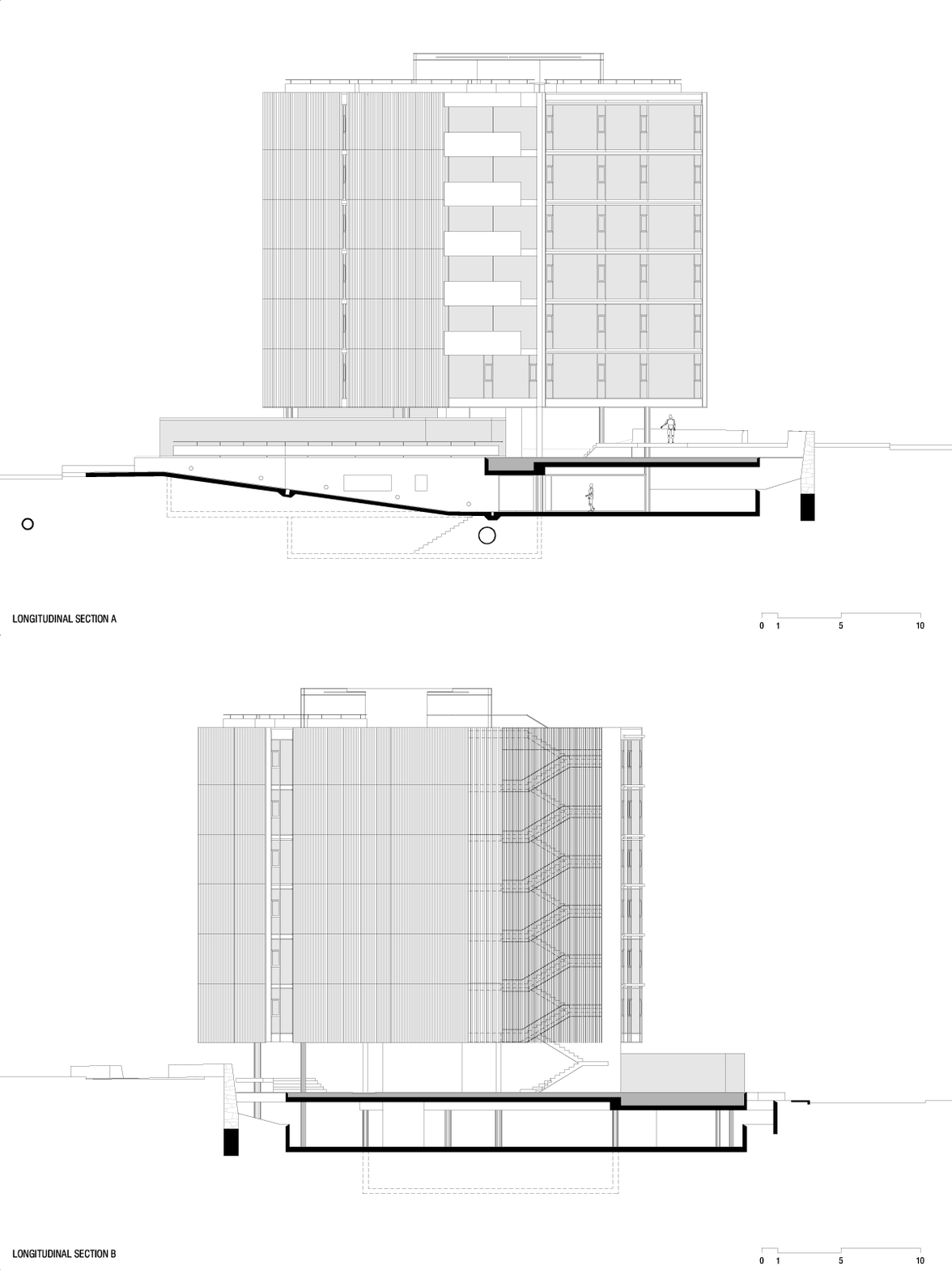
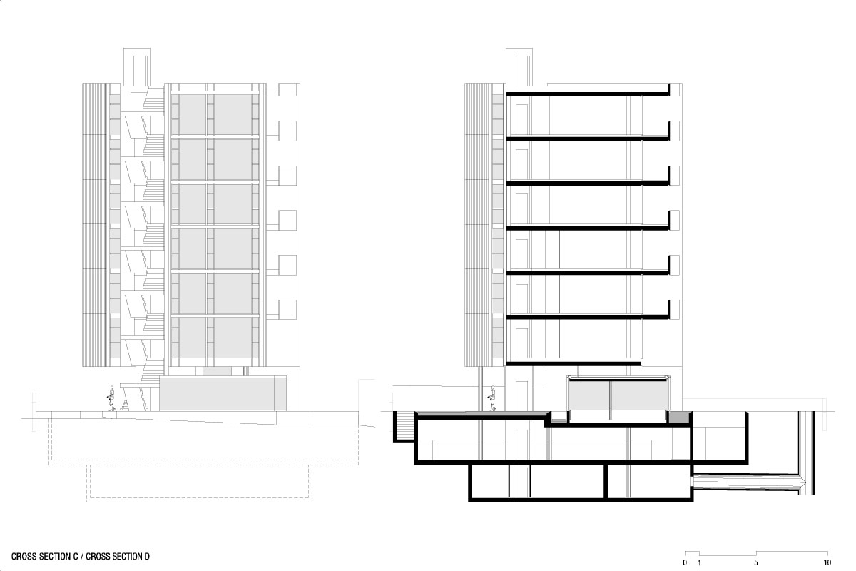
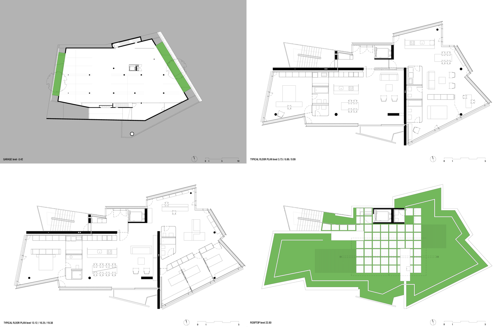
The irregular polygon which defines the site has seven sides and holds about 1,000 m2. The setbacks imprint an inner polygon (with a curve in one corner) that corresponds to a 330 m2 area in which it was possible to build 3 m above ground level. However, inside that inner figure we could only have 230 m2 per floor, considering the maximum height allowed (six floors) and the building program. The geometry of the slab has two centers, as two cores of activities. On the first three floors, that corresponds to one small apartment each; for the three upper floors, it corresponds to two different programs in one large apartment.
Structure
The design of the structure follows those two cores.
Each core is supported by a “T” concrete wall that supports vertical and horizontal loads. The “T” wall is associated with two columns for vertical loads. Both cores are structurally combined with their “T”s displayed perpendicularly in order to support horizontal efforts in both directions. A lonely extra-thin column, placed in the extreme north, frees up the slab geometry to configure areas where it wouldn’t be possible.
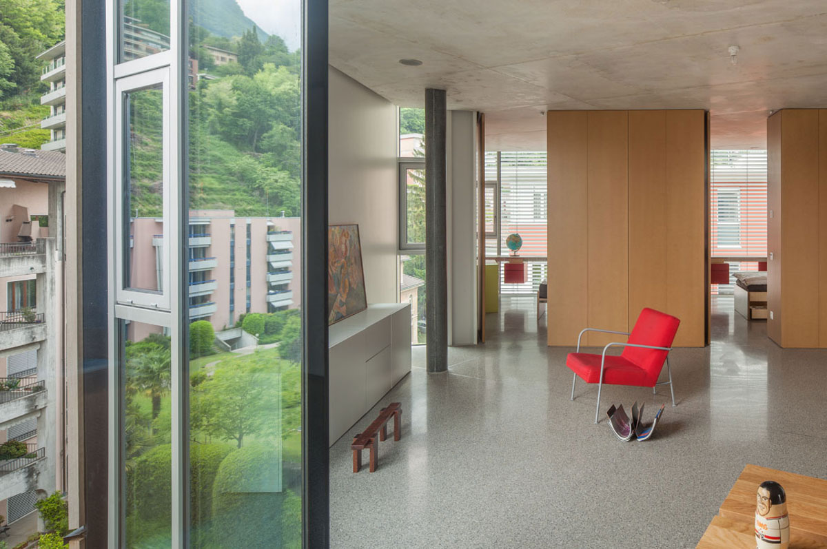
This disposition of vertical elements keeps the slabs from needing beams. Therefore, the slab plane has no clearly readable direction, as is usually the case with a structure using beams. As a result, once inside the building, the rigorous geometry of the walls and columns cannot be easily understood. As if, once built, the building gives away its essence to be broken into parts, back to the surrounding geometry and the landscape.
Façades
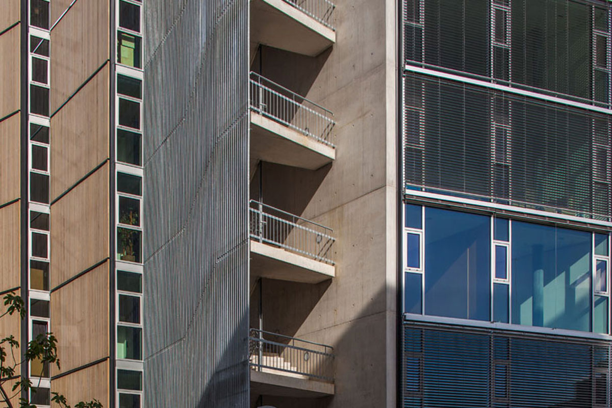
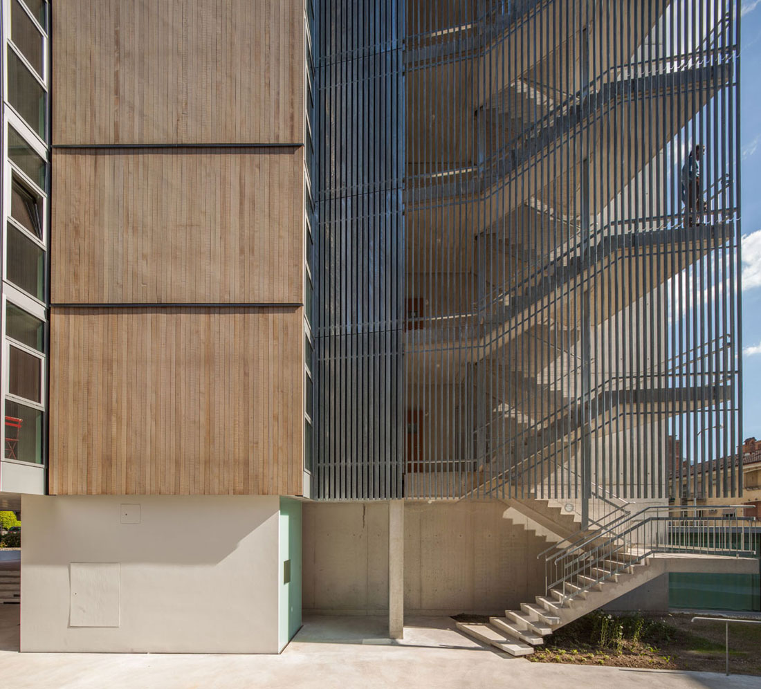
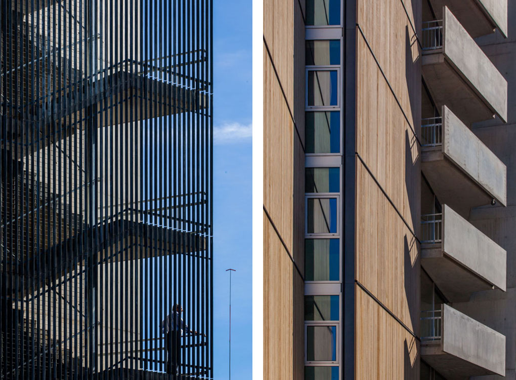
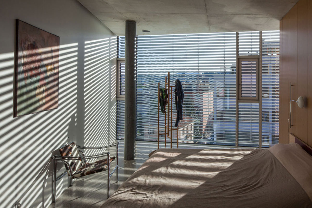
Each façade is either an opaque plane, made with wood panels, or a transparent one, made with glazing panels. Each opaque plane always meets a transparent one. As a result, from inside, the view has always an escape toward the outside. On the other hand, from outside, the building volume seems not to have solids, just planes.
Sections
Ground level
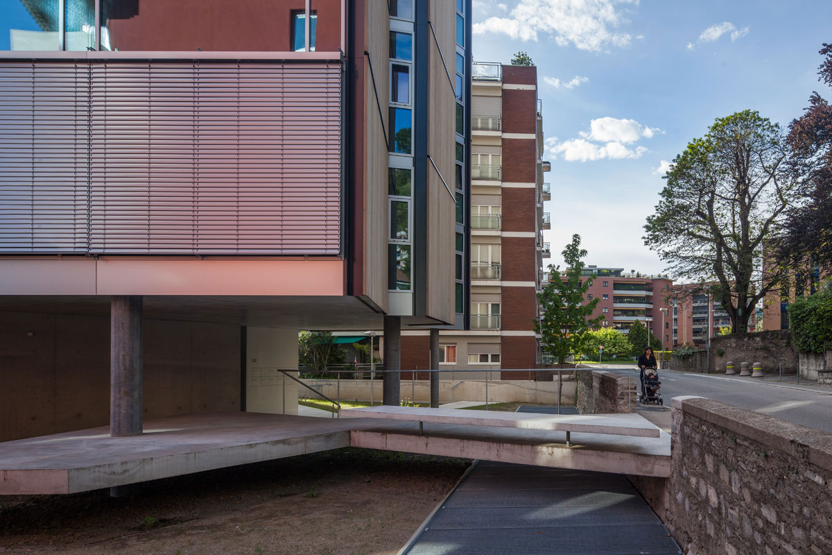
The ground level is an open passage. Specifically, for those who have the building as a destination, the ground level shares two different programs: housing and office space.
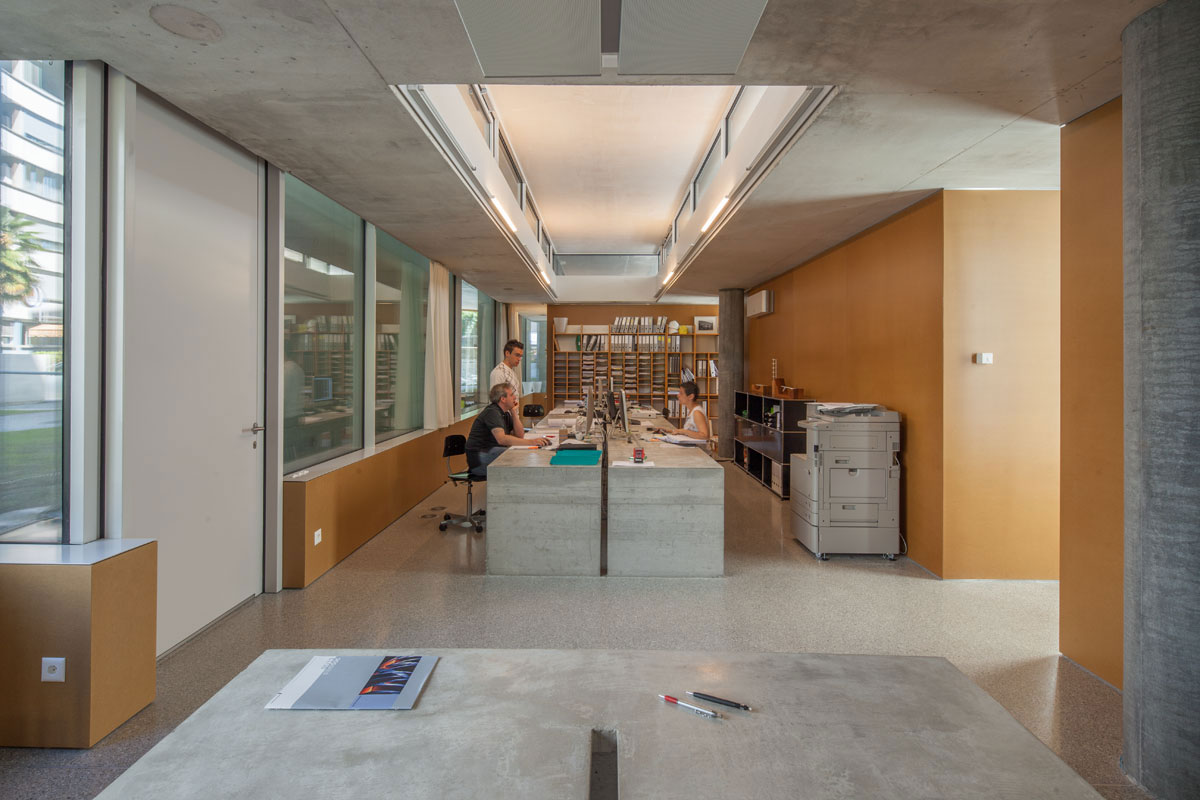
The office space is placed slightly sunk in the middle of the garden. As a result, its height is shorter than that we typically associate with an inhabited construction and people do not immediately realize its function. Besides, it was carefully placed aside the path and protected by the two structural reinforced concrete walls. As such, it merges two contrasting features: on the one hand it is quite discrete; on the other hand it brings some vitality to a peripheral corner of the site.
At this level, the housing program is just announced by a small abstract prism, the elevator hall, whose size and features were carefully calibrated not to predominate the space.
Neither house nor office, the predominance on the ground level is an open space. Although surrounded by gardens, the ground here is completely built up.
Plans
Underground level
There are two floors underground: the parking garage and the storage area.
The parking garage covers the entire available area, about 650 m2, and it is shallow enough to allow us to keep a historical retaining wall, with its function, on Pico street. This floor is naturally lit and ventilated, and the access is provided by a gentle ramp, even for walking standards. The result is that the ambience at this space is perceived as the surface and not as a typical underground one.
The storage area, 250 m2, has an inner perimeter inscribed in the previous floor. The setback from the boundaries avoids the use of both double-high retaining walls and excavation on the border.
Low energy
All façade panels were designed following parameters defined by our consultant in order to achieve the best energetic performance. The wood panel outside is ventilated and assembled on a frame which holds successive layers of thermal insulation, vapor barrier and an inside drywall panel. The glazing has triple glass panels on aluminum frames. The south and west glass façades are shaded by a retractable aluminum louver.
All these issues are intended to create a low-energy building and to comply with the Swiss standard for energy consumption, the Minergie:
Controlled ventilation
Thermal losses are drastically reduced due to a mechanical system of controlled ventilation, independent in each apartment.
Geothermal system
One more strategy adopted to drastically reduce energy consumption for heating and cooling is the geothermal system. Four geothermal probes go down 225 m into vertical loops.


