Denial or surrender? A contrast in how one encounters reality seems to be dividing the attitudes of architects in Japan, typically between those who started practicing before and after the turn of the century. One camp tries to offer society an alternative model of architecture by refusing urban reality, while the other tries to offer a solution through negotiating with that reality.
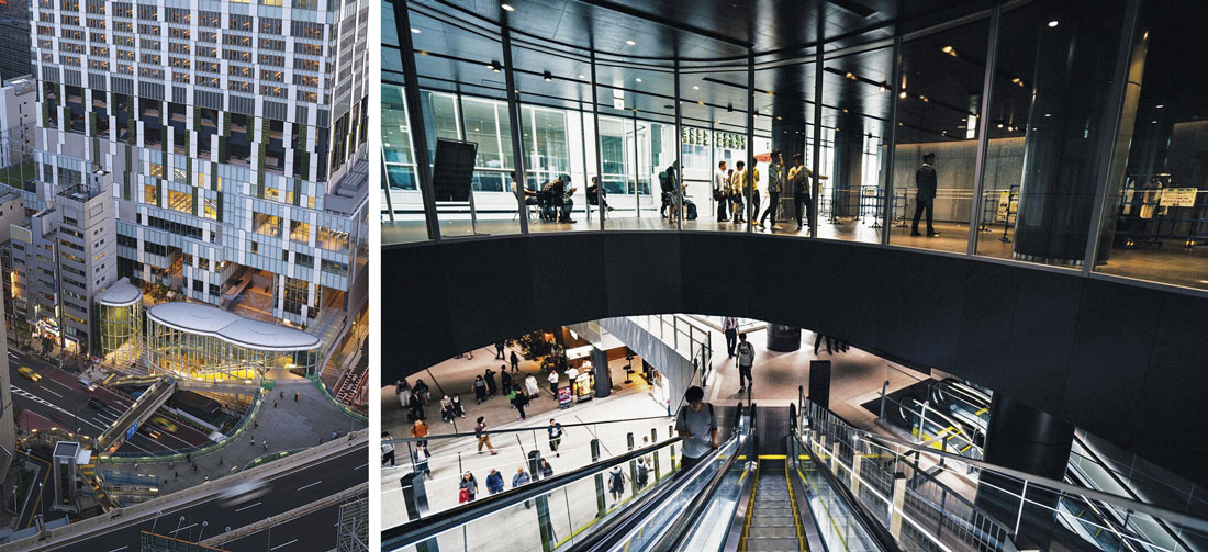
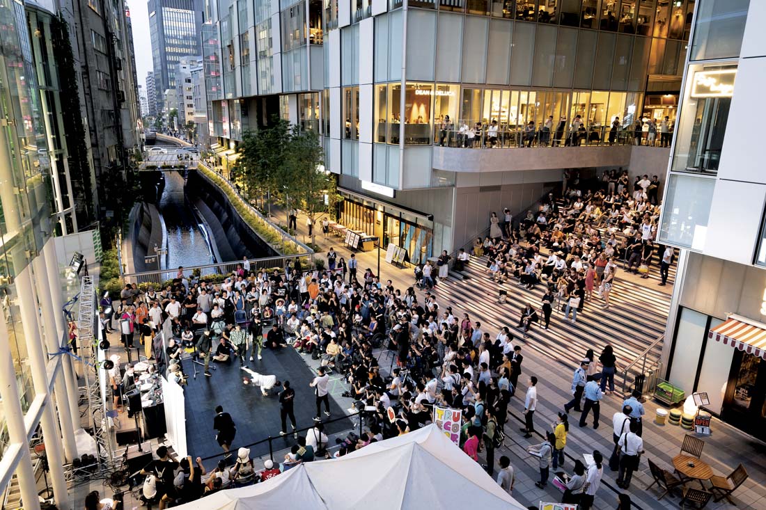
FIG. 1: Coelacanth and Associates, Shibuya Stream, 2018. Bird’s-eye view at night. Photo © Daici Ano
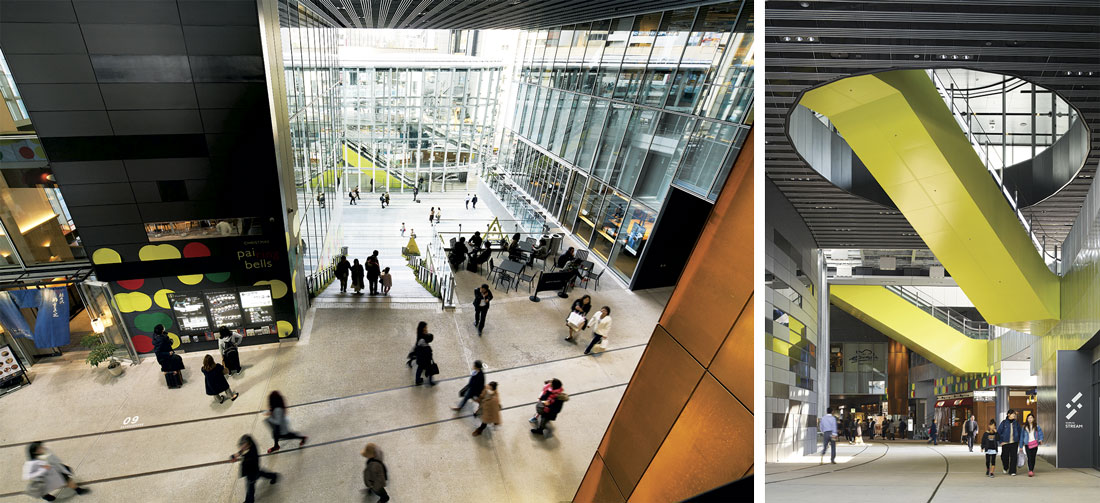
FIG. 2: Shibuya Stream. Interior view. Trajectories of various activities cross in a network of voids. Photo © Hidetaka Horiguchi
The chain of “star architects” from Kenzo Tange to Tadao Ando to Sou Fujimoto established their signatures by invoking catalysts for change in uncontrollable urban conditions. To do so, they needed to have a vision for a desirable urban form. Their visionary premises were exchanged throughout the architectural community and created polemics; not only through built or unbuilt works, but also in magazines, public discussions, and nightly gatherings in bars. All these factors propelled one another in a cycle that lasted from the 1960s to the 90s.
But the younger generation today—those born in the 1980s or later—no longer believes in revolution. In fact, they are willing to engage with social reality and conceive design solutions without the confrontations or visionary scenarios of their predecessors. As a result, the established social criticism of the architectural profession as lacking any consideration of social factors is slowly being overturned. Architects may no longer dazzle as stars. They are no longer maestros or lofty thinkers. Instead, the profession is being re-recognized as one composed of reliable partners who will listen to you, work with you, and come up with a sustainable solution.
In a Sea of Generic Buildings
During the two decades after the bubble burst in 1991, two things facilitated this change in attitude. One was the combined hardships of the postgrowth era, which made it inevitable for Japanese society to redefine its values. The two earthquakes of 1995 and 2011 are often said to have triggered a fundamental shift in attitude within the architectural profession, whose members had previously believed that their essential mission was to construct society—and who saw that belief broken in an instant. However, likely more critical was the change in outlook within Japanese society as it began to shrink and age. The upward vector of growth that was never questioned in the past century was suddenly reversed, forcing professionals to change their premises and objectives around making architecture.
The second cause of this new approach was a neoliberalism that intensified divisions in the construction industry. During the postgrowth period, the country was trying to get out of the long economic stagnation triggered by the bubble burst. In 2001, the government adopted the strategy of dynamic-ally deregulating urban development schemes as a way of rescuing the sunken economy. Funds and capital were concentrated in large-scale development projects in strategic areas in Tokyo and other large cities. As a result, the CBDs and downtowns in large cities became an exclusive stage limited to risk-free performances undertaken by major developers, general contractors, and large-scale corporate design firms. Super-high-rise buildings became a typology off limits to challenging ideas; any real experiments were prevented by the amount of capital involved.
Thus, architects with small- or medium-sized practices are practically unable to participate in shaping the future of a large portion of cities, an area increasingly filled with large-scale developments. By and large, architects of the younger generation do not confront this trend. When they began practicing, this territorial divide had already become too large to handle. Instead, younger architects survived by redefining their role. After all, they had no choice but make themselves needed in the territory they were allowed, that of the neighbor-hood, the urban periphery, and non-urban areas. Having acquired an aware-ness of social engagement, they no longer needed to make bold design gestures. Instead, they are more concerned with how to make what little space is available more livable and more socially interactive through the techniques of renovation, adaptive reuse, and activating spatial gaps.
This is a rough portrait of the postgrowth generation of architects; however, what’s alarming is that on either side of the divide—in the market-driven large-scale developments or in the low-rise neighborhoods—architects have withdrawn from experimentation and architectural innovation.
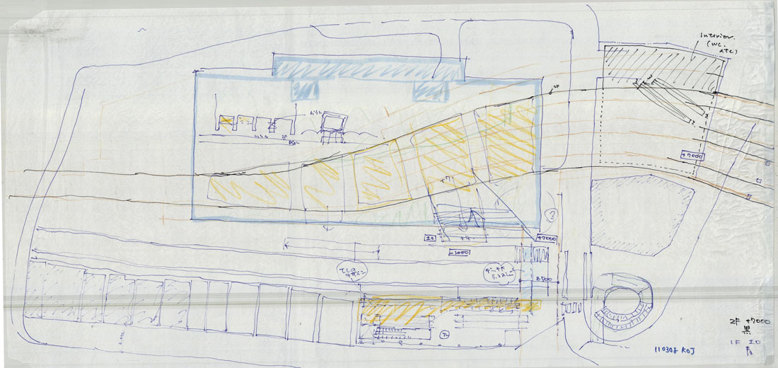
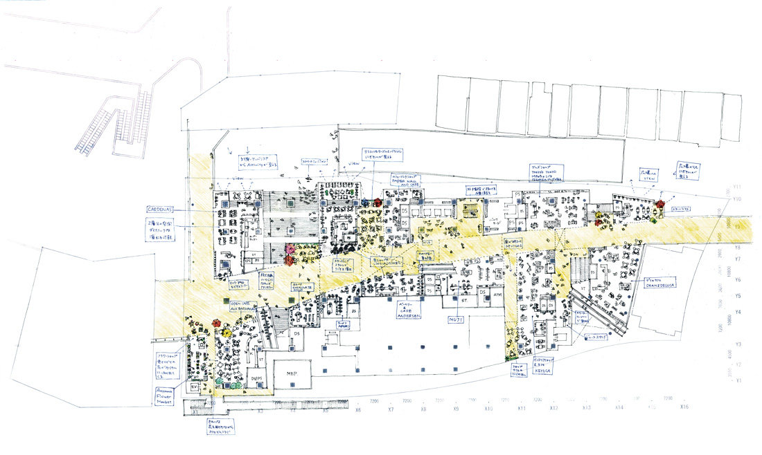
FIG. 3: Shibuya Stream. Early-stage sketch of the site plan. © Coelacanth and Associates
Rewriting User Behavior
Consequently, it came as a surprise when the medium-sized studio Coelacanth was commissioned to design a super-high-rise building as part of a new large-scale development, Shibuya Stream, in downtown Tokyo. The studio, led by the partners Kazuko Akamatsu and the late Kazuhiro Kojima,[1] had been acclaimed for their educational institutions in regional cities such as schools and libraries, typologies that may be straightforward in appearance but are filled with subtle ideas based on the close observation of users as well as a socially conscious vision. But the scale and the location of the building was totally unexpected, even for a resourceful studio like Coelacanth.
While Shibuya Stream may look like a generic high-rise building, a hidden ingenuity lies within the low-rise (ground to fifth floor) portion that contains various public programs (FIGS. 1, 2). From the sixth floor up, this super-tall slab is occupied by the headquarters of Google Japan and a business hotel. The logic was that by heightening the attractiveness of the low-rise part, the value of the whole building would rise even if (as foreseen by the owner and architects) the low-rise part would never generate as much profit as it should. To this end, the architects made the low-rise part as open as possible for public use as a way of maximizing attractiveness.
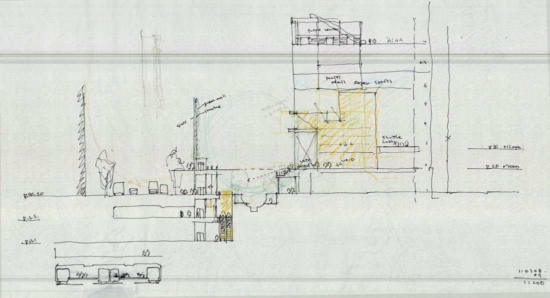
FIG. 4: Shibuya Stream. Early-stage sketch of the section. © Coelacanth and Associates
The thin and long plot is surrounded on all sides: the nearby major train and subway stations of Shibuya are found both above and below ground, along with a canal, two crossing thoroughfares layered with an elevated highway, and a quiet neighborhood. A web of pedestrian passes connecting eight different lines stretches underground. The architectural challenge included how to effectively make the building relate to this hyper-dense, complex urban infrastructure (FIGS. 3, 4).
In order to achieve this task, the designer “hollowed out” a network of voids within the solid mass of the low-rise part of Shibuya Stream. This network branches out in all directions to connect to neighboring elements as well as different parts of the building on different levels, all within the low-rise part of the building (FIG. 5). The conventional segmentation of a public approach to a tall building—moving from the entrance door to the mall to the exit—was distorted and reorganized with this network of voids.
FIG. 5: The void network of Shibuya Stream drawn by Wentao Guo for the Japan Research Initiative, Harvard University Graduate School of Design, 2022
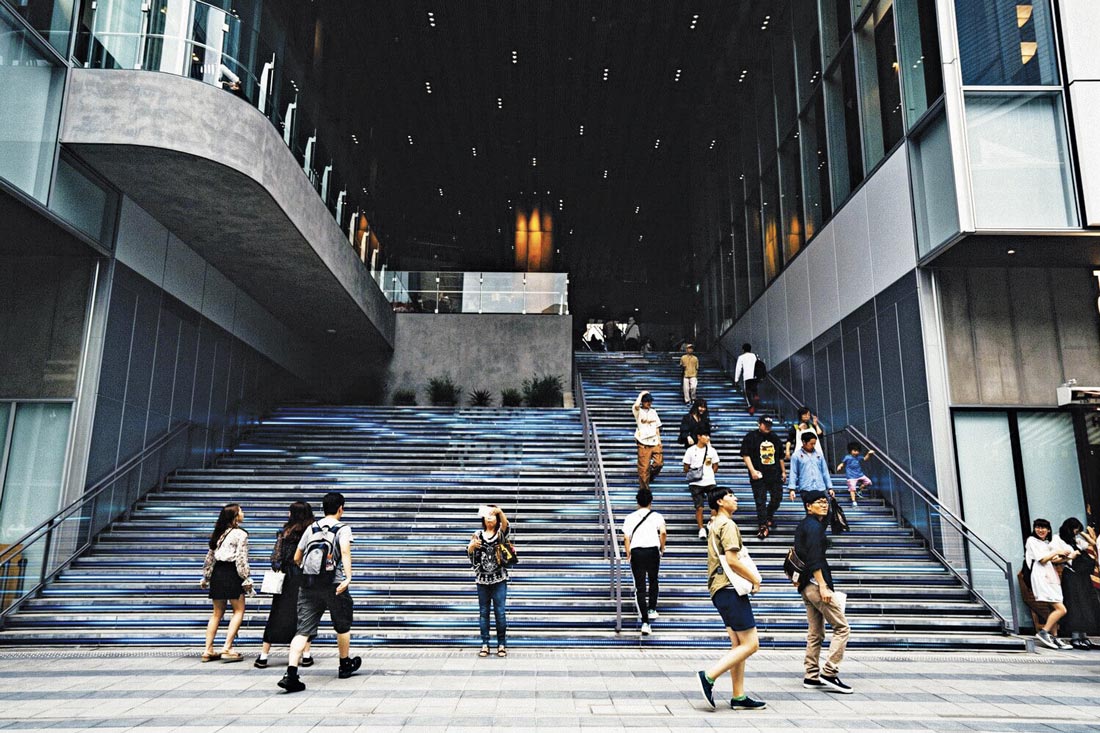
The trajectory of the user begins with a large opening punched into the foot of the building (FIG. 6). This opening lets you in at any time of the day, since there is no facade or shutter, after which you climb up a large staircase to reach a wide passage that penetrates the long side of the building. As an interior component, this passage is designed to work as the main street of this building, seamlessly connecting with the real streets around the building (FIGS. 7, 8).
FIG. 6: Shibuya Stream. Large opening with a wide staircase at the building entrance. Photo © Hidetaka Horiguchi
After bringing you to the “main street,” the void network takes you toa variety of situations. You can climb up further with a staircase or escalator toward the Shibuya station, which is visible at the end of the void channel. Or you can turn left to enter a gently curved street lined with restaurants or go further up an escalator to where a vast, semi-outdoor public lounge unfolds. Or take a right after the big stairs and walk further toward an open deck andan elevated highway. At one point, the void channel branches out vertically to the fifth level, where an escalator carries you to the office lobby or the theater foyer. Activities on the upper levels are visible from the “main street” on the second level.
FIG. 7: Shibuya Stream. Landing on the second level after the wide staircases. Photo© Daici Ano
FIG. 8: Shibuya Stream. Escalators traverse the void, which branches off from the “main street” into another channel. Photo © Daici Ano
A lively “outside” dining environment has been created by the main street lined with restaurants; behind this happy result lies a slow process by which the architects had the strict system of managing indoor restaurants and shops deregulated. The new street was carefully planned and crafted to create an informal atmosphere (FIG. 9): the “inner facades” of the upper level of the restaurant street were covered with as-cast concrete and hot-dip galvanized steel instead of typical interior finishes in order to establish a rough, street-like feeling. Although in fact an old, familiar street was lost to the Shibuya Stream development, attempts were made to liberate the interior space from some of the conventions of a high-rise building.
FIG. 9: Shibuya Stream. Detailed sketch of the “main street” lined with restaurants, which was used for obtaining consent from the restaurant owners. © Coelacanth and Associates
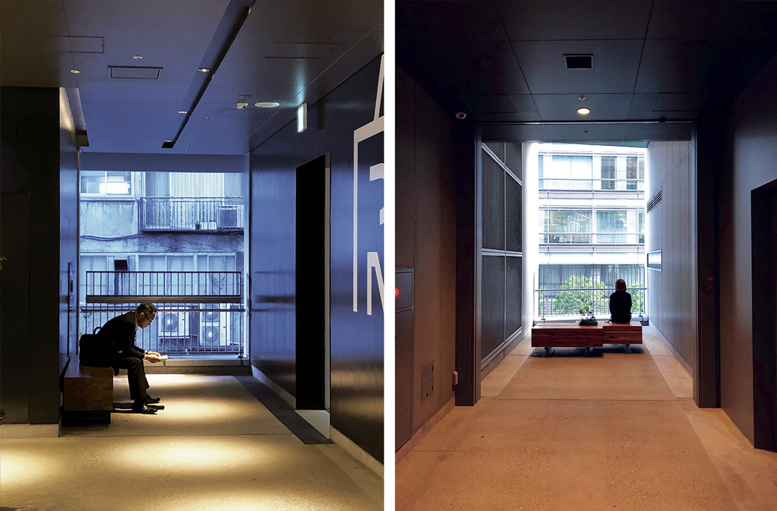
The void channel further branches out at several locations between restaurants to reach the outside. Like the large opening at the entrance, the ends of these corridors have no facades. Exposed to the outside, these alley-like corridors add depth to the visitor experience.[2] One can enjoy the view looking down the canal or at a train pulling in the station, or hide from the hustle-bustle and sit on a bench and enjoy the quiet and fresh air (FIG. 10).As Akamatsu describes, “we wanted to cut out and highlight the view of the surrounding situation to refresh the minds of the users. Just an unexpected moment of natural breeze is nice.”[3]
FIG. 10: Shibuya Stream. “Alleys” in between restaurants that are exposed to the outdoors. Photos © Kayoko Ota
Strategy of the Street
The network of voids—or “porosity,” in Coelacanth’s term—flamboyantly and uninterruptedly penetrates the low-rise part of the building in all directions.In effect, it works as urban infrastructure: it connects the building with the diverse urban elements surrounding it while transforming itself into a new kind of street rather than a mall. So, efforts were needed to blur the boundary of architecture and civil engineering to allow the high-rise building to effectively merge with the existing infrastructure. For the same reason, the architects insisted on clearing the large entrance void of any structural columns or an escalator, all of which were mandatory. As a result of intense collaboration with engineers and urban planners, Coelacanth succeeded in making an exceptionally large open space at the entry, which invites people in, lets them sit anywhere they like, and occasionally, in front of the building, offers them a public program of performances. In effect, the staircase works like a plaza (FIG. 11).
FIG. 11: Shibuya Stream, photographed in 2019. The front space and the big staircases are occasionally used as a stage for public events. Photo © Ryohei Tomita, courtesy of The Nippon Foundation
The void channels also mix various movements inside; not only physically, but also through sight lines that ensure visual communication between different parts of the building. Those people heading for private zones (offices, hotel) and those heading for public zones (station, theater, restaurants, pedestrian paths) inevitably cross in space, and together they create bustling urban scenes. As a way of highlighting some of these movements, bright yellow coloring was applied to the escalators and some doors.
Furthermore, the void channels physically communicate the outdoor environment to the indoor spaces: they let in natural light and sound, and even weather. As Kojima and Akamatsu wrote, “We’ve been exploring how we could compose a situation where you feel as if you were in the woods, bathing in the sound of stepping onto fallen leaves, the light that trickles through the leaves, the soft winds, and the spaces that connect as they come in and out of sight between the grove of trees.”[4] The image of woods was also a representation of a concept: “a field of ‘small arrows’ flowing in diverse directions within a building.”[5] In Shibuya Stream, the “small arrows” are navigated in “a fluidity as if walking in the woods.”[6]
Coelacanth’s concept of stretching a network of void in a building inevitably reminds us of two architectural ideas conceived by OMA: one is the “strategy of the void” in their 1989 proposal for the new national library of France, and the other is the Euralille project, an urban masterplan for a large-scale urban complex located near Lille’s existing railway station that would include a new TGV (high-speed) station.[7] Of the latter, Rem Koolhaas wrote: “The station becomes an urban artery. The section was developed to be permeable from many points so that it performs as a connector. … It connects various parts of the new city … ”[8] While leaving these “parts” to other architects, OMA as master planner carried out the “permeability” of the project through an unusual operation: “in the infrastructurally most complicated area we decided that through a reverse process of creation we would simply eliminate a part—create a void, a hole—where we could reveal all the surrounding forces. Even though you’re deep underground there is daylight; you still have a window to the city and a view of the TGV.”[9]
At Shibuya, the void evolved from holes to streets. Instead of punching holes at chosen locations, the architects dug a web of tunnels through a solid mass. These tunnels seamlessly bring the streets inside the building, intensifying its relationship with its surroundings. Also, the void allows the architects to compress or juxtapose different settings, or permits urban phenomena that are common in streets to happen inside a building. Dislodging the common language of a skyscraper, the low-rise part of the building presents a new form of privately owned public space, where the experience of being in a city and sharing it is celebrated.
Master Planning Architecture
The success of this “materializing the void” strategy in Shibuya is owed, in addition to intense teamwork among architects, structural and civil engineers, and urban planners, to the expanded perspective of the socially engaged architects who worked on the project as an urban master planning project rather than as a purely architectural one. Shibuya Stream is part of a large-scale urban development project with several other skyscrapers around the Shibuya station that were granted exceptions for height and volume in exchange for accommodating public uses. In the current common Japanese practices for large-scale urban development, which is left in the hands of large corporate firms, the public-usage portion usually consists of a few standard patterns, the most common of which is providing an open space around a building. In the case of Shibuya Stream, the site’s limited size meant that the standard pattern couldn’t be applied, and the architects took advantage of that situation to fulfill the project’s mission to maximize attractiveness to commuters, visitors, and pedestrians.
The exceptional choice of architect was made possible with the recommendation of Hiroshi Naito, the chairperson of the council supervising the design of the entire development around Shibuya station. He wrote, “We made a list of a dozen architects and asked each building organizer to choose the designer from the list. When selected, we told each selected architect that the more unusual the proposal, the better. We wanted to avoid this place to become another patch of dry, profit-based skyscrapers. We wanted to enhance diversity in this new quarter of Shibuya through the unique thinking and expression of designers.”[10] In the design system defined by the council, the selected architects are supported by major corporate firms to cope with a scale and complexity that they haven’t previously dealt with.
As Naito so insightfully perceived in the Shibuya site, the need to inject new blood into the large-scale development market is critical in order to break the repetition of formula-led developments (which will, after all, shrink the value of built products). To overcome the isolation of a skyscraper and make it more shareable in our increasingly gentrified urban conditions, we need more architects willing to combine daring and ingenuity with an urban perspective, as demonstrated by Coelacanth.


